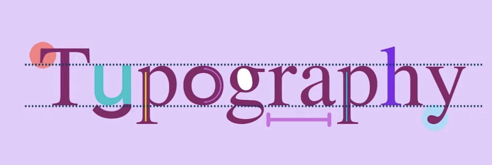
Ever wondered why some words look good enough to eat, while others just don’t hit the mark? That’s typography in action! It’s not just about choosing a font; it’s about creating a vibe without saying a peep. Picture this: You’re reading a spooky story. The words crawl across the page, lean and jagged, like branches on a haunted tree. That feeling you get? That’s the magic of typography.
- It’s Not Just What You Say, It’s How You Say It
- Bringing It All Together
- Typography Theory: Crafting the Visual Voice
- Setting the Stage with Type
- Leading, Kerning, and Tracking: The Personal Space of Typography
- Hierarchy: Who’s the Boss?
- Colors and Contrast: More Than Meets the Eye
- Alignment: The Silent Conductor
- The Art of Emphasis
- Globalization: Typography Without Borders
- The Final Impression
It’s Not Just What You Say, It’s How You Say It
Let’s break it down. Typography is like the outfit your words wear. You wouldn’t wear pajamas to a job interview, right? Same goes for letters. Pick the wrong outfit, and your words might as well show up in flip-flops to a fancy shindig. So, when you’re putting together a flyer or a website, remember, you’re not just a writer, you’re a fashion stylist for letters.
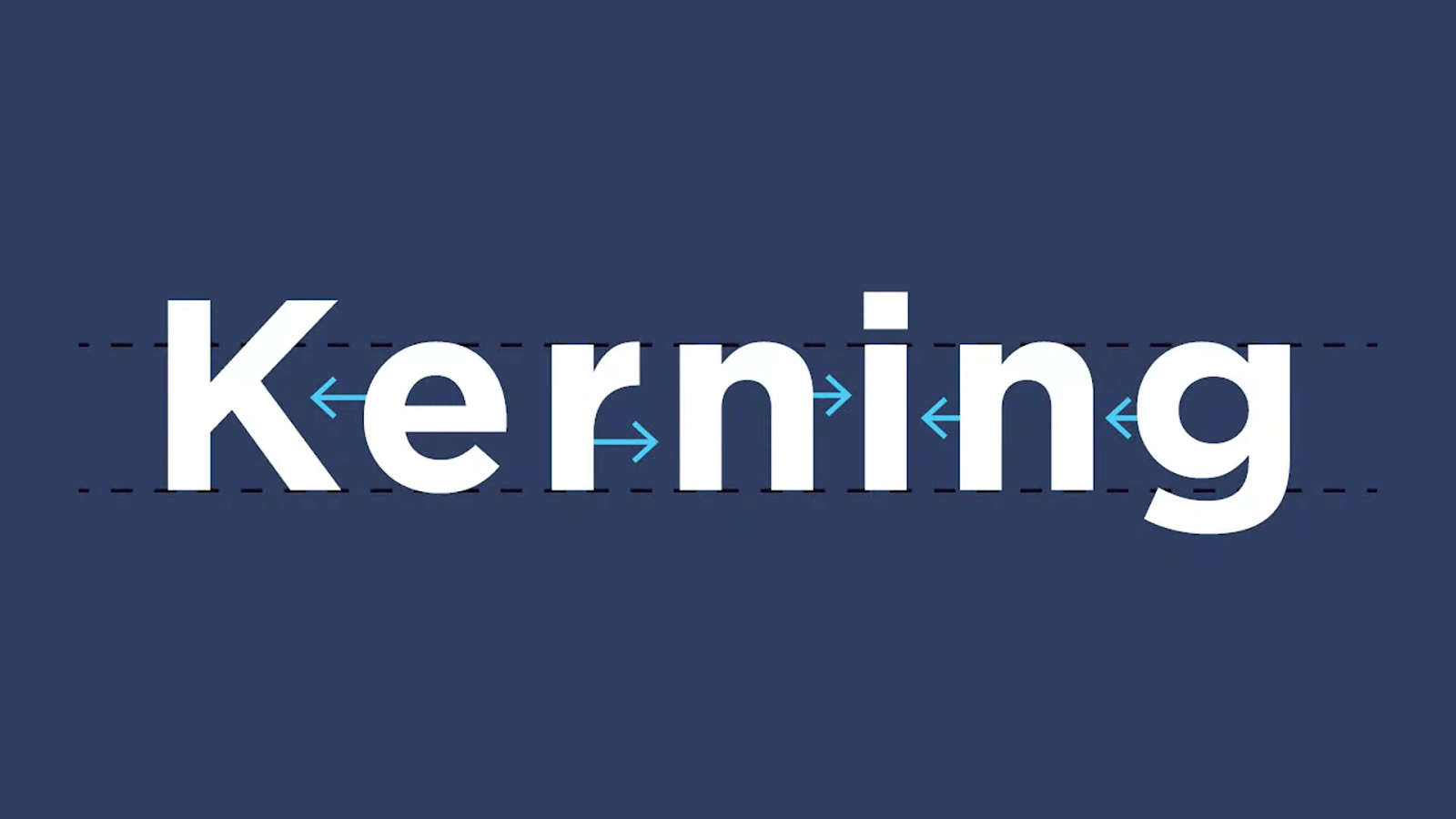
Now, think about personal space. Everyone likes a little room to breathe, and letters are no different. Cram them together too tightly, and it’s like being stuck in a crowded elevator. Spread them out too much, and they look like they’re trying to avoid each other. Finding that sweet spot makes your text inviting, like a cozy chat with a friend.
Ever seen a word that just seemed…off? Maybe it was too heavy on top, or maybe the letters looked like they were playing tug-of-war. Balance is key. You want your words to sit just right on the line, like a seesaw with perfect poise. Get this right, and your words won’t just be read; they’ll be felt.
Bringing It All Together
So, there you have it. Typography isn’t rocket science, but it’s not monkey business either. It’s about giving your words the power to dress to impress and make a grand entrance. It’s about making sure they don’t step on each other’s toes, and that they all sing in harmony. Get it right, and you’ll turn heads with your text.
In the end, good typography might go unnoticed, because when it’s done well, it just feels right. But get it wrong, and it sticks out like a sore thumb. So, the next time you’re about to send those words out into the world, take a minute. Dress them up nice and pretty. After all, you never get a second chance to make a first impression.
Typography Theory: Crafting the Visual Voice
Typography is the unsung hero of our visual world, a craft that dates back to the dawn of printing but remains as relevant as the latest tweet. It’s everywhere, from the book you can’t put down to the sign that catches your eye on the subway. But what is typography, really? And why should you care?
Setting the Stage with Type
Think of typography as the secret sauce that can make your words zesty, zingy, or zestfully zen. It’s the art of making your text not just legible, but also delightful to look at. It’s not just about the font you choose; it’s about the message you convey before your audience reads a single word.
Imagine each font as an outfit for your message. You wouldn’t wear clown shoes to a funeral or a tuxedo to the beach, would you? Similarly, choosing Comic Sans for a legal document or Old English for a toddler’s birthday invitation just doesn’t fit. Each typeface carries its own personality, its own nuances, and choosing the right one is like picking the perfect attire for the occasion.
Leading, Kerning, and Tracking: The Personal Space of Typography
Just like people, letters and words need their personal space. Leading (the vertical space between lines), kerning (the space between individual letters), and tracking (the overall spacing between text) are the crowd control of typography. Too tight, and the text feels suffocated; too loose, and it seems disjointed. Striking the right balance means your text won’t just be read; it’ll be comfortable and inviting.
Hierarchy: Who’s the Boss?
In any gathering of words, some need to stand out—headings, subheadings, captions. This is where hierarchy comes in, helping to guide the reader through the content effortlessly. It’s like a map of the text, signaling where to start and where to go next. Without it, readers might get lost or, worse, give up altogether.
Colors and Contrast: More Than Meets the Eye
Color isn’t just for painters. In typography, color can refer to the actual hue of the text or, more commonly, the shade (how light or dark the text is) and the contrast against the background. High contrast (like black on white) grabs attention and is easy to read, while low contrast might require squinting. And with color, emotions come into play, setting the mood and tone of your text.
Alignment: The Silent Conductor
Left-aligned, right-aligned, centered, or justified—each tells a different story. Left-aligned text is like a steady friend, reliable and clear. Centered text can be like a diva, demanding attention. Right alignment has an edge, a bit unexpected. Justified text is the formal one of the bunch, neat and tidy, but watch out for gaps that can throw readers off the rhythm.
The Art of Emphasis
Bold, italics, underline, caps—these are the spices of typography. Used wisely, they can emphasize important bits or add flavor to the text. But sprinkle them everywhere, and your text turns into an over-seasoned dish that’s hard to swallow. Remember the days of typewriters and moveable type? Each letter had to be painstakingly set by hand. Fast forward to the digital age, and the world of typography has exploded. Now, with a few clicks, you can choose from thousands of fonts and styles. But with great power comes great responsibility. The principles of good typography remain the same, even if the tools have changed.
Today’s typography must adapt to screens of all sizes—from the giant billboard to the smartphone. This is where responsive typography comes into play. Just like a chameleon, your text has to look good and be readable whether it’s on a desktop or on the go.
Globalization: Typography Without Borders
With the world getting smaller, typography has to speak a universal language. Fonts need to have characters for different alphabets and scripts, from the curvy strokes of Arabic to the intricate characters of Chinese. And let’s not forget about accessibility—making text legible for everyone, including those with visual impairments.
At its best, typography is like a symphony. Each element, from font to spacing to alignment, works together to create a harmonious whole. The conductor—the designer or typographer—guides these elements to ensure that the text not only conveys information but also invokes emotion and response.
The Final Impression
In the end, good typography is like a good friend. It’s reliable, makes you feel comfortable, and always enhances the conversation without taking over. As you interact with the text on a page or screen, remember the artistry that went into arranging each letter, each word. Typography is not just about making things look pretty; it’s about making communication effortless, effective, and emotionally engaging.
In a world cluttered with information, well-crafted typography is a beacon of clarity. It guides the eye, engages the mind, and connects us in ways we often take for granted. So, the next time you sit down to create something, take a moment to consider the silent art that speaks volumes—the art of typography.


