When it comes to design, a picture might be worth a thousand words, but a well-designed typography poster can speak volumes. It’s a blend of art and message that grabs attention and sticks in memory. This tutorial will guide you through crafting a typography poster that not only looks striking but also communicates your message loud and clear.
Getting Started: What You Need
To kick off your typography poster design, you’ll need some basic tools:
- A Computer or Tablet: This is your digital canvas;
- Design Software: Adobe Illustrator, Photoshop, or Canva work wonders for beginners and pros alike;
- Inspiration: Collect ideas, quotes, or anything that sparks your creativity;
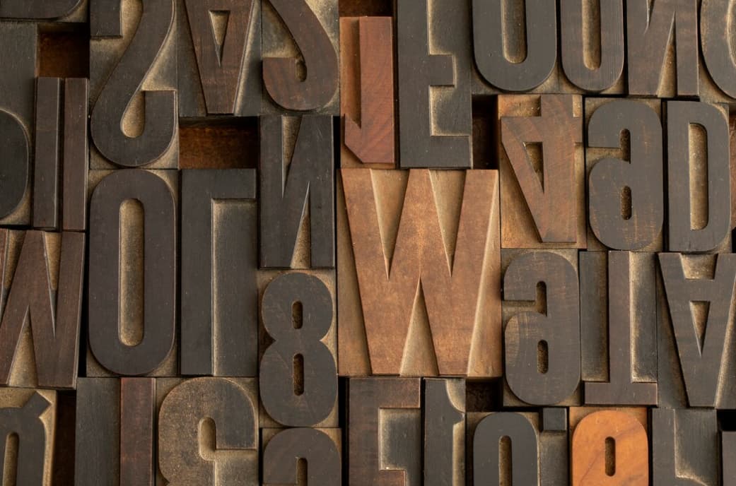
- Fonts: Have a variety of fonts available. Sites like Google Fonts or DaFont offer plenty of free options;
- Graphics: If you plan to include images, prepare these in advance;
- Color Scheme: Decide on a color palette that complements your message.
Step 1: Brainstorm Your Idea
Before your fingers hit the keyboard, take a moment to ponder. What’s the essence of your poster? Is it a powerful quote, a business promotion, or perhaps a concert announcement? The concept is the cornerstone of your poster. It sets the direction for your design choices — from fonts to colors, from layout to the overall vibe. It’s like planning a journey before hitting the road.
Step 2: Pick a Hero Font
The font you choose is not just a style; it’s the voice of your poster. Want to be heard as authoritative? Go for strong, bold typefaces. Is your message playful? Choose a font with a light-hearted character. Remember, your hero font is your main actor — select a type that can play the part convincingly.
Step 3: Lay Out Your Canvas
Crack open your chosen design software and set up your virtual stage. Determine the dimensions of your poster early on. A quick tip: standard poster sizes like 24″ x 36″ or 18″ x 24″ are popular for print, while digital platforms may have their own size requirements. This step is about setting boundaries within which your design will live.
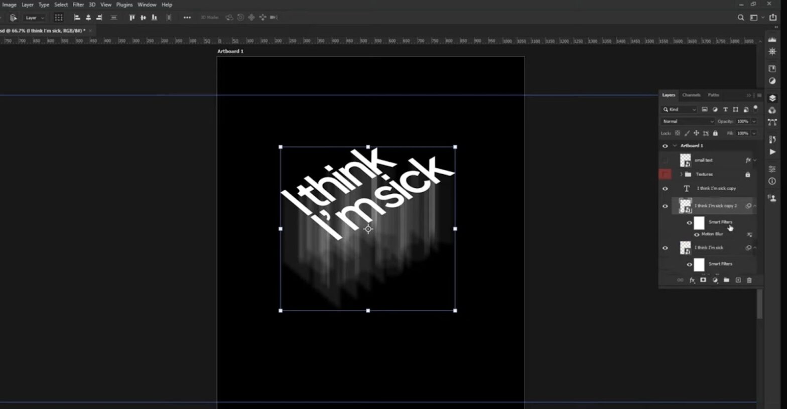
Step 4: Place Your Text
It’s time to get those words down. Type out your message and start shaping it. Want your main message to make an impact? Scale it up. Think of the text placement as a balancing act; your words should draw the eye across the poster in a way that feels natural but dynamic. Contrast is your friend — don’t be afraid to mix different font sizes and weights to create visual interest.
Step 5: Add Color and Graphics
Colors and graphics are the spices of design; they enhance but can also overpower. Choose a palette that reflects the tone of your message — warm colors for excitement, cool hues for a calm feel. If you include graphics or images, they should complement the text, not compete with it. The interplay between your words and visuals should be harmonious, guiding the viewer’s eye rather than causing a visual tug-of-war.
Step 6: Fine-Tune and Edit
Fine-tuning is where good becomes great. Step back and squint at your design, flip it upside down, or view it from a distance. This new perspective can be revealing. Editing is also about refinement. Nudge your text, adjust spacing (also known as kerning), and be ruthless in removing elements that don’t serve a purpose. A minimal approach often speaks volumes.
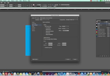
Step 7: Print or Post
If your poster is destined for the digital sphere, optimize it for the web. If it’s going to be printed, double-check the resolution and color settings. Always preview your work before finalizing it to catch any last-minute tweaks. Once you’re confident, release your poster into the wild, be it through social media, print, or as part of a larger marketing campaign.
Tips for Typography Poster Success
Understand Hierarchy
Hierarchy is the design tool that organizes your message. Imagine it as the tour guide for your viewer’s eyes. Your main message is the headline act—it should hit the audience first and stay with them the longest. Secondary information is like the supporting act; it plays an essential role but doesn’t overshadow the star of the show. You create hierarchy not just with size but also with color, spacing, and positioning. It’s like setting the stage for a play, where every actor knows their spot and the spotlight hits just right.
Keep It Legible
Readability is key. It doesn’t matter how beautiful your text looks if it can’t be read from across the room or on a scrolling screen. Legibility is not just about choosing the right font, but also about how you use it. Spacing between letters and lines, color choices, and the size of your text all contribute to how easily your words can be read. Think about different contexts where your poster might be seen—up close, at a distance, in bright light, or in a dimly lit room—and make sure your message stands out clearly in any situation.
Balance Your Design
A poster that is visually balanced has a sense of stability, like a well-balanced meal leaves you satisfied, not searching for more. This doesn’t mean you can’t have an element of surprise. Visual balance can be symmetrical, asymmetrical, or radial—it’s about arranging elements so that no single part of the work overwhelms the others. Color, texture, and form all contribute to the balance. A balanced design ensures that the viewer’s gaze moves comfortably across the poster, taking in every element in harmony.
Play with Space
Negative space is the canvas of your canvas. It’s not empty space; it’s an active part of your design that shapes how the positive elements are seen. It’s the pause between notes that makes music. In a poster, it can highlight the areas you want to emphasize and create a visual hierarchy. Space can also give your design a clean, uncluttered look, making it more appealing and easier to understand at a glance. Use it to emphasize the power of simplicity in conveying your message.
Be Bold with Contrast
Contrast is the spice of design. It’s what makes an element pop, what draws the eye and holds it. High contrast can make your poster stand out in a sea of visuals, especially in busy settings like a street or a social media feed. It’s not just black and white—contrast can be in hues, textures, shapes, or sizes. Think of it as the highlighter of your poster, drawing attention to the most important parts.
Align Your Elements
Alignment is like the rhythm in music—it’s not always noticed when it’s there, but its absence is felt. It’s about creating relationships between elements on your poster. Aligning text to a grid or an image can create a sophisticated, organized appearance. When you break away from alignment, do it with purpose. Breaking the flow can be as effective as keeping it, as long as it serves the design and doesn’t confuse the viewer.
Experiment and Iterate
Experimentation is the heart of creativity. Every version, every draft, and every crazy idea is a stepping stone to your final masterpiece. Mix fonts that you wouldn’t normally pair together. Play with color schemes that challenge the norms. Iteration is key—each version teaches you something new. Sometimes the process can be long and winding, but it’s all about the journey, not just the destination.
Get Feedback
Feedback is your reality check. It can be a pat on the back or a nudge in the right direction. Other people can spot what you’ve become blind to. They come with fresh eyes and new perspectives. Gather feedback from diverse sources—designers and laypeople alike. Remember, feedback is a tool, not a rule. Take what helps you refine and polish your vision and leave what doesn’t.
Learn from the Masters
Learning from others is a shortcut to success. The masters of design have laid paths for us to follow, and their work is a library of lessons waiting to be learned. Study their use of line, form, and color. How did they create rhythm and balance? How did they use contrast to draw the eye? These insights are golden nuggets you can apply to your own creations.
There’s no substitute for doing. Each poster you design is a step forward in your journey as a designer. With every project, you’ll discover new tricks and refine old techniques. Practice doesn’t just make perfect—it makes permanent. Over time, what once required conscious thought becomes second nature. Practice is the price of becoming a seasoned designer, and it’s worth every penny.
Conclusion
Designing a typography poster is a delightful challenge that combines creativity with communication. It’s an opportunity to make words come alive and to visually shout your message from the rooftops. Remember, there are rules in design, but they’re made to be bent, twisted, and sometimes broken in the name of creativity. So arm yourself with these tips, let your imagination run wild, and create a typography poster that speaks volumes.