Typography isn’t merely about making words legible—it’s about infusing language with a distinct visual form that echoes through time. Since the dawn of civilization, humans have sought to record their experiences, laws, and stories. This primal urge gave birth to typography, which has since threaded through the fabric of human history, influencing everything from the spread of religious texts to the proliferation of the internet. The evolution of typography is a mirror reflecting our collective journey, showcasing how we have harnessed visual language to communicate, educate, and inspire.
The Dawn of Writing
In the beginning, there were simple images etched onto cave walls, symbols that represented objects, actions, and concepts. These early attempts at communication evolved into a more structured form as societies grew more complex. Consider the transformation from the pictographs found in ancient Mesopotamia to the cuneiform script—what began as images of the natural world morphed into wedge-shaped marks pressed into clay tablets, a system that could convey everything from a king’s decree to a merchant’s inventory. This progression marked humanity’s first steps towards a standardized written language.
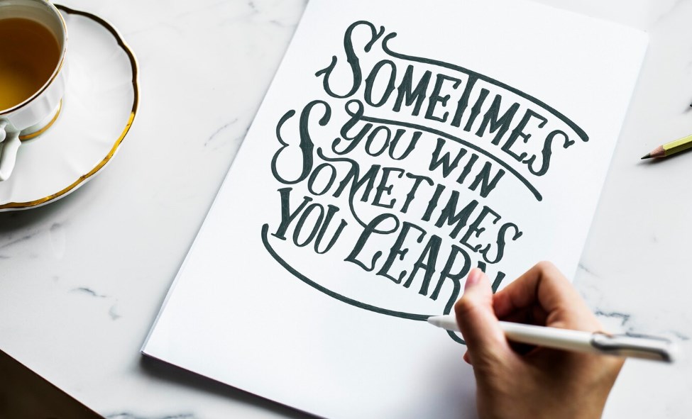
Calligraphy and Script Styles
Calligraphy is the pinnacle of writing aesthetics, where the written word is not just read but also admired for its beauty. The brush strokes of a skilled calligrapher can elevate text to a work of art. Across various cultures, distinct styles emerged:
- Asian Calligraphy: Often created with a brush and ink, it’s revered for its flowing, dynamic strokes;
- Islamic Calligraphy: Celebrated for its intricate geometric designs, reflecting the prohibition against depicting sentient beings;
- Western Calligraphy: Characterized by the use of the broad-tipped pen, it gave rise to a multitude of styles from the Roman capitals to the Gothic script.
Each tradition impacted type design, leading to a rich diversity of fonts that capture the essence of their calligraphic origins.
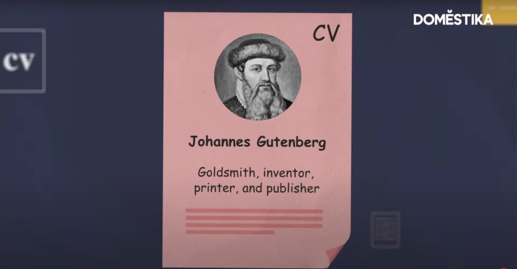
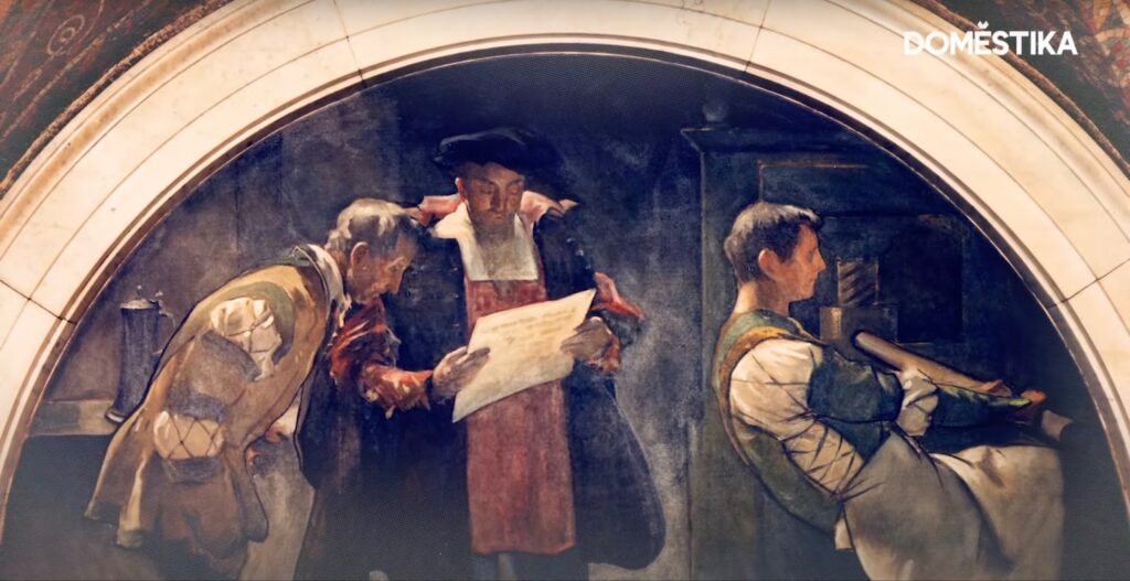
The Gutenberg Revolution
The mid-15th century bore witness to a revolution that would change the course of history. Johannes Gutenberg’s printing press, with its movable type, turned the tide of information dissemination. The Gutenberg Bible, the first major book printed using this method, employed the Blackletter type, known for its dense, dark texture. This invention did not just print words; it printed change, democratizing knowledge in an unprecedented way.
The Renaissance of Typography
During the Renaissance, a period marked by a resurgence in learning and culture, typography too experienced a rebirth. The era saw a shift from the complex Gothic scripts to the more legible Roman typeface, inspired by the classical letterforms of ancient Rome. This shift is typified in the work of type designers like Nicholas Jenson, whose typefaces combined clarity with beauty, their legacy enduring in many modern fonts.
Industrialization and Mass Production
The industrial revolution streamlined type production with new technologies, leading to the widespread use of sans-serif fonts, favored for their clean and modern look. Below is a comparison of popular serif and sans-serif fonts of the era:
| Serif Fonts | Sans-serif Fonts |
|---|---|
| Times New Roman | Helvetica |
| Garamond | Arial |
| Baskerville | Futura |
This table exemplifies the clear distinction between the decorative serifs and the straightforward sans-serifs that emerged during industrialization.
The Modernist Influence on Typography
Modernism in typography is akin to a gust of fresh air that swept through the design world in the early 20th century, clearing away the clutter of centuries. It was an era that championed the mantra “less is more,” advocating for designs that embodied purity and simplicity. This movement dismissed the flamboyant flourishes of Art Nouveau and other decorative styles prevalent at the time, pushing instead for a rational approach to type design.
The influence of modernism on typography is most evident in the typefaces it produced, which are marked by a stark absence of adornment. This was not a mere aesthetic choice but a deliberate alignment with the movement’s philosophical underpinnings: that every element of a design must serve a clear purpose. As a result, typefaces such as Helvetica, Univers, and Akzidenz-Grotesk came to the fore, all of which feature clean, straightforward lines and unembellished characters. The table below shows a few key modernist typefaces and their characteristics:
| Typeface | Characteristics | Year of Creation |
|---|---|---|
| Helvetica | Neutral, clear, highly legible | 1957 |
| Univers | Uniform, wide range of weights | 1957 |
| Akzidenz-Grotesk | Precursor to Helvetica, less stylized | 1896 |
These typefaces not only dominated the print media of the mid-20th century but also became a staple in corporate identity due to their versatile and timeless nature.
Digital Typography and Type Design
The digital revolution was a seismic shift in the realm of typography that took place as the 20th century waned. With the advent of desktop publishing and graphic design software, typography was liberated from the confines of metal and print. The pixel and vector became the new raw materials for type designers, who now had an unprecedented level of control over the form and function of their creations.
Digital type design’s most significant breakthrough was perhaps the introduction of scalable vector fonts with the TrueType format in the late 1980s. This innovation meant that typefaces could be designed and refined on-screen with mathematical precision, and that a single font file could be used to produce clear type at any size. The flexibility of digital typefaces allowed designers to experiment with and craft fonts that could contain a vast array of characters, including those for non-Latin scripts, thus expanding the global reach of digital typography.
The Impact of Typography on Branding and Identity
In the realms of marketing and brand identity, typography is the silent ambassador of brand values. It can be as loud as the colors of a logo or as subtle as the spacing between letters—either way, it plays a pivotal role in conveying a brand’s essence. Take, for example, the authoritative serif of “The Times” newspaper, which evokes a sense of tradition and credibility, or the sleek, sans-serif font of Google’s logo, which reflects the brand’s modern, accessible nature.
The strategic deployment of typography in branding is not limited to logos but extends to advertising, product packaging, and digital platforms. A well-chosen typeface can make a brand appear more reliable, eco-friendly, luxurious, or affordable. Below is a list illustrating how different brands use typography to align with their brand identity:
- Luxury Brands (e.g., Tiffany & Co.): Use elegant, custom serif fonts to convey sophistication and exclusivity;
- Tech Companies (e.g., Facebook): Favor clean, sans-serif fonts to appear modern and approachable;
- Newspapers (e.g., The New York Times): Employ traditional serifs to maintain an air of formality and authority.
Typography in the Digital Age
The digital age has not just transformed the tools of typography; it has revolutionized the very way we encounter and interact with text. The proliferation of screens in every shape and size has necessitated the development of responsive typography, which adapts to the constraints and capabilities of different devices. This adaptability ensures that whether a user is reading on a tiny mobile screen or a large desktop monitor, the experience remains comfortable and legible.
A core component of this new typographic landscape is the advent of web fonts, which allow designers to use a wider variety of typefaces on websites without being limited to those installed on users’ devices. Additionally, variable fonts, a newer technology, offer designers the ability to adjust a typeface’s weight, width, and other attributes on the fly, creating a more dynamic reading experience.
As we continue to navigate this digital terrain, the future of typography looks set to be as fluid and adaptable as the media it graces, ensuring that the written word remains as effective in the virtual world as it has been in the physical one.
Typography Motion Graphics
As we delve deeper into the digital age, typography has transcended static print, flowing into the vibrant world of motion graphics. This dynamic form of typography, known as kinetic typography, brings text to life through animation. It’s an art form that combines the power of words with the fluidity of motion, creating a visual spectacle that enhances the storytelling experience in digital media.
Kinetic typography can express emotion, signify importance, and capture attention in ways static text cannot. It’s become a cornerstone in various digital arenas—from film title sequences to website interactions and advertising campaigns. The movement of the text can be a powerful tool, creating a rhythm that echoes the cadence of spoken word or the beat of music.
Here’s a brief overview of how typography is utilized in motion graphics:
- Film and Television Title Sequences: Typography sets the tone and theme, as seen in classic films like Alfred Hitchcock’s “Psycho” or the contemporary series “Stranger Things.”;
- Advertising: Brands use animated typography to add emphasis and engagement to their messages;
- Web Design and User Interfaces: Motion graphics draw user attention and guide them through a website’s content.
The table below showcases some common applications of typography in motion graphics:
| Application | Purpose | Example |
|---|---|---|
| Film Title Sequences | To set the thematic tone | “North by Northwest” |
| Animated Logos | To create brand memorability | Google’s animated doodles |
| Educational Videos | To emphasize and explain concepts | TED-Ed’s educational animations |
| Promotional Material | To engage and persuade viewers | Spotify’s year-end campaigns |
The union of typography with motion graphics has opened a new dimension in visual communication, where text is no longer bound by the constraints of the physical page or static screen but is instead free to move, change, and interact with viewers in real time. As technology progresses, we can expect to see even more innovative uses of kinetic typography, further blurring the lines between text and performance art.
Conclusion
The art of typography is a chronicle of human innovation. From the first pictograph to the latest digital font, each advancement in typography has not only reflected the era of its inception but also shaped the way we communicate. As we look forward, the history of typography remains a testament to the ingenuity of our species, a foundation upon which we will continue to build our shared future.
FAQs
Gutenberg’s Blackletter was the pioneering typeface of movable type printing.
The industrial revolution introduced mass production techniques, leading to the creation of new, cleaner typefaces like sans-serif.
Digital media has expanded typography’s reach, allowing for dynamic and interactive type that can adapt to a multitude of platforms.
Yes, the choice of typography can significantly influence how a brand is perceived, conveying different messages and emotions.
Current trends include the rise of variable fonts, a renewed interest in serif typefaces for digital spaces, and a focus on legibility and accessibility on various devices.