Typography anatomy transcends the basic understanding of letters and their placement; it represents the core of visual eloquence. Every stroke, serif, and counter in a piece of text carries with it an intrinsic meaning, shaping the way information is received and processed by the reader. For designers, typographers, and visual communicators, the understanding of typography anatomy is paramount. It allows for the creation of text that not only informs but also engages and persuades.
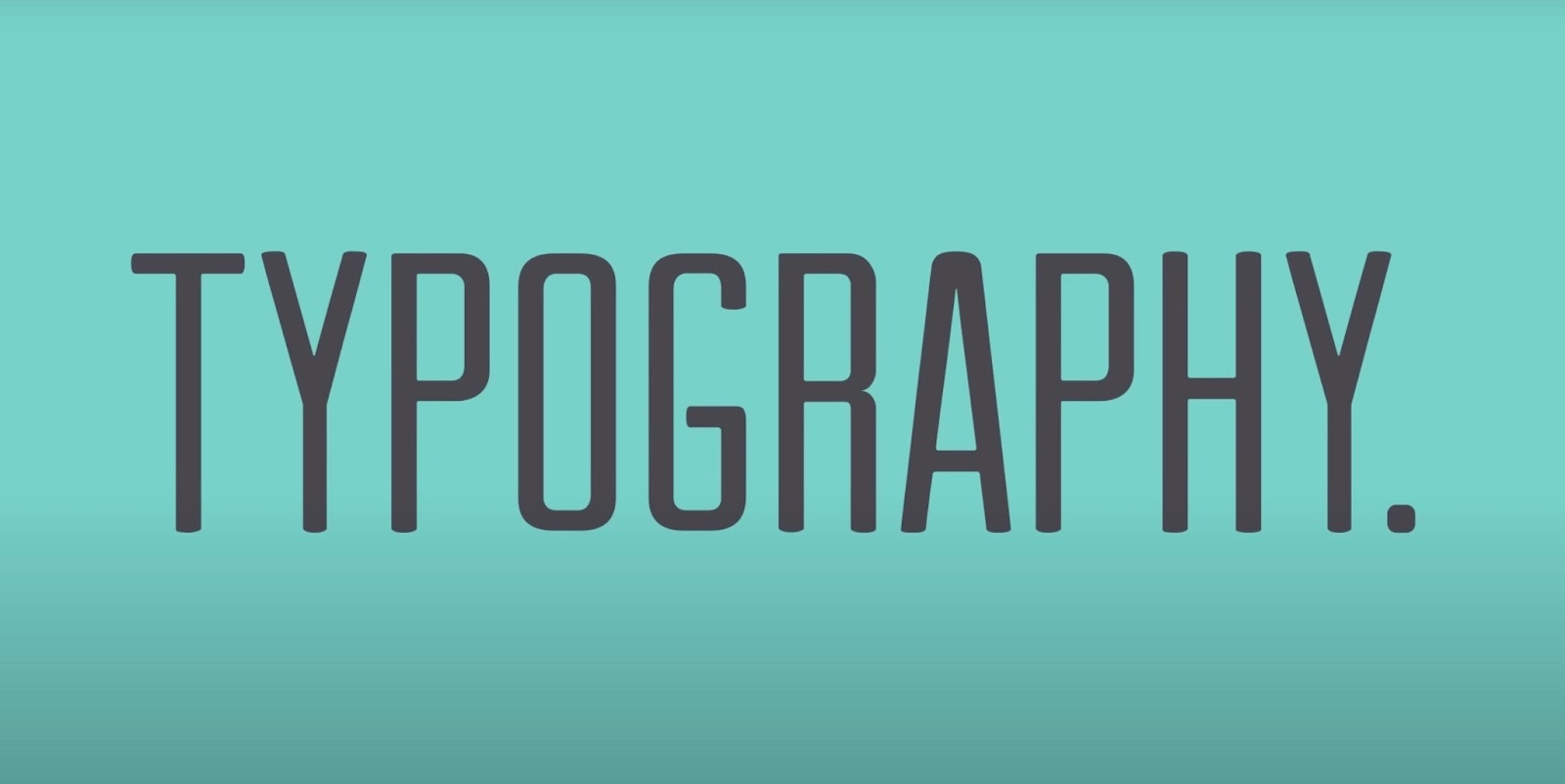
The Essence of Typography
Consider typography as the cornerstone of design that effortlessly combines form with function. It is the subtle art that dictates how text feels and how it functions. Its influence is profound—altering reading experiences, shaping brand identities, and even affecting the usability of digital interfaces. The essence of typography is found in its dual role: ensuring legibility while endowing words with emotion and meaning. It’s not merely about making words readable but about infusing them with a voice, a tone, and an intention.
The Typeface Family and Its Members
Typefaces are as varied as human personalities. Each typeface or font family consists of a set of characters sharing common design features, yet each member brings its unique style to the table. Here’s a brief overview of the main typeface families:
- Sans Serif: Known for their clean lines and modern appearance. Commonly used in digital media for clarity and readability;
- Serif: These typefaces are characterized by small lines or decorative elements attached to the end of strokes, often found in print media for their traditional appeal;
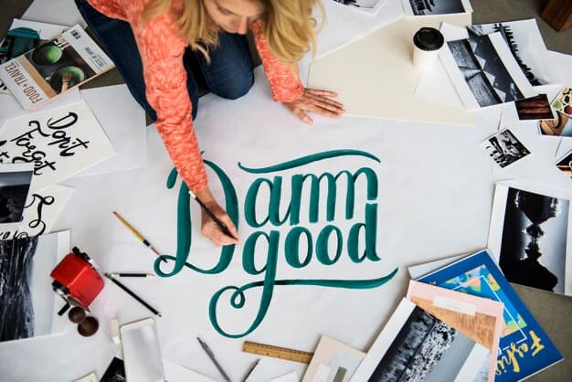
- Script: Mimicking the fluidity of handwriting, script typefaces add a personal and artistic touch to any design.
Each typeface family serves specific roles within visual communication, setting a tone and hierarchy that guides the reader’s experience.
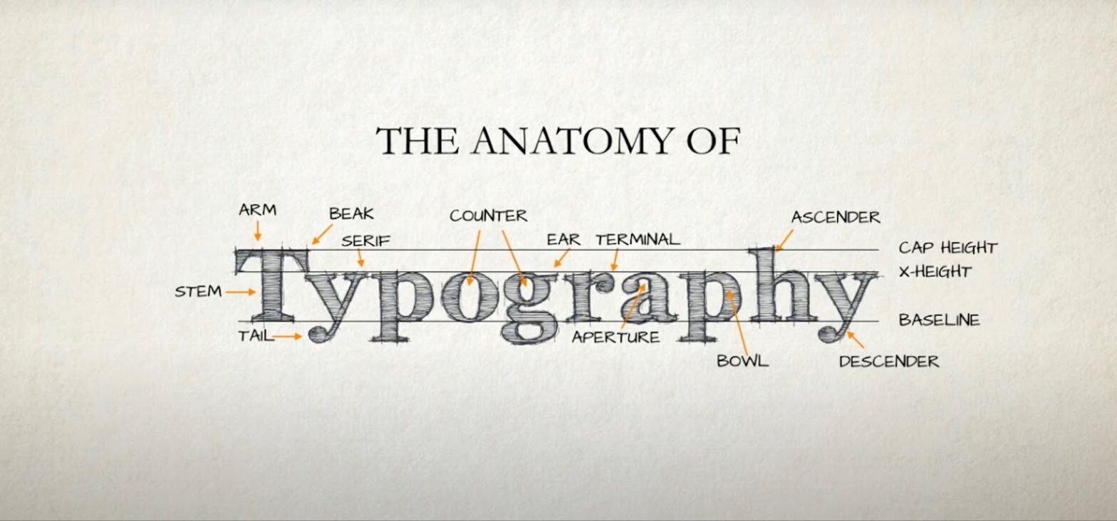
Dissecting the Letterforms
Every letter in every typeface is composed of various parts, each with its technical term. Understanding these terms is crucial for anyone involved in the selection and design of type:
- Baseline: The invisible line where letters sit;
- Ascender: The part of a lowercase letter that extends above the x-height;
- Descender: The part of a letter that extends below the baseline;
- Cap Height: The height of a capital letter measured from the baseline;
- X-height: The height of the lowercase letters, disregarding ascenders and descenders.
This vocabulary is essential for discussing and analyzing typefaces and their characteristics.
The Serif Saga
Serifs are far from just decorative. They’re a historical artifact, harking back to Roman times when letters were carved into stone, and serifs were used to finish off strokes neatly. Fast forward to today, and serifs still hold a significant role in guiding the flow of reading. Some studies suggest that serif typefaces are more legible in print because the serifs create a more distinct outline for each letter. The table below showcases different typeface genres and their typical use cases:
| Typeface Genre | Characteristics | Common Uses |
|---|---|---|
| Old Style | Moderate contrast between thick and thin strokes, serifs with bracketing | Books, Newspapers |
| Transitional | Greater contrast, less bracketing on serifs | Magazines, Reports |
| Modern | Extreme contrast, thin serifs without brackets | Fashion, Fine Art |
Understanding Kerning, Leading, and Tracking
In typography, the white space is just as important as the letters themselves. These spaces are manipulated through:
- Kerning: Adjusting the space between specific pairs of characters to achieve a visually pleasing result;
- Leading (line-spacing): The vertical spacing between lines of text. Too tight leading can make text blocks look cluttered; too loose may disconnect related lines of text;
- Tracking: The uniform adjustment of spacing across a range of characters to affect the density of a text block.
Correctly using these techniques is vital to the readability and aesthetic of the text.
The Impact of Typography in Branding
The choice of typography is a silent ambassador of brand identity. It’s not just about aesthetics; it’s a critical component that can encapsulate a brand’s essence and communicate its values to the audience. For instance, a technology company might choose a sleek, sans-serif font to convey a sense of innovation and efficiency, while a luxury brand may opt for a serif font that exudes elegance and tradition. The right typography can enhance brand recognition, establish emotional connections with the audience, and differentiate a brand from its competitors. Here you can see how different brands use typography:
| Brand | Typeface | Brand Attributes Conveyed |
|---|---|---|
| Tech Startup | Modern Sans-serif | Innovative, User-friendly |
| Luxury Retailer | Elegant Serif | Traditional, High-quality |
Typography in the Digital Age
Digital platforms have revolutionized typography with the advent of web fonts and responsive design. The introduction of pixel-perfect fonts has allowed for crisper on-screen reading experiences, and the development of responsive typography ensures that text is legible and aesthetically pleasing on any device. The challenge for modern typographers is to create typefaces that can maintain their character and readability across various digital mediums. The key considerations for digital typography:
- Scalability across devices;
- Legibility on different screen sizes;
- Load times and performance implications.
The Legality of Letters: Copyrights and Fonts
Not all typefaces are created free in the eyes of the law. The design of a typeface can be copyrighted, and its use is governed by licensing agreements. It’s crucial to understand the distinctions between typeface and font, copyright, and licensing to avoid legal pitfalls. For designers and businesses, navigating the legality of typography means ensuring that the chosen fonts are appropriately licensed for their intended use.
Typography Tools and Software
The tools used in typography range from traditional to cutting-edge digital software. Adobe Illustrator and Photoshop have long been staples for designers, but a plethora of other tools and software options have emerged, offering diverse functionalities. Open-source software like Inkscape or FontForge provides accessible alternatives for typography creation and manipulation.
| Software | Features | Best For |
|---|---|---|
| Adobe Illustrator | Vector Graphics, Font Design | Professional Design Work |
| Inkscape | Free, Open-source, Vector Graphics | Hobbyists and Beginners |
| FontForge | Font Creation, Open-source | Amateur Typographers |
Conclusion
The mastery of typography anatomy is not just for aesthetes and designers—it’s a fundamental skill for anyone who communicates with text. Each element, from the serif at the foot of a letter to the leading between the lines, plays a critical role in how a message is perceived and understood. As we advance into an increasingly digital future, the significance of typography only grows. By appreciating and applying the principles of typography anatomy, we can create text that is not only visually appealing but also functionally superior.
FAQs
The most crucial aspect is understanding how different typographic elements come together to create a readable and aesthetically pleasing piece of text.
Typography can significantly influence brand perception by conveying attributes such as reliability, whimsy, strength, or sophistication.
Absolutely. The right typography can greatly enhance readability by improving the clarity and legibility of the text.
Legal considerations include copyright laws, licensing agreements, and ensuring the chosen typeface is appropriately licensed for its intended use.
The choice of software depends on the specific needs and skill level of the designer, with options ranging from Adobe Illustrator to open-source alternatives like FontForge.