Crafting a print project that stands out entails more than simply possessing the most exceptional printer in the neighborhood; it necessitates the inclusion of exceptional design elements and carefully curated text that effortlessly engages the reader.
Have you ever pondered over the impeccable appearance of professionally designed print materials, characterized by their sharp precision and flawless presentation? To achieve this level of clarity and readability, expert designers harness the power of typography’s pivotal trio: leading, kerning, and tracking. While each of these elements holds its significance, leading, in particular, holds the potential to either elevate or mar a design. In this article, we delve deeper into the art of print design and explore how mastering the nuances of leading, kerning, and tracking can transform your printed materials from ordinary to extraordinary.
Understanding Line Spacing: Decoding ‘Leading’
“Leading” is the technical term given to the vertical spacing between lines of text, an element pivotal to the readability and visual appeal of printed and digital media. This term, pronounced “LED-ing,” is not a modern invention but rather a legacy from the era of hand-typesetting, where actual strips of lead were used to physically create space between lines. Here’s an expansion of its significance and use:
The Historical Context and Modern Application
- Origins: The roots of it go back to the days when typesetters would manually insert slivers of lead between lines to adjust spacing. This craft required precision and an eye for detail to ensure text was legible and aesthetically pleasing;
- Evolution: With the advent of digital typesetting, the term has been carried over, but the process is now effortlessly achieved with a few clicks in a word processor or design software.
Practical Utilization of Leading
Adjusting the leading is more than a mere mechanical task; it’s an essential design technique that can be employed to achieve various objectives:
- Space Optimization: Whether the aim is to conserve space on a page or to fill it, manipulating the leading can have a significant impact. For example, a dense academic paper might require tighter leading to accommodate more text, while a minimalist poster could benefit from increased leading to create a sense of openness;
- Aesthetic Enhancement: It can dramatically alter the character and readability of text. Tight leading may give a sense of urgency or density, while generous leading can convey luxury or clarity;
- Hierarchy and Emphasis: By varying the leading, designers can create a hierarchy or draw attention to specific elements of text, distinguishing headlines from body text, for instance.
Best Practices for Effective Leading
To employ leading most effectively, consider the following recommendations:
- Balance: Aim for a harmonious balance between text and whitespace. Too little leading can cause reading fatigue, while too much can disrupt the reader’s flow;
- Consistency: Maintain consistent leading throughout a body of text to create a rhythm that guides the reader’s eye comfortably from line to line;
- Context Adaptation: Adjust leading based on the context and medium of the content. What works for a printed book may not translate well to a webpage or mobile interface.
Impact on Design and Communication
Masterful manipulation of leading is not simply about aesthetics; it has practical implications:
- Enhanced Readability: Well-spaced text is easier on the eyes, leading to better comprehension and retention of information;
- Mood Setting: The spacing between lines can set the mood of the text—professional, whimsical, serious, or casual—thus impacting how the message is received;
- Brand Reinforcement: Consistent use of it across various materials can reinforce brand identity, instilling a sense of familiarity and trust in the audience.
Mastering Typography: The Key to Professional-looking Text
Typography is a crucial element in creating visually appealing and readable text content, whether it’s for print or digital media. The arrangement of type involves not only the selection of font and size but also the consideration of color, spacing, and alignment. It is often the nuanced adjustments in typography that can elevate the professionalism of a document or graphic piece.
Typography Nuances and the Art of Spacing
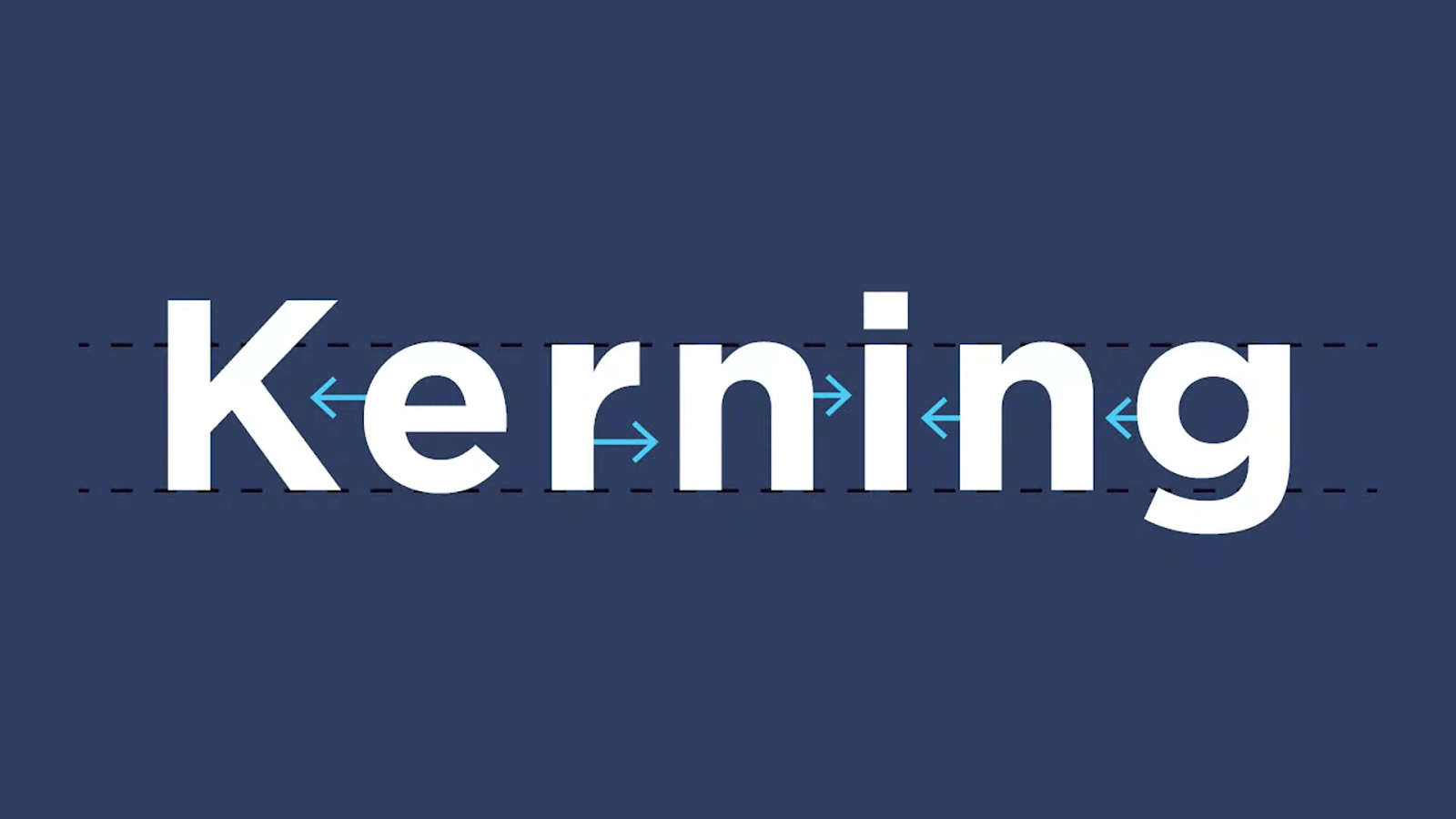
Each typeface has its unique characteristics — from the width of individual letters to the spacing between them (known as kerning) — and these subtleties can greatly impact the overall look and readability of text. For instance, the way a letter ‘A’ might sit beside a ‘V’ differs from typeface to typeface and adjusting the space between these characters can greatly enhance legibility and aesthetic appeal.
When experimenting with various fonts, it becomes evident that not all typefaces behave identically on the vertical or horizontal axis. This variation can lead to inconsistencies in the visual flow of the text, making it appear unbalanced or disjointed. In graphic design, attention to such detail is paramount; it’s the finesse of well-adjusted spacing that separates amateur designs from professional ones.
Navigating Awkward Typography
Occasionally, the default settings may lead to suboptimal presentation of text. This is often described as ‘awkward typography’, where the spacing or alignment disrupts the text’s harmony. Awareness and correction of these issues are central to effective formatting.
Essential Formatting Strategies
The application of formatting adjustments is twofold: at the character level and the paragraph level. Understanding both layers is vital for fine-tuning the typography to perfection.
Paragraph-level Formatting:
- Alignment: The flush of text can be left, right, centered, or justified. Each serves a different visual and functional purpose, from creating a formal look to ensuring easy readability;
- Spacing: Manipulating the space before and after paragraphs can help in structuring content, making it easier to follow and more aesthetically pleasing.
Character-level Formatting:
- Font Selection: Choosing the right typeface can convey mood and tone. The readability and visual impact of the text are significantly influenced by this choice;
- Font Size: The scale of letters must be appropriate for the medium and purpose, maintaining legibility while fitting the overall design;
- Leading: This refers to the vertical space between lines of text. Proper leading prevents the text from appearing cramped or overly stretched.
Incorporating these elements with a discerning eye can transform the layout of text from ordinary to outstanding. For those aiming to ensure their documents or designs communicate with both clarity and style, here are some additional tips:
- Consistency is Key: Use the same formatting rules throughout the document to maintain a cohesive look;
- Contrast for Emphasis: Play with bold or italic styles to highlight important sections without overdoing it;
- Balance: When using various typefaces or sizes, ensure there’s a harmonious balance so that no element overwhelms the others;
- Whitespace: Don’t fear empty space. Whitespace can be a powerful tool in making your text more readable and less cluttered.
The Importance of Leading in Paragraph Formatting
Leading, often misunderstood as simply a property of individual characters, is actually a fundamental aspect of paragraph formatting that ensures readability and visual appeal in any body of text. When one speaks of ‘leading’, it is essentially the space between lines of text, which plays a crucial role in the overall look and legibility of the content. It’s paramount that leading is uniformly applied to entire paragraphs rather than selected lines to avoid a disjointed and unprofessional appearance in the text layout.

Steps to Adjust Leading in Adobe InDesign
For those utilizing Adobe InDesign, fine-tuning the leading of paragraphs can be a seamless process when following the correct procedure. The goal is to create an aesthetically pleasing and easily digestible text block. Here’s a step-by-step guide to adjusting leading in different versions of InDesign:
For Previous Versions of InDesign:
- Navigate to the ‘Edit’ menu and then select ‘Preferences’;
- From the options panel on the left, click on ‘Type’;
- Within the ‘Type Options’, you will find ‘Apply Leading to Entire Paragraphs’. Select this option.
- Click ‘OK’ to save the changes;
- For InDesign Creative Cloud (CC) and Later;
- Access ‘Preferences’ directly from the InDesign menu;
- Follow the same steps from the ‘Type’ option onward;
- Upon completion, every new paragraph created will automatically follow these leading settings, promoting consistency throughout your document.
Best Practices and Insights for Leading
When considering the aesthetics and readability of text, adhering to leading best practices can vastly improve the quality of the document:
- Understand Auto Leading: InDesign’s default setting is ‘auto leading’, which is set to approximately 120% of the current font size. For example, with a 10 pt font size, the auto leading would generate 12 pts of space between lines;
- Adjusting for Readability: While auto leading is helpful, one should not solely rely on it. Adjust leading according to the specific requirements of the document and audience readability needs;
- Consistency is Key: Ensure that leading is consistent across all paragraphs. This uniformity is essential for a professional look and feel;
- Consider the Audience: If the document is intended for an older audience or those with visual impairments, consider increasing the leading to enhance readability;
- Font Size Matters: Larger font sizes may require more leading to prevent the text from appearing cramped;
- Balancing Act: Too much leading can disconnect lines of text, making it difficult to follow, while too little can cause text to look crowded and uncomfortable to read. Finding a perfect balance based on the context and content is critical.
By incorporating these insights and recommendations into the use of leading in paragraph formatting, the clarity and visual appeal of any text can be significantly improved, ensuring that it is approachable and enjoyable for the intended audience.
Conclusion
As the digital landscape continues to evolve, so too will the definition of leading graphic design. Designers will need to stay adaptable, continuously learning and innovating to meet the ever-changing demands of their clients and audiences. Whether it’s creating stunning visuals for a website, crafting a memorable logo, or designing a compelling social media campaign, leading graphic design will remain a vital element in effective communication and brand identity. It’s a field that thrives on creativity, problem-solving, and the power of visual storytelling, making it an exciting and influential discipline in the modern world.