Typography and font are two terms that often get used interchangeably, but they actually refer to distinct aspects of the world of design and typography. Understanding the difference between these terms is crucial for anyone involved in graphic design, web development, or publishing. Typography and font play fundamental roles in shaping the visual and textual elements of printed materials, websites, and various forms of media. In this article, we’ll delve into the nuances of typography and font, exploring their definitions, functions, and the impact they have on the way we communicate and consume information in our digital age. So, let’s unravel the mystery behind these two essential components of visual communication and discover how they contribute to the aesthetics and readability of the content we encounter daily.
Unraveling Typography and Fonts: An In-Depth Guide for Visual Artists
Often, visual artists and graphic designers invest much of their effort in crafting compelling images. This trend is not without reason: studies suggest that the human brain processes images 60,000 times faster than text. Hence, selling a product or idea solely through text may demand extraordinary creativity to maintain audience engagement. Yet, no amount of creativity guarantees that readers will consume the entire text, prompting the vital role of typography. Unfortunately, few individuals fully grasp what typography means, often interchanging it with fonts or typefaces. This article aims to decipher these terminologies, investigating their distinctions and roles in visual communication.
Exploring the World of Typography
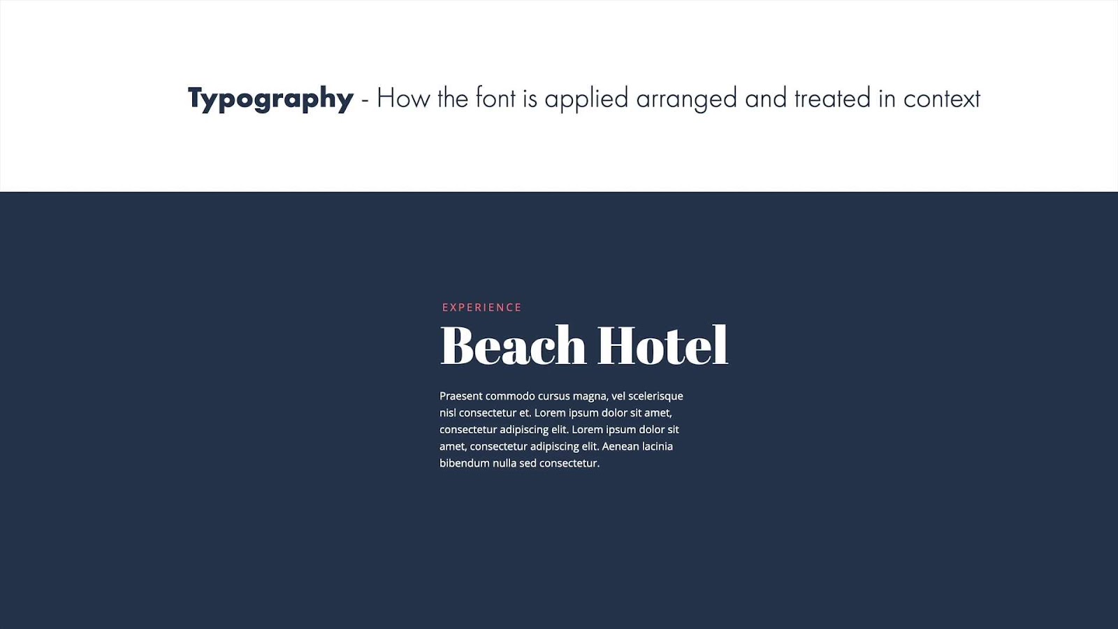
Typography refers to the arrangement of text within a composition, serving as an umbrella term encompassing fonts and typefaces. The idea of typography involves several elements, including:
- Text Format: This refers to the visual presentation of the text, considering if the headings are bold, large, small, or normal;
- Text Structure: It questions if the composition includes subheadings and how the text aligns within the frame or medium used;
- Visual Hierarchy: Typography also reviews how information is visually presented and whether its hierarchy is appropriately structured;
- Aesthetic Appeal: A core aspect of typography is the visual attractiveness of the text to readers.
Considering these elements, typography ensures text communicates effectively, appealingly, and cohesively within any chosen medium.
Deciphering Typeface and Type Styles
The terms typeface and type styles often get muddled together, largely because they share a close relationship. Type styles are chosen by a type designer and get packaged in a particular font. Altering specific aspects of a typeface, such as extending specific letter strokes, will change its unique appearance but the original font remains constant. However, if the entire text arrangement shifts, it triggers an alteration in the document’s typography.
Understanding Fonts
Fonts serve as specific representations of type styles, dictating the varying sizes, styling, and weights of a type style. Every font belongs to a typeface family where the core design remains congruent but may feature slight variations in letter styling. These variations still fall within the same design family.
For instance, consider the commonly used “Calibri” font. It can transform into bold, italic, or underlined versions, but each variation remains part of the original “Calibri” design.
However, using diverse styles of “Calibri” for different text segments in two distinct compositions would yield different typographies for each text. In simple terms, a font serves as a component of typography. Various fonts are employed to enhance text visual appeal, maintaining reader interest throughout the text’s entirety. The same font can morph into different sizes and styles to enrich the overall typography.
Here are some key points to remember about fonts:
- They add intrigue and variety to a piece of text, helping to keep the reader engaged;
- Variations of it, including bold, italic, and underlined, remain within the same design family;
- Using different styles within the same document is a common way to achieve diverse and compelling typography;
- Fonts are a significant element of typography, influencing how the text is perceived and consumed.
Conclusion
In the digital age, where the variety of fonts and type options is vast, understanding the fundamentals of typography and font usage can empower designers to make informed decisions that serve the purpose and aesthetics of their projects. By appreciating the intricacies of both typography and fonts, one can harness their combined potential to create visually engaging and effective communication. So, whether you’re designing a website, crafting a print publication, or simply choosing fonts for personal projects, a deeper grasp of the difference between typography and font will undoubtedly elevate your design endeavors.


