Script Fonts: Combining Elegance and Functionality
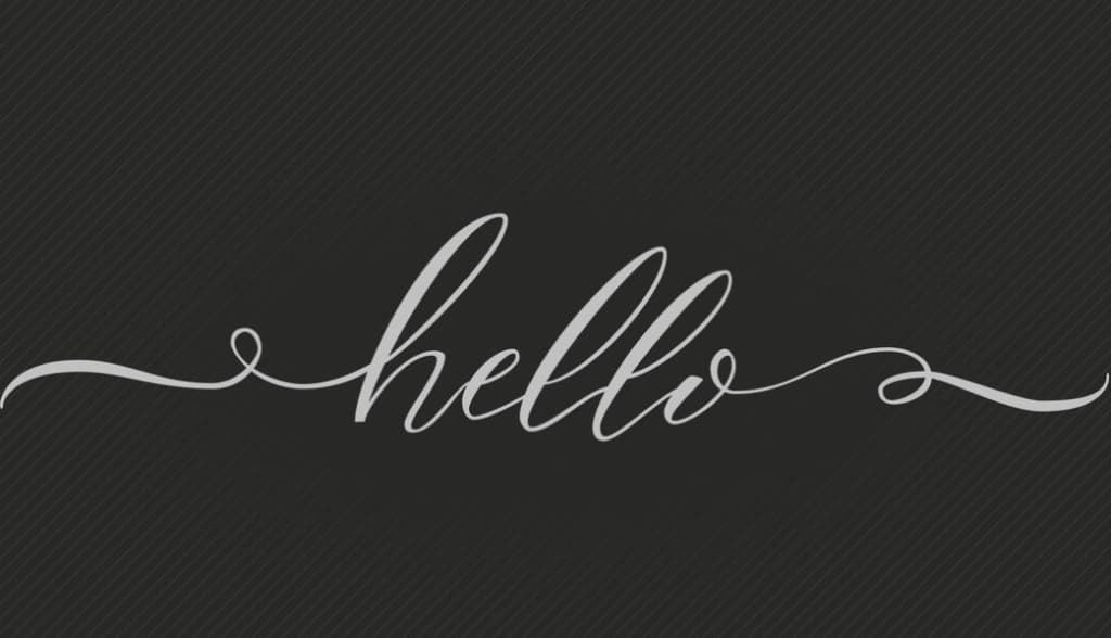
Script fonts contribute a unique blend of grace and individuality to any design layout. Their handwritten styles, combined with features like swashes, ligatures, and alternate characters, provide an artistic touch that can enrich the visual appeal of a design. However, despite their aesthetic strengths, script fonts can also pose challenges in terms of readability due to their intricate designs.
Script Fonts: Ideal for Larger Headlines and Intro Paragraphs
Script fonts are particularly effective when used for large-sized headlines or introductory paragraphs. Their artistic flair draws attention and sets the tone for the content that follows. Yet, it’s vital to remember the need for a clear, easily decipherable script. Clarity is crucial when using script fonts in these contexts so that style does not overshadow the purpose of the text – communicating information effectively.
Selecting Readable Script Fonts: Key Considerations
When selecting script fonts, readability should always be a central consideration. Here are three crucial aspects to examine:
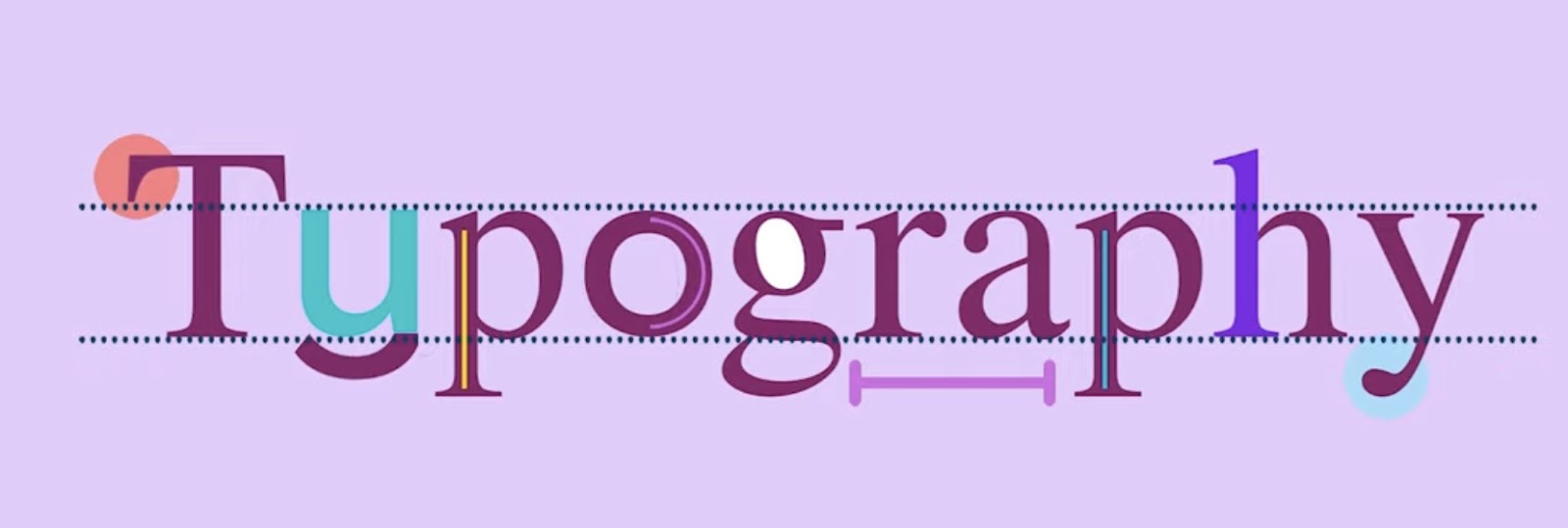
- X-Height: This refers to the height of lowercase letters. A lower x-height often makes the font harder to read. Fonts with tall and wide counters (the completely or partially enclosed spaces in letters) are often more readable as they help distinguish individual letterforms;
- Stroke Contrast: This pertains to the variation in line thickness within the letterforms. Fonts with high stroke contrast (significant variance between thick and thin lines) tend to be less readable than those with low stroke contrast. Monoline scripts, which maintain a consistent line weight, are generally easier to read;
- Stress: This is the tilt or lean of the characters. More upright characters are usually more readable as they tend to be closer together, thus facilitating easier scanning.
Exploring Varieties of Script Fonts
There’s a considerable range of script fonts available, each with its unique visual flair and readability levels. The key to selecting the right script font lies in understanding the nature of the content and the audience’s needs. Designers must strike a balance between artistic appeal and readability.

Script Fonts in Digital and Print Media
Script fonts have found their place within both digital and print media. They add a touch of personality to a website or printed material, often used in headlines, banners, or logos. While using script fonts, designers should ensure that the fonts display well across various screen sizes and print forms, maintaining their readability even when scaled.
- Bulletto, Zetafonts;
- Veronica, Miller Type Foundry;
- Buinton Rough, Mika Melvas;
- Montana Typeface, Alex Couture;
- Catsy, Emil Karl Bertell;
- Brushability, My Creative Land;
- Motherline, Letterhand;
- Raph Lanok, Alit Design;
- Sailoria, Wacaksara co;
- Magehand, Typia Nesia;
- Serene Textured, Pedro Teixeira;
- Aromatica, Latinotype;
- Vodka, Fenotype;
- Head Turn, Blue Vinyl Fonts;
- Zing Script Rust, Fontfabric.
Conclusion
Script fonts, with their attractive styles and personality-infusing characteristics, can provide a significant boost to any design project. However, their use requires careful consideration of factors such as x-height, stroke contrast, and stress to ensure optimal readability. With a well-chosen script font, designers can ensure their design doesn’t just catch the eye, but also efficiently communicates the intended message. Understanding the nature of the content, the platform of publication, and the audience’s requirements are key to unlocking the full potential of script fonts. You might be interested in: Unraveling the Mystery of Smart Quotes in InDesign.


