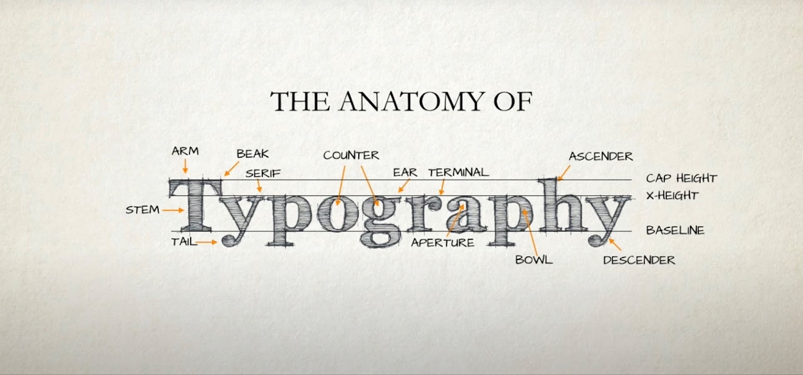
Typography is an entire art form that’s not just about picking the right typeface. The way text is arranged on a page can drastically affect its readability and overall aesthetic appeal. No two pieces of text are the same, yet they must always be clear, easy to read, and well-proportioned.
Achieving such equilibrium is a complex task, often requiring a deep understanding of the nuances of typeface and layout.
Typography Harmonization: Crafting Equilibrium
For effortless balancing, easy scanning, and comfortable reading, there is a need for a suite of fundamental techniques and adjustments commonly utilized in Adobe InDesign:
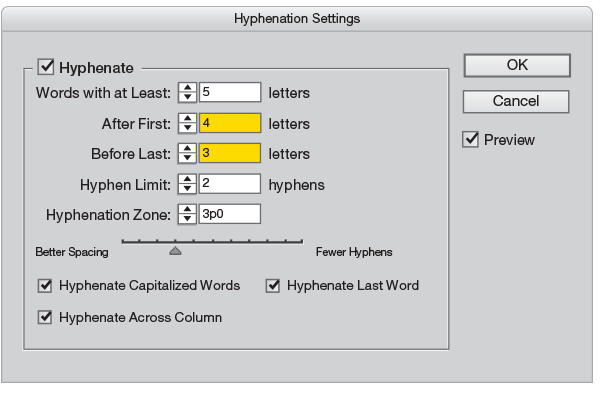
- Hyphenation for smoother lines. Hyphenation is the secret to creating smoother text flows. It prevents the reader’s eyes from jumping erratically from line to line, enabling a more comfortable reading experience. It’s recommended to hyphenate after the first few letters and before the last few, avoiding hyphenation between certain letter pairs that can be challenging to read. To maximize impact, adjusting the slider for letter spacing around hyphens is also suggested;
- Optical Margin Alignment. To eliminate unwelcome white space at the beginnings of lines that start with punctuation, activating optical margin alignment is advisable. This setting helps to hang quotation marks and ensures a uniform left edge;
- Glyph Scaling. Glyph scaling allows for the proportional resizing of character width. A subtle range from slightly less to slightly more than 100%—barely noticeable to the human eye—can be employed. This minor adjustment can have a significant effect on the text’s visual appeal;
- Spacing between words and letters. The default settings for word and letter spacing in InDesign might be too generous for some tastes. It’s important to find the right balance for the chosen typeface. These settings automatically adjust the spacing and serve as a starting point for further refinement;
- The Composer. Sticking to the Adobe Paragraph Composer setting is advisable. This setting determines how InDesign processes text composition when typing or editing a paragraph, adjusting line breaks accordingly. This ensures smooth text flow and maintains its visual harmony.
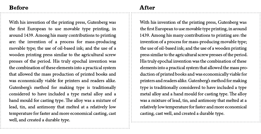
In design, the devil is truly in the details, and creating a balanced text block is no exception.
Utilizing these techniques and experimenting with your personalized adjustments will reveal the allure and strength of well-thought-out typography. Start with the fundamentals, refine your skills, and watch as your text comes to life with harmony and finesse. Your readers will appreciate the effort.
Fine-Tuning the Equilibrium: Practice and Precision
While these configurations lay a solid foundation for balanced typography, it’s crucial to recognize that various typefaces come in different weights, and formatting requirements can vary. This may necessitate manual tweaking and precision adjustments tailored to the specific nature of your project.
To achieve an impeccably balanced block of text, begin with the suggested settings and then, both optically and manually, make refinements until the text attains the desired level of equilibrium.
Conclusion
Crafting a harmonious and balanced block of text involves more than just the selection of an appropriate font. Every adjustment, from hyphenation to optical margin alignment, glyph scaling, and composer settings, plays a crucial role in creating text that is not just readable but also visually pleasing.
Stinson’s persistent pursuit to perfect this formula highlights that there’s craftsmanship in typography. Typography isn’t merely words on a page; it’s about crafting an experience for the reader. By adhering to such meticulous methods and implementing necessary adjustments in font and formatting, one can create perfectly balanced typography that captivates and engages the audience.