In the realm of visual design, typography stands as a silent yet influential force, steering the viewer’s perception and experience. This article delves into the sophisticated art of typography and its power to make or break the aesthetic appeal of a design.
You will uncover advanced methods for applying typography with precision and creativity, from manipulating the space between letters to the strategic use of fonts, colors, textures, and the integration of imagery.
With each paragraph, gain valuable insights into making typography work for you, crafting designs that not only capture attention but also convey messages with clarity and impact.
Harnessing Letter Spacing for Impact
The subtleties of letter spacing, or tracking, hold the power to alter the character and clarity of a message. Widen the gaps, and you instill a sense of sophistication and clarity; tighten them, and you can convey urgency or solidity. This technique is not merely about aesthetics; it’s a tool for enhancing legibility and mood. Properly adjusted letter spacing can lead to:
- Increased readability in large text blocks;
- Improved visual harmony and balance;
- Enhanced overall legibility, especially in digital interfaces.
Selecting Fonts for Dynamic Contrast
The strategic selection of fonts injects life and hierarchy into a piece of design. It’s not just about choosing any two contrasting typefaces; it involves a calculated decision to match a font’s personality with the message and context. Pairing an authoritative serif with a clean sans-serif can direct attention and organize information effectively. The key considerations include:
The emotional response elicited by font choice.
The legibility of font pairings in various contexts.
The establishment of a visual hierarchy to guide the user’s eye.
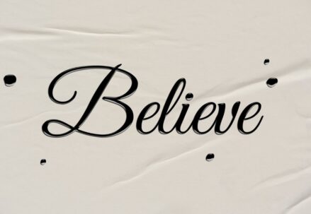
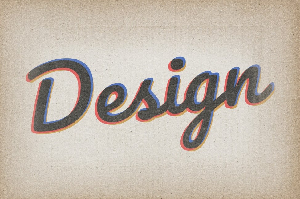
Incorporating Color and Texture with Typography
Color and texture serve as vehicles for emotional and visual depth in typography. A splash of color can highlight critical information or brand identity, while texture can add depth and tactile quality to otherwise flat visuals. However, these elements must be used with discretion to maintain readability. Engaging with color and texture involves:
- Selecting color palettes that reflect the brand and message;
- Understanding the psychology of color in typography;
- Applying textures that do not overwhelm or distract from the content.
Blending Typography and Imagery for Cohesion
The fusion of text and image is a dance of balance and harmony, where each component complements the other. Whether it’s text that overlays an image or type that frames and defines it, the integration should seem seamless and intentional. This approach calls for a nuanced understanding of composition and requires:
- Skill in layering text with visual elements without losing legibility;
- A keen eye for the interplay between text and image;
- Creativity in using typography to enhance or narrate visual stories.
All in all, it’s about crafting an entire visual language that aligns with the goals and essence of the project at hand. Whether designing a corporate website, a vibrant poster, or a minimalist brochure, the application of advanced typography techniques can profoundly influence the outcome, ensuring that the design is not only visually striking but also conveys its intended message with precision.
Through the thoughtful manipulation of letter spacing, font diversity, color, texture, and imagery, one can create a design that stands out in the competitive landscape of visual media.
Expanding the Role of Typography Beyond Aesthetics
Typography does far more than just make a design look good; it fundamentally shapes how information is received and understood. It’s the architect of design that constructs meaning, guides attention, and ensures the message not only reaches the eyes but also resonates with the audience. Effective typography demands an understanding of:
- The psychological impact of type choices on perception;
- How typographic details contribute to the usability and accessibility of content;
- The way typography can influence the user’s journey through a design.
Deep Dive into Font Styles and Their Functions
When it comes to font styles, designers have an array of choices, each with its distinctive voice and functional implications. Serif fonts might bring an air of tradition and reliability, while sans-serif fonts can offer a clean, modern aesthetic. Script fonts add a personal touch but require careful use to maintain legibility.
Key points to explore include:
- The historical context of different font styles and their contemporary application;
- The strategic use of font weights and styles to emphasize content;
- Best practices for combining fonts to ensure cohesiveness without sacrificing individual character.
Typography Styles as Visual Narrators
Typography styles go beyond font choice; they encompass the overall treatment of text, including capitalization, italicization, and bolding, which can tell a different story. The role of typographic styles is to facilitate communication without overshadowing the content itself.
This section should address:
- The nuanced use of typographic emphasis to create rhythm and emphasis;
- How typographic styles can help create a voice and tone within the text;
- Techniques for ensuring that style enhancements improve rather than compromise the design.
The Strategic Use of Color in Typography
Color wields significant power in typography, shaping how text is seen and felt. Beyond aesthetic appeal, color in typography can signal importance, organize content, and evoke emotion. A thoughtful color strategy must consider several factors:
- Contrast and legibility against various backgrounds;
- Cultural and contextual meanings of colors;
- Accessibility considerations, ensuring that color choices are perceivable by all users.
Texture: Adding Dimension to Typographic Design
Texture can infuse typography with a sense of realism, dimension, and character. It is not just an embellishment but a tool that can add a layer of meaning or brand association to text. In applying texture, it is important to consider:
- The compatibility of texture with the overall design aesthetic;
- The functional purpose of texture in aiding the storytelling within the design;
- The technical implications of texture, such as print versus digital mediums.
The Synergy of Typography and Imagery
Combining typography with imagery is not just about layering elements; it’s about creating a conversation between words and visuals. When done correctly, this combination can amplify a message, add layers of meaning, and create a memorable user experience. Exploration in this area involves:
- Techniques for achieving balance and focus when combining text and images;
- Methods for ensuring that typography does not get lost or overpower the imagery;
- The impact of typographic choices on the interpretation of images.
Final Thoughts
In conclusion, typography is the thread that weaves through the fabric of design, holding it together and giving it form and function. It is both the foundation and the flourish of visual communication, deserving of careful study and application. The techniques discussed here are just the beginning; they serve as a launchpad for designers to innovate and articulate their unique visions through the power of type.
By embracing the full spectrum of typography’s potential, designers can create not just visually stunning pieces, but also deeply engaging experiences that resonate with their audience.