Discover the significance of typography beyond merely selecting a font style for your interface design. It’s about the art and science of organizing, styling, and presenting text to effectively communicate information and offer a visually appealing experience.
Issues such as isolated single lines at the beginning or end of paragraphs, known as widows and orphans, can mar an otherwise excellent website design.
Transforming User Experience
Typography can make or break the user interface (UI) design by affecting how users perceive and interact with the interface:
- Communication: Text acts as the primary tool for communication in most digital interfaces. Typography bridges the gap between the system and the user, conveying messages, directions, and data;
- Brand Personality: The choice of font can reflect the brand’s personality or a project’s nature. For instance, a playful, casual font for a children’s app, or a clean and professional one for a corporate website;
- Readability: The impact of typography on content readability is substantial. Selecting the appropriate font, size, and letter spacing can make the content more accessible and enjoyable to read.
Additionally, typography establishes a visual order within an interface. It guides users’ focus on key elements and content, simplifying navigation and interaction with the UI.
Key Typography Elements in Interface Design:
- Fonts: The selection of fonts is crucial. UI designers often use a mix of fonts, one for headlines and another for body text. This combination should be cohesive and aligned with the project’s objectives;
- Font Styles: There are various font styles, including regular, bold, and italic. These can be used to highlight or create contrast in the design;
- Font Size: The size of the font is vital for readability. Headlines usually have a larger font size than the main text, which aids in scanning and enhances visual appeal;
- Line Spacing (Leading): The space between lines of text, known as line spacing, affects readability. Adequate spacing prevents the text from looking cramped and makes it more legible;
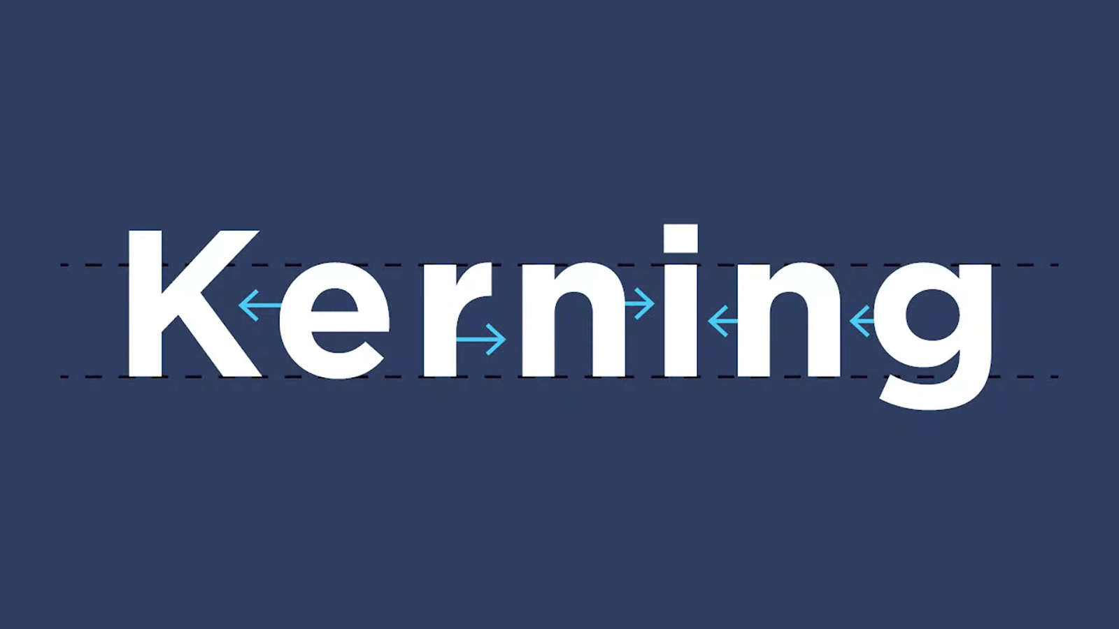
- Letter Spacing (Kerning): Adjusting the space between individual letters enhances the overall aesthetic and readability of the text;
- Text Color: It can evoke emotions and set the tone. It should complement the overall color scheme of the UI.
Mastering Typographic Excellence in User Interface Design:
To conquer the art of typography within UI design, consider the following principles:
- Consistency: Maintain typographic uniformity across your UI to foster a cohesive and professional appearance;
- Hierarchy: Establish content priorities by varying font size, weight, and style to steer user attention;
- Legibility: Ensure text is easily readable with sufficient contrast against its background;
- User Feedback: Collect user input and conduct usability tests to refine font choices;
- Accessibility: Aim for a UI design that is approachable for a diverse audience by adhering to typographic accessibility guidelines, including proper contrast and text-to-speech compatibility.
UI designers should invest time in understanding and mastering the nuances of typography to create interfaces that are not only visually attractive but also highly functional and user-friendly.
Harnessing Typographic Influence for Superior UI Designs
Typography stands as a cornerstone of UI design, exerting a significant influence on the visual aesthetics and functionality of a digital platform. In this discourse, we unveil the subtleties of typographic application in UI design and illuminate its critical role in elevating the user experience.
Typography: The Visual and Functional Soul of UI
In UI design, typography transcends the simple act of selecting a font style. It involves the art and science of arranging, styling, and presenting text to not only convey information effectively but also to craft an attractive visual perception. This means that typography holds the capacity to both enhance and undermine the design of a UI, shaping how users perceive and engage with the interface.
The Influence of Typography in User Interface Design:
- Communication: Text is a primary communication tool across most digital interfaces. Typography serves as a bridge connecting the system to the user, conveying messages, directions, and data;
- Brand Personality: The font selection can mirror the character of a brand or project. For instance, a playful, informal font might suit a children’s app, while a clean, professional one fits a corporate website;
- Readability: Typography significantly impacts how easily content can be read. The right font choice, size, and letter spacing can make the content more accessible and enjoyable to read;
- Visual Hierarchy: Typography establishes a visual order within an interface. It aids in drawing user focus to key elements and content, simplifying navigation and interaction with the UI;
Elements of Typography in User Interface Design:
- Fonts: Choosing the right fonts plays a crucial role. Interface designers often select a combination, using one for headings and another for body text. This combination should be harmonious and align with the project’s goals;
- Font Styles: Fonts come in various styles, such as regular, bold, italic, etc. These styles can be utilized to highlight or create contrast within the design;
- Font Size: The size of the font is critical for readability. Headings usually have a larger font size compared to body text, which facilitates scanning and enhances visual appeal;
- Line Spacing (Leading): The space between lines of text, known as line spacing, can affect readability. Ample spacing prevents text from feeling cramped and makes it more pleasant to read.
- Letter Spacing (Kerning): Adjusting the spacing between individual letters can improve the overall aesthetic look and readability of the text.
- Color: The hue of the text can transmit feelings and set the tone. It should blend with the overall color scheme of the UI.
Mastering Typography in User Interface Design
To master typography in UI design, it’s important to adhere to these principles:
- Consistency: Maintain a uniform approach to typography throughout the UI to present a cohesive and professional appearance;
- Hierarchy: Establish content priorities by varying the size, weight, and style of fonts to guide the user’s attention;
- Legibility: Ensure that text is easy to read and stands out against the background;
- User Feedback: Collect feedback from users and conduct usability testing to refine font choices;
- Accessibility: Make the UI design inclusive by adhering to typography accessibility guidelines, including appropriate contrast and compatibility with text-to-speech features.
In conclusion, typography is the cornerstone of UI design that affects both aesthetics and usability. When used effectively, typography enhances communication, guides UI, and elevates the overall user experience.
UI designers should invest time in understanding and mastering the nuances of typography to craft interfaces that are not only visually appealing but also highly functional and user-friendly.
Typography: The Key to Stunning User Interfaces
Typography is often referred to as the silent communicator within the sphere of UI design. It plays a critical role in shaping the visual allure and functionality of digital platforms. In this article, we explore why typography is the key to creating stunning user interfaces.
Typography: The Art of Visual Communication
In the realm of UI design, typography functions like a visual dialect. It empowers designers to impart information, evoke feelings, and guide user interactions through the strategic deployment of text. The selection of typeface, font families, and text placement can have a significant impact on how users perceive and engage with an interface.
- Readability and Clarity: Typography is vital for ensuring text is readable and clear. A well-chosen font size, style, and letter spacing can enhance readability, easing content comprehension and navigation through the interface;
- Visual Hierarchy: Typography aids in crafting a visual pecking order within the UI. By varying font size, weight, and style, designers can steer users’ focus to key elements, ensuring a smooth and intuitively understood user journey;
- Branding and Identity: The choice of typography can convey a brand’s persona. For instance, a formal and elegant font may be employed for a luxury label, while a playful and relaxed font suits a children’s app.
Different fonts and typographic treatments can elicit specific emotions. Serif fonts might be linked with tradition and formality, while sans-serif fonts are often tied to modernity and simplicity.
Fundamentals of Typography in User Interface Design
Choosing the right fonts is among the most critical decisions. UI designers often select a combination of fonts: one for headlines and another for body text. These fonts should align with the goals of the project and its branding:
- Font Styles: Various font styles, such as regular, bold, italic, and others, can be leveraged to emphasize certain points and create visual contrast within the design;
- Font Size: The size of the font plays a crucial role in readability. Titles generally should be larger than body text to facilitate scanning and boost user engagement;
- Line Spacing (Leading): Appropriate line spacing ensures readability and an aesthetically pleasing text presentation;
- Letter Spacing (Kerning): Adjusting the space between individual letters can improve legibility and the visual allure of the text.
The color of the text does more than enhance visual appeal; it sets the emotional stage. It must integrate seamlessly with the overall color scheme of the UI to ensure a cohesive and appealing look.
Striving for Typographic Mastery in User Interface Design
To craft outstanding UIs through typography, consider the following best practices:
- Consistency: Maintain a uniform typographic style throughout the UI to project coherence and professionalism;
- Hierarchy: Structure content priority by varying font size, weight, and style to capture the user’s attention;
- Legibility: Ensure text is easy to read with a strong contrast against the background;
- User Feedback: Gather user insights and conduct usability testing to refine font choices;
- Accessibility: Make UI design inclusive by adhering to accessibility guidelines, including proper contrast and screen reader compatibility.
Typography is undeniably a cornerstone in crafting stunning UI. It melds aesthetics with utility, allowing designers to communicate, direct, and engage users effectively. By mastering both the art and science of typography, UI designers can enhance their projects and create visually appealing, user-friendly interfaces that make a lasting impression.
Final Thoughts
Typography is a crucial facet of UI design that can make or break user perception. Grasping typographic principles, choosing the right fonts, and mastering the art of consistency and hierarchy empower the creation of compelling UIs that captivate and intrigue audiences.
Do not underestimate the power of typography in your next UI project. Begin forging exceptional user experiences today.