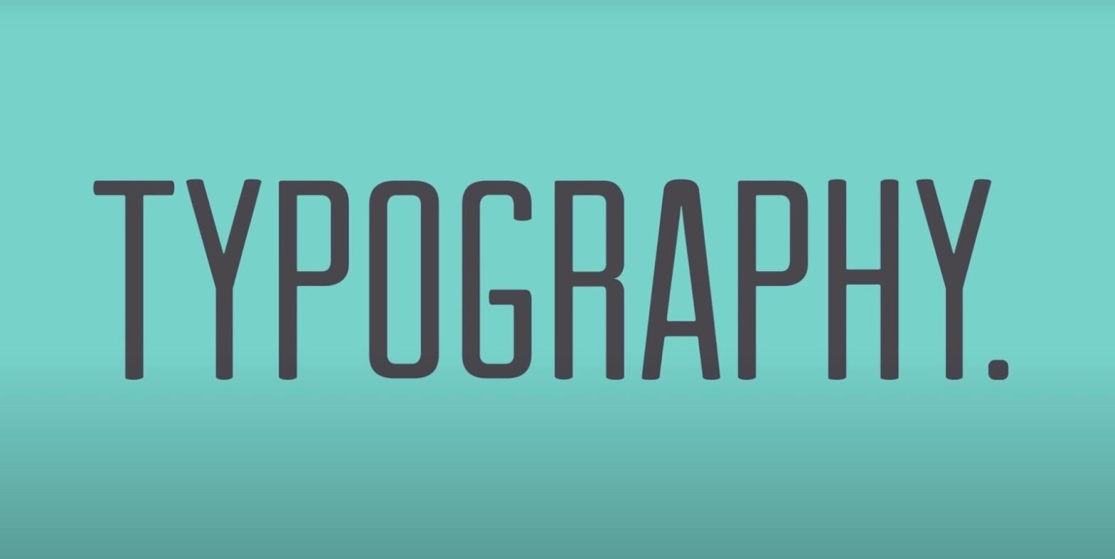
Once solely the purview of dedicated typesetters and meticulous print designers, typography has transcended its conventional confines. In the contemporary digital realm, typography is a ubiquitous force, permeating every nook of our online experiences. Every web page, every mobile app interface, every digital billboard is a testament to typography’s pervasive influence. So, what is typography? It is the craft and technique of arranging type to make the written language more legible, readable, and visually appealing. It commands significance because it’s not just about the aesthetic. It shapes our interaction with the written word, affects usability, and even sways emotion and perception.
Typography is both art and science. As an art, it requires a designer’s eye for aesthetics and a storyteller’s sense of how to best present information. As a science, it relies on understanding human perception, how people read, and how the eyes and brain process visual information. At its best, typography is invisible—readers shouldn’t notice the type itself but rather the message it conveys.
Decoding Typography: More Than Just Fonts
When we delve deeper into typography, it becomes clear that it’s not just about choosing “pretty” fonts. It’s the structural backbone of written communication. Every letter on a page or screen is meticulously crafted, not only to stand as a symbol of sound but to contribute to the overall harmony of a document or website. Think of it as visual ergonomics: typography exists to make reading not only possible but pleasurable.
A paragraph of text might look simple, yet it’s a complex dance of many factors: font choice, line length, line spacing, and letter spacing, to name a few. Each element is a gear in the machinery of typography, calibrated to create a smooth reading experience. Here’s how they align:
- Font Choice: The decision that sets the stage, defining the voice and personality of the text;
- Line Length: Too wide or too narrow, and the reader’s eyes struggle to move from one line to the next;
- Line Spacing (Leading): The vertical gap between lines, not enough space can make text feel cramped;
- Letter Spacing (Tracking): The overall uniform space between characters, critical for legibility.
History Etched in Serifs and Sans-Serifs
The tale of typography is a rich tapestry woven through time, from the chiseled inscriptions of ancient Rome to Gutenberg’s revolutionary movable type, and onto the crisp digital fonts we use today. Each advancement in typography has mirrored a leap in cultural and technological progress. A brief table depicting key milestones:
| Era | Development | Impact |
|---|---|---|
| Mid-15th Century | Gutenberg’s Movable Type | Mass production of texts, spread of knowledge |
| 18th Century | Transition to Modern Typefaces | Improved legibility, elegance in design |
| 20th Century | Digital Typesetting | Accessibility, new design possibilities |
Understanding this history helps us appreciate the reasons behind the shifts in design trends—whether for improved readability, aesthetic tastes, or technological advances.
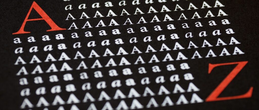
Anatomy of Typography: Dissecting Letterforms
A deep dive into the anatomy of typography reveals a complex structure, much like the human form, each part with a specific name and function. Terms such as ‘x-height,’ ‘baseline,’ and ‘descender’ are not just for typographers; they’re for anyone who wants to understand how type works.
Here’s a breakdown of common terms:
- X-Height: The height of the lowercase letters, excluding ascenders and descenders;
- Baseline: The line upon which most letters sit;
- Ascender: The part of a letter that extends above the x-height;
- Descender: The part of a letter that drops below the baseline.
Understanding these terms is akin to a musician understanding notes and scales—it’s the foundation of fluency in the language of type.
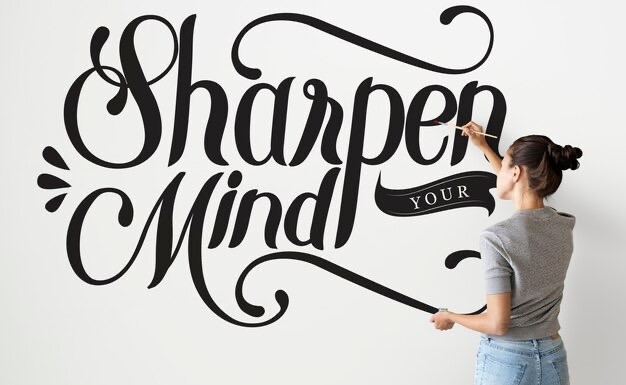
Choosing the Right Typeface: Function Meets Art
Selecting the appropriate typeface is a pivotal decision in typography that intertwines function with art. It isn’t merely about what’s in vogue; rather, it’s about what serves the purpose of the text and complements the design. Different typefaces can evoke different feelings and responses from the reader.
Here’s a list illustrating how different typefaces can influence perception:
- Serif Fonts: Often convey formality, reliability, and respectability;
- Sans-Serif Fonts: Impart a modern, clean, and approachable feel;
- Script Fonts: Can introduce elegance, flair, or a personal touch.
The Psychology Behind Fonts: Perception and Mood
Fonts are laden with psychological nuances. The weight, size, and style of a font can convey a myriad of emotions and set the tone of the text. A bold, blocky font might scream authority and strength, while a light, whimsical script might whisper of elegance and refinement. This psychological impact is subtle yet powerful, influencing how the message is received and interpreted by the reader.
Consider the atmosphere generated by these font choices:
- Times New Roman: Traditional, trustworthy, academic;
- Helvetica: Neutral, clean, professional;
- Comic Sans: Casual, friendly, often regarded as informal or out-of-place in serious documents.
Grids and Layout in Typography: Structured Beauty
Invisible to the untrained eye, a well-implemented grid in typography is the skeleton that orders the body of text. It is the unseen guideline that arranges letters, words, and paragraphs into a cohesive whole. When absent, readers might not pinpoint the cause of their discomfort, but they will feel the disarray of a disorganized layout. A grid brings order, helping to direct the reader’s eye and making the information more digestible.
Responsive Typography: A Fluid Approach
The varying screen sizes from desktops to watches demand that typography be not just static, but fluid and adaptable. Responsive typography ensures that text is legible and appealing across all platforms, an absolute necessity in a world where content is increasingly consumed on the go. It’s about maintaining readability and aesthetic pleasure, regardless of where it’s viewed.
Responsive typography might involve:
- Scalable Vector Graphics (SVGs): For logos and icons that need to stay crisp;
- Media Queries: In CSS, to adjust font sizes and line heights based on screen size;
- Flexible Grids: To adjust the layout dynamically as the viewing device changes.
Accessibility in Typography: Design for All
If typography is not accessible, it fails its core objective: to communicate effectively. Accessible typography considers all potential readers, including those with disabilities. It means selecting typefaces, sizes, colors, and spacing that can be read easily by everyone, including individuals with dyslexia, vision impairments, or other cognitive differences.
The Future of Typography: Trends and Technology
Emerging technologies like AI, VR, and AR are pushing the boundaries of typography. They challenge traditional notions of how type should look and function, ushering in an era of dynamic and adaptable typography that can change in real-time according to context or user interaction. Typography is no longer confined to the static page or screen; it is becoming an integral part of the user interface in immersive environments.
Expect to see trends such as:
- Variable Fonts: One font file that behaves like multiple fonts, offering a full range of weight, width, and other attributes without multiple files;
- Augmented Reality (AR): Typography that interacts with the real world in real-time;
- Artificial Intelligence (AI): Algorithms that can suggest the best fonts and layouts based on user behavior and preferences.
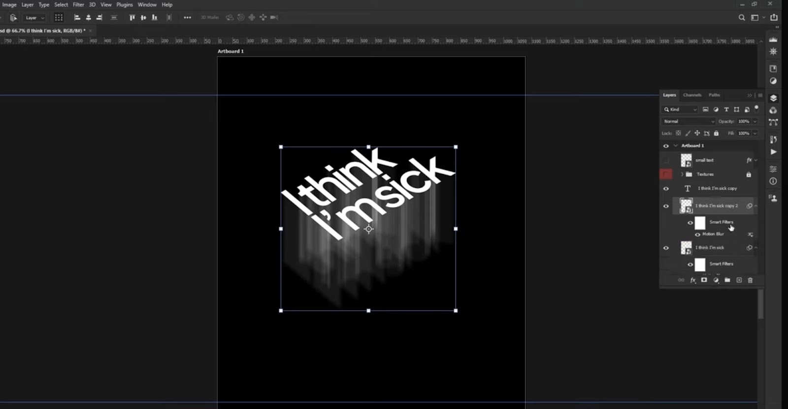
Typography Portraits Tutorial: Crafting Visual Narratives
A typography portrait is an artful blend of text and image, forming a visual narrative that’s both engaging and revealing. This tutorial will guide you through creating your own typography portrait.
Creating a Typography Portrait in Brief:
- Select a High-Contrast Image: Your subject should have clear and defined edges;
- Choose Meaningful Text: Pick text that relates to the subject, such as quotes or lyrics;
- Utilize Design Software: Tools like Adobe Photoshop or Illustrator are ideal for layering text and image;
- Outline and Text Placement: Outline your subject and start filling it in with your chosen text, adjusting the size and direction to match the contours of the image;
- Styling: Use a cohesive color scheme and vary font weights for depth;
- Adjust and Refine: Fine-tune spacing and alignment for visual balance.
Here’s a condensed table to summarize the essentials:
| Step | Action | Tip |
|---|---|---|
| 1 | Image Selection | Use high-contrast for clarity |
| 2 | Text Choice | Make it personal or thematic |
| 3 | Software Setup | Adobe suite for versatility |
| 4 | Outline | Guide for text shaping |
| 5 | Styling | Consistency in color and font style |
| 6 | Refinement | Balance and visual harmony |
In this process, the text is not merely an addition to the image but an integral component of the portrait’s overall impact. It offers a unique medium for expression, inviting viewers to read into the deeper meaning of the piece, both literally and figuratively.
Final thought
As we conclude our exploration of typography, it’s clear that it’s much more than just selecting fonts. It’s an art that infuses life into language, shaping how we interact with words. From the historical depth of serif and sans-serif to the dynamic nature of responsive typography, understanding this craft is crucial for effective communication.
Typography’s power lies in its subtlety—its ability to influence emotion and comprehension often goes unnoticed, yet it remains an essential element of design. As we look to the future, we see the boundaries of typography expanding with technology, promising new horizons for this ancient craft.
Remember, whether crafting a document or designing a visual narrative with a typography portrait, the principles of typography are your guides to clarity, beauty, and innovation in communication.