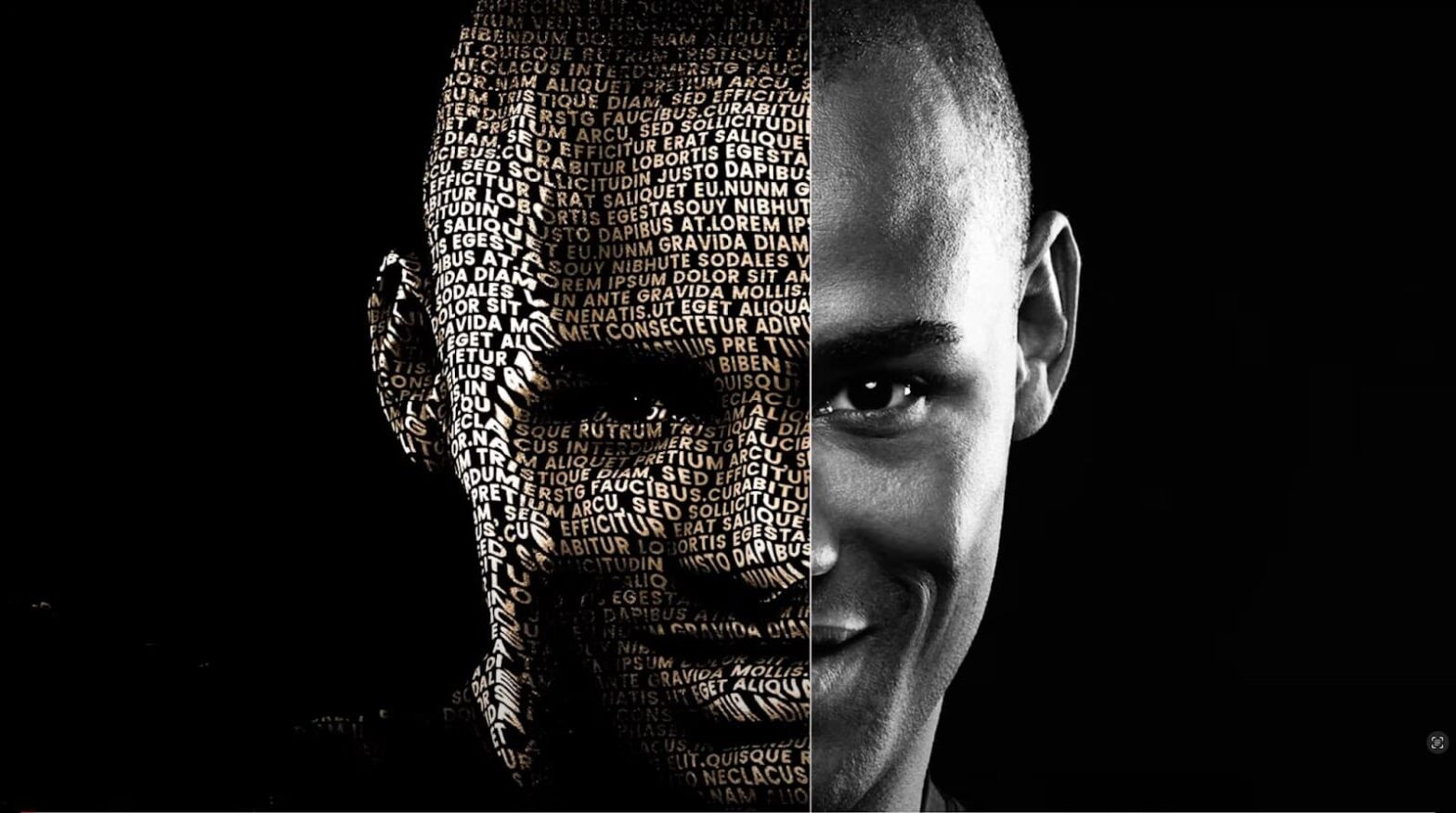
Creating a typography portrait is akin to painting with a keyboard; each keystroke adds a shade or texture to your canvas. This unique art form blends the precision of typesetting with the fluidity of visual design, resulting in a piece that speaks volumes both literally and figuratively.
To initiate the voyage into typography portraiture, it’s essential to appreciate the layered nuances it involves. The process isn’t merely about placing letters over a silhouette but about how each letter’s form, weight, and posture come together to mimic the human features’ natural lines and curves. Like a traditional artist who knows their brush strokes, a digital artist must know their typefaces and how their characteristics can build a visual narrative.
Your Toolkit for Typography Portraiture
Before embarking on your typographic journey, ensure your toolkit is complete. The essentials include:
- Software: Adobe Illustrator, Photoshop, or other vector-based drawing programs;
- Font Library: A diverse collection of typefaces, from bold serifs to delicate scripts;
- Reference Image: A high-resolution photograph to guide your portrait;
- Patience and Creativity: The willingness to experiment and the creativity to see beyond the literal.
Font Selection: The Voice of Your Portrait
Fonts convey emotion. Choosing the right font is analogous to an artist picking the right color palette. It sets the tone for the entire portrait. For instance, a bold, strong type like Rockwell suggests a sense of resilience, while a delicate script such as Edwardian Script may convey elegance.
The following table outlines font types and the emotions they commonly portray:
| Font Type | Emotion Conveyed | Example Usage |
|---|---|---|
| Serif | Traditional, Respectable | Portraying a historical figure |
| Sans-serif | Modern, Approachable | A tech entrepreneur |
| Script | Elegant, Artistic | A classical musician |
| Display/Novelty | Quirky, Unique | A pop culture icon |
Setting Up Your Canvas
In your chosen software, set up a new document. This digital canvas will be the bedrock upon which you’ll layer texts to sculpt your subject’s features. A standard approach includes:
- Select a canvas size based on the intended display medium (e.g., A4 for print);
- Set the resolution to 300 DPI for print or 72 DPI for web;
- Define a color scheme that complements your chosen fonts and subject.
The Initial Sketch with Words
Begin by blocking out the most prominent features of your portrait with larger fonts or bold statements. This process involves:
- Identifying the portrait areas with the most contrast;
- Choosing type sizes that correspond to the scale of each facial feature;
- Utilizing bolder typefaces for areas that will be in shadow.
This initial layer serves as the scaffolding for your typographic construction.

Shading and Texture Through Typography
The mastery of typography portraits lies in creating an illusion of depth using nothing but text. This section involves:
- Mixing font weights to mimic light and shadow;
- Adjusting the line spacing (leading) to achieve the desired texture;
- Employing different type sizes to add detail and dimension.
Detailing with Letters
When it comes to the detailing phase, the typography portrait begins to take on a life of its own. This stage is delicate, requiring a keen eye for how the curvature of each font melds with the natural undulations of the human face. It’s about achieving a rhythm where the letters not only represent but become the facial features, enhancing the curves of cheeks or the lines of a jaw with a carefully chosen typeface. Adjustments in kerning are vital here, as the space between characters must be finessed to give the illusion of a seamless surface, as if each letter was organically meant to fit beside the next.
Moreover, orienting the text to mirror the angles and directions of the facial features adds to the lifelike quality of the portrait, making the piece not only a representation but also an echo of the subject’s visage. In these intricate crevices of artistry, you will find a variety of font sizes weaving together the story of the individual, from the whisper-thin strands of hair to the deep etchings of age or the subtle softness of youth.
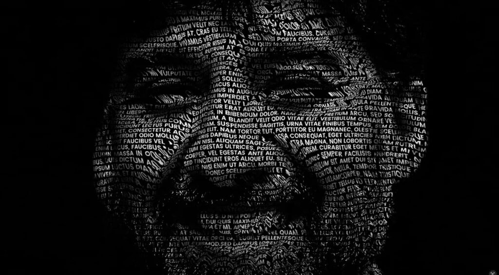
Bringing Life to Eyes with Text
The eyes, often termed the windows to the soul, are a focal point in any portrait. Their depiction through typography is a meticulous process that demands an artful selection of fonts—those capable of conveying the complexity and depth of human eyes. The creation of the iris and pupils using text is not just about aesthetic appeal but about capturing the gaze that reflects the subject’s essence. Words are layered, much like a painter’s brushstrokes, adding depth and emotion to the eyes, making them appear as though they might truly see. Sometimes, the chosen words themselves carry weight, selected for their relevance to the subject’s narrative, adding layers of meaning to the visual artistry.
Balancing the Composition
Achieving balance in the composition is not just a technical requirement but an expressive one. As the artist, you must step back periodically to observe the typography portrait as a whole. Assess the distribution of textual elements across the canvas, ensuring that the visual weight does not tip the scales but remains poised in harmonious equilibrium. Play with symmetry and asymmetry, using them to your advantage to either reinforce stability or introduce dynamic tension. The dance between text density and the surrounding negative space is a subtle one, but it is this very interplay that can make a piece sing.
Finishing Touches: Refinement and Contrast
In the concluding phase of the portrait, it’s all about the nuances. Refinement is key. Here, you’ll engage in a bit of alchemy with contrast settings, enhancing sharpness or softening details to achieve the perfect tonal balance. It’s a delicate act of scrutinizing each element, ensuring that every letter not only serves its purpose in the aesthetic of the portrait but also maintains legibility and contributes to the overall appeal. Effective use of negative space is not neglected; it guides the viewer’s eye and provides breathing room within the textual tapestry.
Exporting Your Masterpiece
The final step of your journey is to bring the artwork into the world in its most fitting form. The digital age offers a spectrum of file formats, each with its specialty. For web display, a JPEG’s balance of quality and file size is often ideal. A TIFF file’s lack of compression makes it perfect for print, preserving the portrait’s clarity down to the finest letter. And for online sharing, particularly where backgrounds may vary, the transparency support of PNG files is invaluable. Each format has its stage, and choosing wisely will ensure your typographic portrait is seen at its very best.
Exploring Typography Portraits with Illustrator
Adobe Illustrator is a powerful ally for creating typography portraits, offering precise tools for text manipulation. To dive into this craft, consider exploring dedicated Illustrator tutorials that walk you through the entire process. These guides typically cover:
- Basic Typography Tools: Learning the ropes of Illustrator’s type capabilities;
- Text Manipulation Techniques: Discovering how to warp and shape text to fit facial contours;
- Layering and Texturing: Understanding layer management and the use of masks for refined details;
- Color Schemes: Applying color and gradients to bring vibrancy to your typographic work.
Such tutorials are a goldmine for both novices and expert designers, helping to sharpen your skills and infuse creativity into your typographic portraits. With Illustrator’s robust features, you can transform simple letters into complex, emotive faces that tell a story as much through form as through content.
Conclusion
The creation of a typography portrait intertwines the love of language with visual artistry. Each font and word placement is deliberate, culminating in a piece that not only depicts a likeness but also tells a story. With patience and practice, your keystrokes can bring forth the soul of a subject, all while dancing on the fine line between text and texture.