When it comes to creating stunning 3D text, Blender, the powerhouse open-source software, has become an indispensable tool for designers and artists alike. The realm of 3D typography in Blender is an exciting landscape where the artistry of text meets the dynamism of three dimensions, providing endless possibilities for creativity. In this article, we’ll delve into the world of Blender typography and explore how you can leverage this incredible software to elevate your 3D text designs.
Understanding the Basics of Blender Typography
Blender boasts advanced typography tools that extend far beyond the capabilities of standard 2D graphic design software. It transforms the art of text design into an immersive 3D experience, allowing artists and designers to create text that leaps off the screen and interacts with other elements in three dimensions. Below is an expanded explanation of how Blender’s tools bring a new depth to typography:
- Initiating Text Creation: The process starts when you introduce a text object within your virtual environment. Blender’s interface makes this step as straightforward as typing on a word processor. Once your text appears, you can dive into a vast selection of fonts, from the classical to the avant-garde, to find the perfect typographical representation of your project’s underlying tone. Adjusting the font style is just the beginning of the customization process, setting the stage for further creative exploration;
- Advanced Manipulation Techniques: Blender’s real strength is evident in its manipulation capabilities. Unlike in 2D spaces where text remains flat, Blender enables a multitude of transformations. You have the freedom to twist each character, bend words around imaginary shapes, or stretch and compress text to convey dynamic movement or subtle emphasis, pushing the boundaries of traditional typography. Additionally, you can add three-dimensional depth through extrusion—pulling letters out into the third dimension—and beveling, which rounds the edges to give letters a more sculpted look. These features allow for an incredible level of detail and complexity in designing your text;
- Dynamic Materials and Textures: Finally, the three-dimensional text in Blender is brought to life through the application of materials and textures. This step goes beyond mere color changes, enabling text to have a variety of surfaces ranging from reflective metals to diffuse, paper-like textures. You can simulate the interaction between light and material, allowing your text to cast realistic shadows, exhibit specular highlights, or even appear translucent. By applying these materials, your typography can achieve an aesthetic that resonates with your scene’s environment and lighting, creating moods from the hyper-realistic to the fantastically surreal.
Blender thus provides an incredibly versatile platform for typographic design, combining the art of lettering with the expansive potential of 3D modeling to create textual presentations that are not only visually striking but also rich with meaning and context. Whether for motion graphics, title sequences, or dynamic branding, the process of crafting text in Blender is an adventure in design that goes well beyond the written word.
Setting Up Your Workspace
Before diving into the intricacies of 3D typography, it’s essential to configure your Blender workspace. A well-organized environment paves the way for a smoother creative process. Start by opening Blender and selecting the layout that best suits typography work—typically, the ‘Layout’ or ‘Modeling’ workspace preset. Within this space, arrange your panels to have quick access to the tools you’ll use most frequently: the properties editor for text properties, the outliner to manage your objects, and the 3D viewport where all the magic happens. Customize your toolbar to include shortcuts for adding text and modifying it, and set up your camera so you have a preferred view ready. Saving this configuration as a default startup file can expedite your workflow for future projects.
Basic Navigation and Interface Introduction
Blender’s interface may appear daunting at first, but with a basic understanding of navigation, you can move through it with ease. The 3D viewport is your canvas, manipulated through key mouse controls: scrolling to zoom, holding the middle mouse button to orbit around objects, and shifting with the middle mouse to pan. Familiarize yourself with the key areas such as the timeline for animation, the properties panel for detailed adjustments, and the outliner for scene organization. Mastering these will allow you to maneuver around your typography project efficiently and accurately, ensuring that you can focus on the creative side rather than wrestling with the software.
Adding and Editing Text Objects
To begin adding textual elements to your scene, simply press ‘Shift+A’ to access the add menu and select ‘Text.’ This places a flat, 2D text object in your scene, which can be moved and edited like any other object. Enter edit mode by pressing ‘Tab,’ allowing you to type your desired words directly in the viewport. With basic commands under your belt, you can scale, rotate, and position your text. The properties panel is your ally here, offering more sophisticated options such as font size, paragraph alignment, and character spacing—tools that refine your text into the precise shape and form you envision.
Choosing the Right Font for 3D
The transition of text from 2D to 3D introduces a new set of considerations when selecting fonts. In 3D space, readability may be affected by perspective and depth, making some intricate or thin fonts less suitable. Seek out typefaces with strong, clear lines that stand up to the addition of depth and dimension. Blender supports TrueType and OpenType fonts, which means you have a vast selection at your disposal. Test out how your chosen fonts behave when extruded and beveled; some may reveal unexpected and delightful aesthetic qualities when given the 3D treatment.
| Attribute | Description | Considerations for 3D |
|---|---|---|
| Font Weight | The thickness of the character strokes. | Thicker weights (bold, heavy) often translate better in 3D. |
| Legibility | How easy it is to distinguish one character from another. | High legibility is crucial for readability from various angles. |
| Serif vs. Sans Serif | Serif fonts have small lines at the ends of characters; sans serifs do not. | Sans serif fonts typically have a more modern and clean look in 3D. |
| Line Width Consistency | The uniformity of line width across characters. | Consistent line width can produce a more cohesive 3D appearance. |
| X-height | The height of the lowercase ‘x’ relative to the font’s uppercase letters. | A larger x-height can improve readability in 3D. |
| Counter Shape and Size | The open space in letters like ‘a’, ‘b’, ‘d’, ‘o’, etc. | Ample counter space can help maintain legibility after extrusion. |
| Kerning and Tracking | The space between characters and groups of characters. | Evenly spaced kerning and tracking help avoid visual clutter in 3D. |
| Complexity of Design | The intricacy of the font design, including decorative elements. | Simple designs usually work better to prevent mesh complexity in 3D. |
| Scalability | How well the font maintains its legibility and aesthetic when resized. | A scalable font ensures quality when adjusting for different 3D sizes. |
| Reactivity to Light and Shadow | How the font plays with light and casts shadows. | Fonts with good reactivity can create dramatic lighting effects in 3D. |
| Compatibility with Bevel and Extrude | How well the font’s design responds to 3D effects. | Some fonts may lose their character when beveled or extruded excessively. |
| Versatility | The font’s ability to look good in different styles and contexts. | Versatile fonts can be used in a variety of 3D design scenarios. |
Adjusting Fonts to Fit Your Design
Once a font is chosen, fitting it into your overall design concept is crucial. This involves adjusting letter spacing, line height, and alignment to ensure harmony and balance within your composition. Blender offers detailed control over each of these aspects, found under the ‘Font’ tab in the properties panel. You might increase the spacing to create a sense of airiness, or decrease it to convey urgency or solidity. Be mindful of the overall aesthetic and the message you intend to communicate; every typographic decision should be purposeful and contribute to the design’s cohesive whole.
Advanced Text Manipulation Techniques
Going beyond basic adjustments, Blender allows for a myriad of advanced text manipulation options. You can convert text to a mesh to manipulate individual vertices for custom shapes, or use curves for non-linear text flows that twist and turn through three-dimensional space. The integration of text with other 3D elements can also be explored; for instance, wrapping text around objects or integrating it into a scene as though it’s part of the environment. These techniques require a deeper understanding of Blender’s toolset but unlock a higher level of customization and creativity, pushing the boundaries of traditional typography.
The Secrets to 3D Text Magic in Blender
Creating compelling 3D text in Blender is not just about the tools; it’s about how you use them. Here are some secrets to mastering Blender typography:
Exploring the Depths of Bevel and Extrusion in Blender:
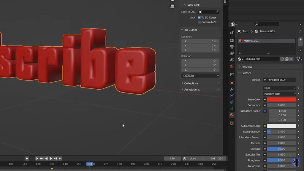
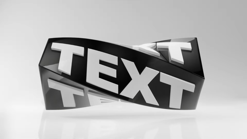
Blender’s bevel feature offers a transformative approach to typography, creating beveled edges that give characters a more defined and three-dimensional appearance. These angled edges are more than just visually pleasing; they play a crucial role in how light and shadow interact with your text, thus intensifying the three-dimensional illusion. On the other hand, the act of extruding text in Blender is akin to giving it a physical presence in the digital world. By extending the text out from a two-dimensional plane, you endow it with a tangible depth. This extrusion process can be customized to produce a range of creative outcomes, from subtle raised letters that provide a hint of depth to dramatic block-like structures that boldly stand out from the background.
Illumination and Shadow Play in 3D Typography:
Lighting within Blender is a potent storytelling tool, particularly when it comes to typography. By meticulously positioning light sources and finessing their characteristics such as intensity, hue, and direction, you can dramatically enhance the text’s dimensionality and texture. The play of light and shadows not only accentuates the forms and curves of each character but also sets the tone and atmosphere for your typographic artwork. Skillful manipulation of shadows contributes a sense of groundedness, enabling the text to convincingly occupy its space within the scene.
The Art of Materials and Textures:
Blender’s vast material and texture capabilities open up a universe of creative potential. Whether you’re emulating the reflective sheen of metals, the clear purity of glass, or the matte finish of plastics, Blender’s material editor is your palette for experimentation. Moreover, venturing beyond conventional materials into the realm of the abstract can result in typography that is not only visually engaging but also rich in texture, enticing viewers to reach out and touch the once-flat characters that now burst with life.
Bringing Text to Life through Animation:
In Blender, static text can be transformed into a narrative element through animation. Your typographic creations can dance, dissolve, rebuild, or subtly shift, turning static visuals into dynamic stories. Animation capabilities in Blender range from basic movements like rotations and scales to intricate choreographies where individual letters and words move with complex, lifelike kinetics, adding a temporal dimension to your typographic expressions.
Employing Modifiers for Sophisticated Typography:
The utilization of modifiers in Blender can elevate your typography to unprecedented levels of intricacy. Whether it’s creating a mirror image of a word, applying an array modifier to duplicate text in a pattern, or using deformative tools like wave or lattice to warp and alter the text, modifiers are a gateway to an extraordinary typographic landscape. These tools empower designers to implement intricate designs with efficiency and precision, which might be exceedingly laborious to accomplish by hand.
Practical Tips for Blender Typography Projects
To elevate the quality of your typography projects in Blender, it’s essential to consider several key factors throughout your design process:
- Thoughtful Font Selection: The choice of font is crucial in three-dimensional typography. In Blender, it’s important to select typefaces that maintain their visual integrity and appeal when transformed from flat text into 3D models. A font that looks elegant in a 2D format may become unwieldy or unattractive once extruded. Test a variety of fonts to ensure your choice maintains its desired effect in a three-dimensional context;
- Prioritizing Readability: The allure of Blender’s extensive effects can be enticing; however, it’s vital to keep the fundamental goal of typography in mind—communication. Adding too many effects can overwhelm the text and detract from its readability. Strive for a balance between visual impact and clarity. A well-designed piece of 3D text should convey its message effortlessly, regardless of the complexity of its design elements;
- Scene Optimization Techniques: Managing the technical performance of your Blender scene is as important as the design itself. High-polygon models can be resource-intensive, leading to slower rendering times and a cumbersome design process. Using Blender’s modifiers such as Decimate or Remesh can help reduce polygon count without significantly affecting the visual fidelity of your text. The goal is to maintain a smooth workflow by keeping your scene optimized, ensuring that your computer resources are focused on rendering your final design rather than struggling with the complexity of the working model;
- Incorporating Reference Imagery: Inspiration is key in the design process, and reference images can serve as a valuable guide in your typography project. Whether you’re aiming to replicate the look of certain materials, like brushed metal or translucent glass, or you’re trying to achieve a specific artistic style, having a reference image can direct your choices in materials, lighting, and text effects. This step can help in achieving a more authentic and intentional design that resonates with your project’s theme.
Conclusion
Blender opens up a universe where typography extends beyond the page or screen into the expansive world of 3D. By mastering Blender’s typography tools, you can create text that not only conveys a message but also packs a visual punch, with depth, texture, and movement that bring your words to life. So whether you’re creating a logo, a title sequence, or simply experimenting with text in a 3D space, Blender offers a flexible and powerful platform to unleash your typographic creativity. Start exploring today and watch as your text transforms from simple strings of characters to immersive 3D art. You might be interested in Tips for Enhancing Your Typography Proficiency.