In the realm of design, illustrative typography stands as a beacon of creativity, where the essence of words melds seamlessly with the allure of visuals. This unique art form breathes life into letters, transforming them from mere carriers of meaning to storytellers in their own right. Each curve and line in illustrative typography is not just a functional necessity but a deliberate stroke of art, invoking emotions and crafting experiences. Here, typography is not just seen; it is felt.
The Genesis of Artistic Alphabets
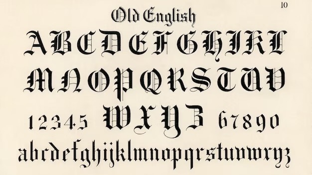
Tracing the lineage of illustrative typography unveils a rich history steeped in the traditions of calligraphy and illuminated manuscripts. From the ornate scripts of medieval scribes to the bold graffiti of urban streets, the artful shaping of letters has long been a cultural cornerstone. This chronicle of typographic artistry is marked by milestones:
- Ancient Calligraphy: The elegant dance of brush and ink, where each character is a masterpiece;
- Gutenberg’s Revolution: The printing press era, birthing the mass production of type;
- Art Nouveau: A movement that infused type with organic, flowing lines;
- Digital Age: The advent of software that has democratized typographic art, making it accessible to all.
Understanding Typography and Its Artistic Side
Typography, at its core, is the art and technique of arranging type. But beyond its basic function, it serves as a canvas for creativity. It’s not merely about choosing fonts; it’s about crafting an emotional palette:
- Typeface Selection: The personality of the font;
- Hierarchy and Contrast: Guiding the reader’s attention;
- Color Theory: Conveying mood through color;
- Composition: The spatial arrangement of type elements.
The Aesthetics of Letters: More Than Just Fonts
The aesthetics of typography transcend beyond the selection of fonts. They inhabit the realm of space, contrast, alignment, and color, contributing to the reader’s experience by influencing perception and understanding. The visual appeal of typography lies not only in the readability of text but also in its ability to evoke an atmosphere, build a setting, and create an emotional resonance.
The Process: Crafting Visual Language
The creation of illustrative typography is a meticulous process that intertwines the essence of language with the intuition of art. It’s a journey from concept to completion, often involving these steps:
- Conceptualization: The inception of a thematic vision for the text;
- Sketching: The preliminary drawings that lay the foundation;
- Digitization: Bringing sketches to life through digital tools;
- Refinement: Fine-tuning details for clarity and impact;
- Finalization: Polishing the artwork for its final form.
Typography in Branding: A Visual Identity
Illustrative typography in branding is not just about being seen—it’s about being remembered. It can encapsulate a brand’s ethos, making it instantly recognizable across various media. Consider the iconic typographic logos of brands like Coca-Cola or Disney—each serves as a visual ambassador, instantly conveying the brand’s story through its stylized script.
Case Studies: When Type Meets Art
Here we would explore notable examples of illustrative typography:
| Brand/Artist | Style | Impact |
|---|---|---|
| Coca-Cola | Script | Brand Identity |
| Shepard Fairey | Stencil | Political Statement |
| Jessica Hische | Hand-Lettering | Editorial Elegance |
Software and Platforms for Typographic Illustration
In the digital era, the arsenal of tools at a typographic artist’s disposal is critical, rivalling the importance of skill itself. The right software acts as a catalyst in the creative process, bridging the gap between concept and reality. Adobe Illustrator, for instance, is a mainstay in the field, cherished for its vector-based capabilities that make typography designs infinitely scalable without loss of quality. It stands alongside Procreate, a favorite for iPad aficionados, which is lauded for its user-friendly interface and a library of brushes that mimic the strokes of physical media. Meanwhile, Adobe Photoshop remains a powerhouse for those who delve into texturing and complex raster-based typographic art, offering an unrivaled depth of features.
In contrast, Affinity Designer has emerged as a cost-effective alternative, boasting robust capabilities for both vector and raster design. The choice of platform is often a reflection of a typographer’s specific needs—be it the scalability of vectors, the organic feel of various brushes, the intricacies of texturing, or the constraints of a budget. Each software brings its unique flavor to the table, enabling the creation of typography that is as varied as it is compelling.
The Future of Typography in a Digital World
The trajectory of illustrative typography is intimately entwined with technological progress. As we step into an era where virtual and augmented realities begin to blur the lines between digital space and physical presence, typography is set to transcend traditional boundaries. We stand on the brink of experiencing text that does more than simply lie flat upon a page—it will soon surround us, offering a level of interaction and immersion previously confined to the realms of science fiction.
Emerging trends such as augmented reality promise to bring typographic elements into our real-world environment, enhancing our daily lives with layers of information and design. Variable fonts are also on the rise, versatile in nature, allowing extensive variety within a single file, adapting to context and purpose with fluidity. Furthermore, responsive typography is poised to become more sophisticated, ensuring that text is not only legible but also aesthetically pleasing across an array of devices and screen sizes. As these technologies evolve, the art of typography will continue to flourish, presenting endless opportunities for innovation and expression.
Crafting a Narrative Through Type
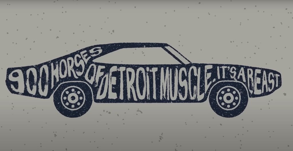
Illustrative typography does more than present information; it tells a story. Consider a children’s book where the typography curls like a vine around the illustrations, or an advertisement where the letters mimic the product’s shape. These are not mere design choices; they are narrative decisions that enhance and complement the storytelling. Crafting a narrative through type involves:
- Thematic Consistency: Ensuring that the typography aligns with the overall story;
- Emotional Resonance: Selecting type that elicits the right feelings from the audience;
- Interactive Elements: Engaging the reader by making the typography a part of the interactive experience.
Through illustrative typography, designers have the power to make type not just a transmitter of words, but a character in the narrative itself.
Advanced Techniques in Illustrative Typography
The journey through illustrative typography often leads to the exploration of advanced techniques that push the boundaries of text as an art form. Advanced typography encompasses a range of sophisticated methods that enable designers to inject deeper meaning and more nuanced emotion into their work. It’s an area where the mastery of type becomes a playground for innovation and where the fusion of illustrative elements with text creates a harmonious blend of readability and aesthetic appeal.
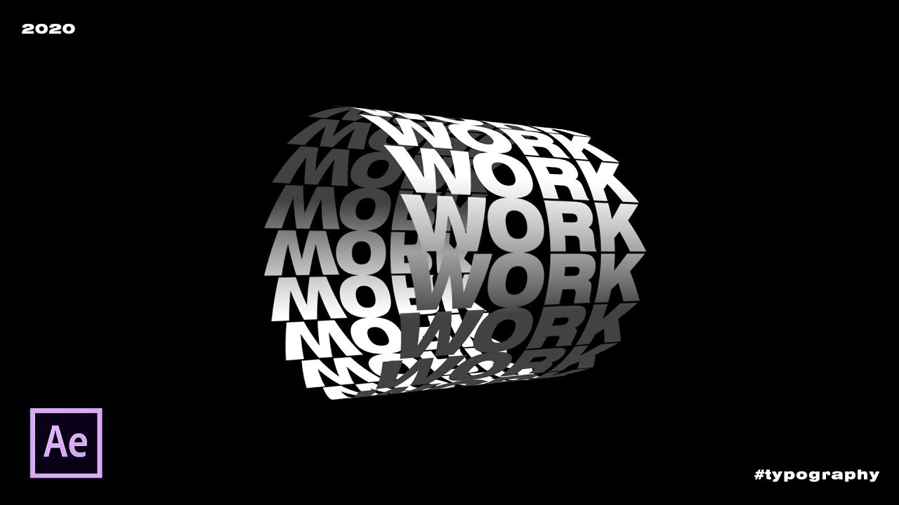
In the realm of advanced techniques, designers often experiment with layering, texture, and three-dimensional effects to bring a tactile quality to their typographic illustrations. They may incorporate animation to add motion and life to static words, transforming them into narratives that unfold over time. Another advanced method is the use of kinetic typography, which involves moving text in ways that visually represent the message, such as expanding words to signify growth or shattering text to illustrate destruction.
Combining these advanced techniques with the principles of illustrative typography can result in works that are not only visually stunning but also rich with meaning. For instance, a designer might use texture to give a vintage feel to a font, evoking nostalgia, or employ three-dimensional effects to make a message ‘pop’ from the page, grabbing the viewer’s attention.
Here is a brief overview of some advanced typographic techniques:
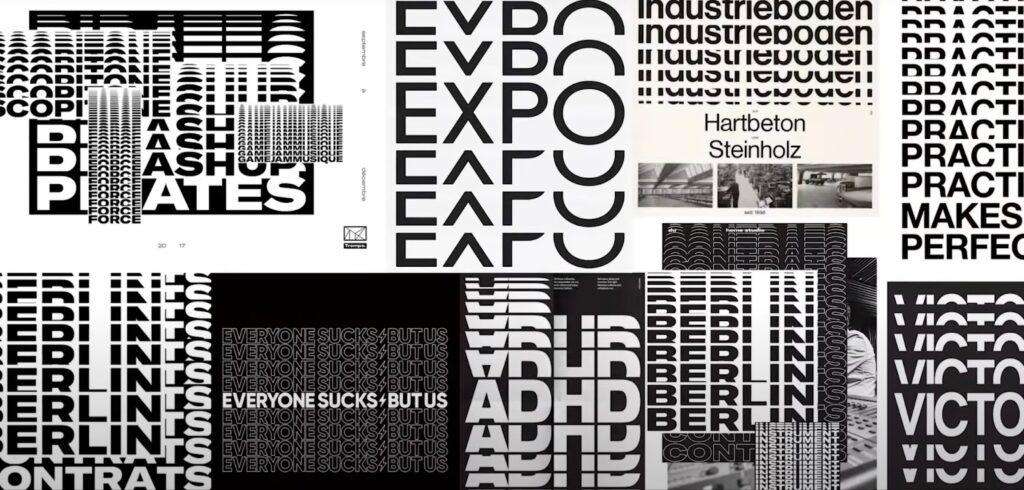
- Layering: Creates depth by overlaying text with different colors, textures, or patterns;
- Texturing: Applies surface details to give the impression of materials like metal, paper, or fabric;
- 3D Effects: Gives the illusion of space and volume to make text stand out;
- Animation: Brings movement to typography, enhancing the narrative through visual dynamics;
- Kinetic Typography: Involves the use of motion to connect the text visually with the concept it represents.
The table below illustrates how these techniques can be applied to various types of illustrative typography:
| Technique | Application | Visual Effect |
|---|---|---|
| Layering | Poster Design | Depth and Complexity |
| Texturing | Brand Logos | Tactile Sensation |
| 3D Effects | Event Invitations | Dramatic Presence |
| Animation | Digital Advertisements | Engaging Narrative |
| Kinetic Typography | Instructional Videos | Enhanced Comprehension |
Through the thoughtful application of these advanced techniques, illustrative typography becomes more than just beautiful—it becomes an experience that engages, informs, and delights.
Conclusion
Illustrative typography, with its fusion of form and function, stands as a testament to the enduring power of well-crafted design. It goes beyond the basics of type to become an emotive force, one that can tell a story, invoke a feeling, or solidify a brand in the collective consciousness. As we continue to push the boundaries of digital technology, the art of illustrative typography will only grow more intricate and immersive, solidifying its role as an essential facet of visual communication.
FAQs
Illustrative typography can significantly enhance user experience by creating intuitive navigational cues and adding an emotional depth to the user interface, ultimately making digital interactions more engaging.
One can learn illustrative typography through various online courses, tutorials, and by studying the work of renowned typographers. Practice and experimentation are key to mastering the art.
When using illustrative typography, it’s important to consider copyright and font licensing agreements, ensuring that the typefaces used are properly licensed for the intended application.
Yes, with careful design choices such as considering contrast, size, and legibility, illustrative typography can be made accessible while still being visually engaging.
Balancing creativity with readability involves ensuring that the type remains legible and conveys the intended message while also using artistic elements to enhance the visual impact.