Advanced typography is the craft of arranging type to make written content not just readable, but visually compelling and engaging. It goes beyond basic font selection, encompassing the strategic use of typefaces, spacing, and layout to communicate effectively. As typography has evolved, it has become a crucial element of design, impacting how messages are perceived and interacted with. Good typography enhances user experience, ensuring that the intended message is conveyed clearly and memorably. This intricate form of communication is key in a world where visual content is king.
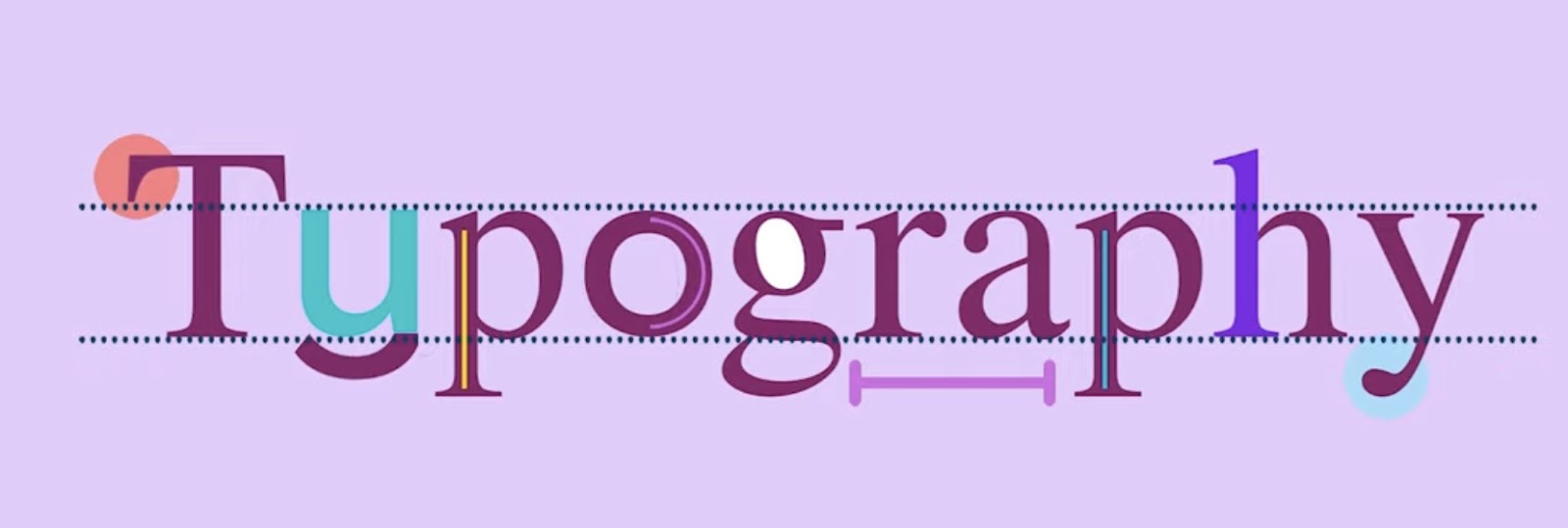
The Anatomy of Type
The anatomy of type is much like the anatomy of the human body—complex, intricate, and essential for function. Each letter in a typeface, known as a glyph, has its own unique structure, which can significantly affect readability and aesthetics. Let’s dissect the key components:
Serif vs. Sans Serif:
Serif fonts are characterized by small lines or strokes attached to the end of a larger stroke in a letter or symbol. Times New Roman and Garamond are classic examples. They’re often used in print due to their readability and tradition. Sans serif fonts, like Helvetica and Arial, lack these embellishments, which gives them a cleaner and more modern appearance, making them a popular choice for digital content.
Kerning, Leading, and Tracking:
- Kerning: Adjusting the space between individual letter pairs to achieve a visually pleasing result. For example, the letters “A” and “V” when placed next to each other often require kerning to reduce the visual gap;
- Leading: Refers to the vertical space between lines of text. It is crucial for readability; too little leading can make text feel cramped, too much can make it seem disjointed;
- Tracking: Unlike kerning, which adjusts spacing between specific pairs of letters, tracking is the uniform adjustment of spacing across a range of characters, affecting the overall density and texture of the text.
| Typography Term | Definition | Example Usage |
|---|---|---|
| Serif | A small line attached to the end of a stroke in a letter or symbol. | Times New Roman has prominent serifs. |
| Sans Serif | A typeface without serifs. | Helvetica is a commonly used sans serif font. |
| Kerning | Adjustment of space between individual letter pairs. | Proper kerning prevents the text from looking uneven. |
| Leading | The vertical space between lines of text. | Increased leading can enhance the readability of a paragraph. |
| Tracking | The uniform adjustment of spacing across characters. | Tracking is often increased to fill more space and create a certain aesthetic. |
Typeface Selection and Brand Identity
The confluence of typeface selection and brand identity is a dance of form and function. A typeface is not merely a vessel for words; it embodies the ethos of a brand, imbuing every letter with personality. The meticulous process of choosing the right typeface involves understanding the brand’s core values, target audience, and the emotional impact of different typefaces. For instance, a law firm might lean towards strong, authoritative serifs that speak of tradition and stability, while a tech startup might opt for sleek, clean sans serifs that project modernity and innovation.
Case studies of successful brand typography weave this narrative. Consider how Apple employs the sans serif Myriad Pro to mirror its clean, minimalist design philosophy. Alternatively, The New York Times uses its custom serif typeface to honor its historical gravitas while adapting to the digital age. These choices are never accidental; they are deliberate decisions that align with the brand’s voice and audience expectations.
The resonance between a brand’s visual identity and its typographic face can amplify its presence in a crowded marketplace. It’s about creating a visual language that can be heard above the noise—a language that speaks without speaking, compelling the audience through the sheer force of design.
Typography in Web Design
When it comes to web design, typography is not just about making words legible—it’s about setting a tone, providing a user-friendly experience, and ensuring that the content flows seamlessly on various devices.
Responsive Typography:
This is the practice of adjusting typeface and layout to work across different screen sizes and resolutions. The goal is to maintain readability and aesthetics from a smartphone to a large desktop monitor. This involves scaling font sizes, adjusting line heights, and sometimes changing font weights to ensure clarity at every size.
Web-safe Fonts vs. Custom Typefaces:
- Web-safe fonts are those that are widely available across different operating systems and devices, such as Arial, Georgia, and Verdana. These fonts ensure consistency and quick loading times;
- Custom typefaces can give a unique character to a website but require careful implementation with font services like Google Fonts or Adobe Fonts to ensure they display correctly on all devices.
Here’s a list of considerations for using typography in web design:
- Readability on Small Screens: Ensure that text is legible on small devices by using larger font sizes and increased line heights;
- Cross-Browser Compatibility: Test typography across multiple browsers for consistent rendering;
- Loading Times: Use web-safe fonts or ensure custom fonts are optimized for quick loading to improve user experience;
- Scalability: Employ relative units like ems or rems for font sizes to enhance scalability and responsiveness;
- Accessibility: Choose typefaces and font sizes that are easy to read for users with visual impairments.
Color Theory in Typography
The intersection of color theory and typography is a vibrant space where designers can infuse meaning and emotion into text. Color can elevate a message or sink it; it can shout or whisper. The hues chosen for typography carry as much weight as the words themselves. Consider the warmth of a coffee shop’s chalkboard menu written in earthy tones, invoking a sense of coziness, or the urgency of a clearance sale banner in bold reds. These are not just aesthetic choices; they are strategic design decisions.
When it comes to typography, color can enhance legibility and focus. The high contrast of black text on a white background is a classic example, but there’s a spectrum of possibilities. Here’s a succinct look at the emotional cues colors can signal in typography:
- Red: Energy, passion, danger;
- Blue: Trust, calm, stability;
- Green: Growth, health, prosperity;
- Yellow: Optimism, clarity, warmth;
- Purple: Creativity, luxury, spirituality;
- Black: Elegance, sophistication, power.
Utilizing colors effectively requires an understanding of contrast and complementation. High contrast colors improve readability, especially online, while complementary colors can highlight key information without straining the reader’s eyes. The following table offers a guide for pairing fonts with background colors for optimal readability:
| Font Color | Background Color | Use Case |
|---|---|---|
| Black | White | General text for maximum readability |
| White | Dark Blue | Headlines and calls to action for a professional tone |
| Dark Grey | Light Yellow | Subdued yet warm tones for highlights or quotes |
| White | Green | Eco-friendly or health-related content to evoke a natural feel |
| Black | Pale Orange | Engaging and inviting for promotional material |
While trends in color usage come and go, the principles of color theory remain constant. By leveraging these principles, designers can create typography that not only informs but also emotionally engages the reader.
The Art of Hierarchy in Typographic Design
Creating a visual hierarchy with typography is not just about aesthetics; it’s a vital part of user interface design that guides the reader through content in a logical manner. A well-executed typographic hierarchy helps to organize content, allowing users to quickly find what they’re looking for and understand the relative importance of each element.
Techniques to Establish Visual Order:
- Size: Larger fonts capture attention first and are typically used for headlines or important calls to action;
- Color: Utilizing different colors can distinguish text by its level of importance or relate it to specific actions or feelings;
- Weight: Bold or heavy font weights stand out against regular or light weights, signaling a higher rank in the hierarchy.
Consider this example hierarchy in a webpage layout:
- Main Headline (H1): Largest font size, bold weight, distinct color;
- Subheadings (H2, H3, H4): Decreasing sizes, varied weights, complementary colors;
- Body Text: Standard size and weight, high readability;
- Captions and Legal Text: Smallest size, lighter weight.
By establishing a clear hierarchy, you create a roadmap for the reader’s eyes, leading them from the most critical information to the details.
Accessibility in Typography
When discussing accessibility in typography, we are delving into the realm of design with a purpose beyond aesthetics. Accessible typography doesn’t just look good; it opens up content to a broader audience, including those with visual impairments. The goal is to deliver clarity, convenience, and an inclusive experience. Ensuring that typography is legible, with enough contrast against its background, is a cornerstone of accessible design. It’s about choosing type sizes that are legible on various devices and designing for ample white space to prevent visual clutter.
There’s also a compelling conversation around typefaces specifically designed for readability. Fonts like Atkinson Hyperlegible and OpenDyslexic include features that help distinguish letters, a boon for readers with dyslexia. These fonts showcase the potential of typography as a tool for inclusion, demonstrating how design considerations can have a profound impact on user experience.
Designers must also remain cognizant of the dynamic nature of web content. With the rise of e-readers and adjustable text sizes, it’s imperative that typography retains its integrity across all forms of media consumption. This dynamic scalability is not merely a feature—it’s a bridge to understanding, a facilitator of knowledge, and a silent ally in the pursuit of universal accessibility.
Typography Trends and Innovation
Staying abreast of trends is crucial for designers who want to keep their work fresh and relevant. However, following trends does not mean abandoning time-tested principles of good design. Instead, it means understanding how new ideas can fit within the frameworks of typography that ensure readability and aesthetic pleasure.
Latest Trends in Type Design:
- Variable Fonts: These are a new form of font technology that offers significant flexibility and control over type appearance;
- Color Fonts: Fonts that contain colorful and textured characters are becoming more popular, especially in web design;
- Kinetic Typography: The technique of moving text in videos and presentations to capture attention and add emphasis.
Predictions for the Future of Typography:
- Increased Interactivity: As web technologies evolve, expect to see more fonts that react to user actions;
- Augmented Reality Fonts: Typography that integrates seamlessly with AR experiences could become commonplace;
- Sustainability in Type Design: Eco-friendly fonts that use less ink and screen energy will likely gain popularity.
Incorporating these trends into your work can give you an edge, but always weigh them against the project’s goals and the principles of good typography.
Typography Software and Tools
Delving into the realm of typography requires not only a keen eye for design but also the right set of tools. The software and tools at a typographer’s disposal can range from the ubiquitous Adobe Creative Suite, with its powerhouse Adobe Illustrator and the font-rich InDesign, to specialized software like Glyphs or FontLab for those who venture into creating their own typefaces.
The mastery of these tools is no small feat. Each program offers a labyrinth of features, tailored to fine-tune kerning, leading, and everything in-between. The proficiency in these applications often distinguishes the amateur from the seasoned professional. For example, Illustrator excels in vector-based logo design, allowing for precise manipulation of letterforms, while InDesign shines in layout design, offering robust typography controls to ensure that the end product is both beautiful and functional.
The digital age has also seen the rise of online typography tools, such as Google Fonts and Adobe Fonts, which provide a plethora of typefaces that can be easily integrated into web design. These platforms have democratized typography, allowing designers of all levels to experiment with and deploy professional-looking type with ease.
Creative Applications of Advanced Typography
Advanced typography is not confined to the printed page or the static web image; it is an art form that transcends mediums, adapting and evolving with technology and culture. From the printed poetry that dances across the page to the dynamic text in motion graphics, typography can tell a story, set a scene, and evoke emotion.
In the realm of editorial design, typographic creativity manifests in the form of playful layouts, where text wraps around images and breaks free from the grid, engaging the reader’s curiosity and guiding them through the narrative.
Motion graphics bring a kinetic energy to typography, with letters that bounce, shift, and transform, capturing the viewer’s attention in a way that static text simply cannot. This dynamic form of typography is not just for entertainment; it can make complex data more digestible, turning a dense infographic into an engaging visual story.
The following list exemplifies creative applications of advanced typography:
- Editorial Design: Magazines and newspapers utilizing unique column layouts, pull quotes, and typographic illustrations to guide the reader’s journey;
- Motion Graphics: Animated typography in video content that adds rhythm and emphasis to storytelling;
- Interactive Media: Web design that incorporates hover effects, changing typefaces, or dynamic scaling based on user interaction;
- 3D Typography: Utilizing depth and perspective, 3D typography adds a new dimension to visual communication, often seen in advertising and poster design;
- Augmented Reality: Overlaying typographic information onto the real world, enhancing the user’s perception and interaction with their environment.
Through these applications, typography is elevated from a mere means of conveying information to an expressive tool that can animate, persuade, and delight. It is this blend of form, function, and innovation that continues to push the boundaries of what typography can achieve.
The Impact of Typography in Marketing
Typography in marketing is the silent ambassador of brand identity—it can affect perceptions, influence emotions, and sway decisions. The strategic use of typography in marketing materials can significantly impact how a message is received. Whether it’s the elegance conveyed by a luxury brand through delicate serifs or the forward-thinking attitude of a tech company expressed through sleek, geometric sans-serifs, every typographic choice sends a subliminal message to the consumer.
Consider the impact of a well-designed typographic poster: the way the largest type attracts the eye to the most important message, the journey the reader’s gaze takes down the page, led by decreasing font sizes and contrasting colors, all culminating in a compelling call to action. This is not by chance but by design. The effectiveness of these choices is often measured through marketing campaigns, where conversion rates can hinge on the clarity and emotional appeal of the typographic presentation.
The subtleties of typography can also be leveraged to create a sense of familiarity and trust. Repetition of typographic elements across different mediums—be it print, web, or packaging—establishes a consistent voice, a hallmark of brand reliability.
Conclusion
Advanced typography is more than an artful arrangement of letters; it’s the cornerstone of visual communication that gives life to the written word. It’s a power that can evoke emotions, reinforce messages, and influence decisions. With each carefully chosen font, weight, size, and color, typographers craft an invisible yet palpable experience for the audience. As technology evolves and design trends shift, the field of typography remains dynamic, with ongoing learning essential for any designer.
Embracing new tools, understanding emerging practices, and studying the impact of typography across different media are all part of the continual evolution of this craft. The power of advanced typography lies not only in its ability to make content aesthetically pleasing but also in its function as a silent narrator of brand stories and a guide through the digital landscape.