The manner in which you arrange your print project can significantly impact the ultimate appearance and tactile quality of your marketing material. Among the most potent yet uncomplicated methods to infuse novelty is through the incorporation of a bleed into your design.
If you happen to be uncertain about the precise definition of a bleed, its appropriate application, and the potential hurdles associated with its inclusion in your project, continue perusing. We will delve into the concept of bleeds and offer valuable guidelines to ensure that your print project consistently exudes an impressive allure.
Understanding the Concept of Bleed in Printing
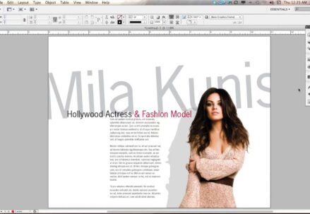
In the realm of professional printing, the concept of a ‘bleed’ is integral to achieving a visually seamless product. The technique involves extending the design beyond the final size of the piece. This means that graphics, backgrounds, or color blocks spill over the intended cut lines. After the printing process, the excess is trimmed off, ensuring that the final product doesn’t retain unsightly strips of white at the edges, which can occur due to minute shifts during the cutting phase. The result is a crisp, edge-to-edge color or design that gives a finished and professional look to the printed item.
The Dichotomy of Bleed vs. No Bleed
Imagine flipping through a stack of brochures or business cards. Some burst with color right up to the paper’s edge, while others retain a stark, unprinted frame. This is the difference between bleed and no bleed. In the no bleed approach, the printing ceases before reaching the edge, creating a border – often white – that frames the content. In contrast, the bleed technique extends the print beyond the edge, so when it’s cut to size, the design appears to “bleed” off the page, eliminating borders and creating a more immersive visual experience.
Evaluating the Advantages and Trade-Offs of Print Bleeds
Before deciding on whether to incorporate a bleed in a printing project, it’s essential to weigh the benefits and possible drawbacks. Here’s an in-depth look at factors to consider:
When Bleeds Are Beneficial:
- Enhanced Visual Appeal: A bleed can dramatically increase the visual impact of a design, particularly for full-color backgrounds or vivid imagery that extends to the paper’s edge;
- Precision in Design: If your artwork includes elements that reach the edge, a bleed ensures that no important details are inadvertently trimmed away;
- Professional Finish: For materials like booklets, magazines, or folded pamphlets, bleeds ensure that the design continues across folds without any breaks, offering a sleek and uninterrupted look.
Potential Considerations:
- Cost Implications: Printing with a bleed often requires a larger sheet of paper since the design is printed larger than the finished size. This can sometimes lead to higher production costs;
- Design Adjustments: Certain projects, such as those with a specific border or frame, may be better suited to a no bleed design to maintain the integrity of the intended aesthetics.
Tips for Implementing Bleeds:
- Consult with Professionals: If unsure about how to proceed, it’s wise to consult with a printing specialist who can provide advice tailored to the specific project;
- Check Print Specifications: Always ensure the design aligns with the printer’s specifications for bleed to guarantee the best results;
- Consider the End-Use: Reflect on how the material will be used or displayed. If it’s to be presented or distributed alongside materials without bleeds, consider if a unified look is important.
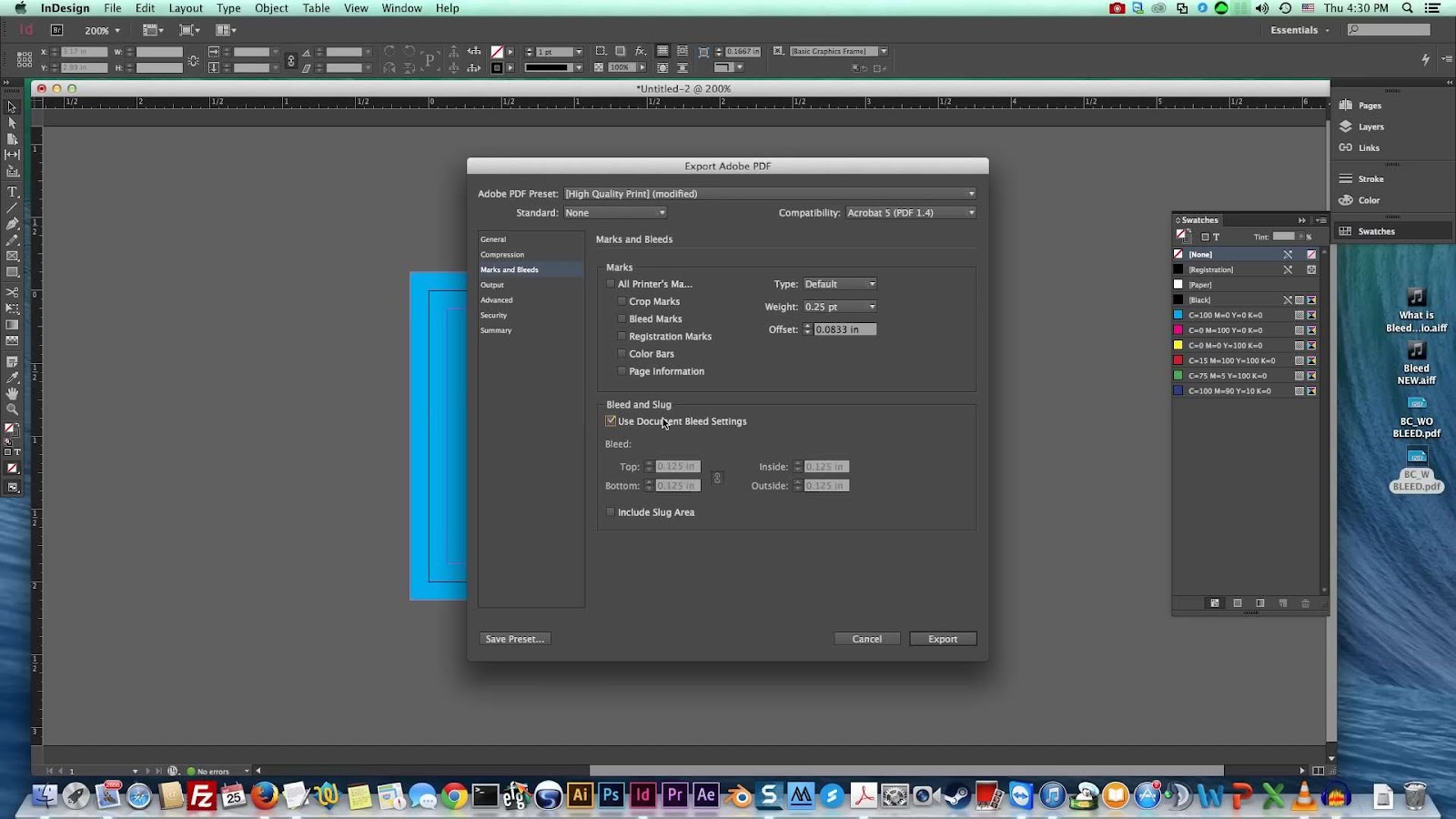
Deciphering Proof Marks for Print Jobs with Bleeds
Understanding Trim and Fold Indicators
Incorporating bleeds into print projects is an integral part of creating a polished, edge-to-edge look in the final product. Recognizing the various markings on a proof is essential for achieving the desired outcome.
Trim Marks: These are the guideposts for the final cut of the page. You’ll notice them as small lines intersecting at the corners just outside your main content area. They play a crucial role in ensuring that the imagery extends fully to the edge of the paper, leaving no unwanted margins or white space post-trim.
Tips for Perfect Trimming:
- Always verify that the trim marks are correctly positioned according to the dimensions of the final product;
- Confirm that the distance from the trim marks to the edge of the image is equal on all sides to maintain symmetry after cutting;
- Fold Marks: Look for these as dotted or dashed lines typically indicating the fold points on larger sheets. For example, these marks guide the precise half-folding of an 11″ x 17″ paper into a booklet format.
Recommendations for Accurate Folding:
- Ensure the fold marks align with the intended design, especially if the fold intersects any text or vital imagery;
- Pre-fold samples to check for alignment issues before running the entire batch.
Leveraging Graphic Design Software for Precision
Default settings in graphic design programs are often calibrated to offer optimal results for bleeds, trims, and folds. Nevertheless, a deeper understanding of these elements is beneficial for creating superior printed materials.
Insights into Software Settings:
- Double-check default settings against project requirements to avoid any discrepancies;
- Adjust bleed settings to accommodate specific print machinery or paper sizes if needed.
Crafting Professional Print Materials
Knowledge of bleeds, trims, and folds is a gateway to assembling print projects that exude professionalism and attention to detail.
- Enhancing Print Quality:
- Conduct a thorough review of proofs, scrutinizing the positioning of trim and fold marks;
- Collaborate with your print provider to understand their specific requirements and capabilities.
- Additional Considerations:
- Factor in the type of paper, as different thicknesses and textures may affect how ink sets and how paper folds;
- Consider the printing method (digital vs. offset), as this can impact the bleed requirements and overall presentation.
In conclusion, while software presets offer a strong foundation, the nuances of print preparation can significantly impact the final product. An in-depth comprehension of proof markings, coupled with a proactive approach to design and consultation with printing professionals, can elevate the quality of any printed magazine or material. Dive into the fascinating world of typography and discover how ‘widows‘ can shape the visual harmony of your designs.
Conclusion
Choosing to use a bleed in printing projects is largely dictated by the visual and functional requirements of the piece. It can elevate the design, ensuring a professional and polished look, especially critical in marketing and branding materials. While it may entail a slightly higher cost and require careful planning, the benefits of a bleed can significantly outweigh these factors, resulting in a stunning final product that stands out. Conversely, for projects with a distinctive border or when cost-savings are paramount, opting out of a bleed could be the appropriate choice.