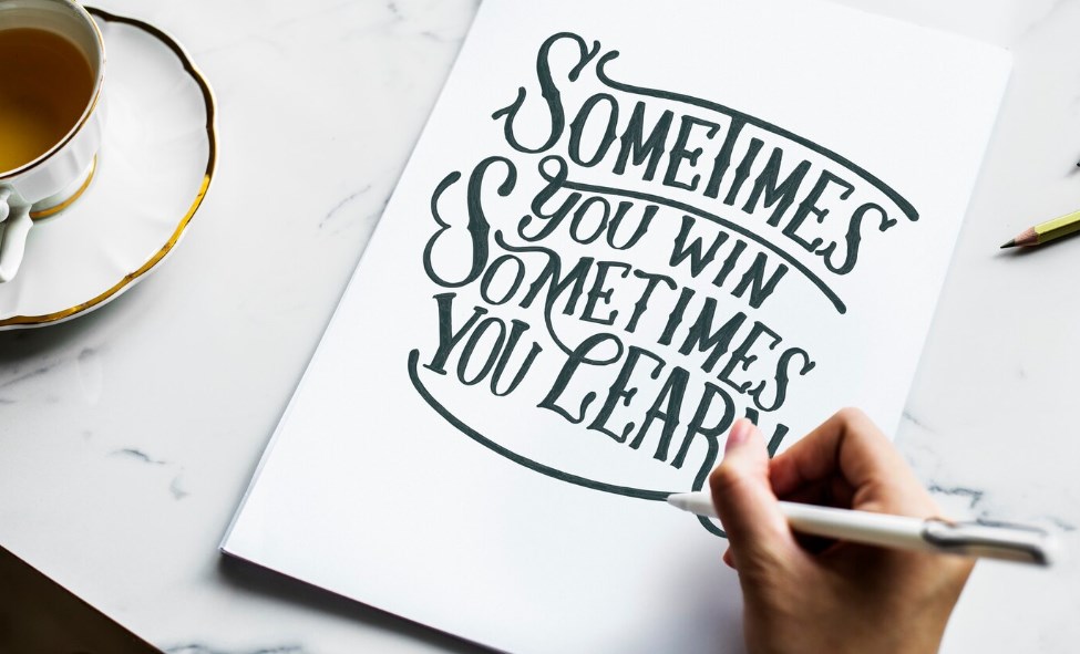
In the dynamic world of graphic design, the ultimate pursuit often transcends the creation of visually pleasing arrangements. The true challenge lies in captivating and engaging the audience, prompting not just a momentary glance but a lingering gaze that seeks to unravel the visual narrative presented. This is where the concept of visual tension enters the stage, a powerful tool in the designer’s arsenal, poised to transform the ordinary into the extraordinary. Visual tension, with its undercurrents of conflict and contrast, serves as a catalyst, prompting an involuntary pause and deeper engagement from the viewer. It’s the subtle yet potent force that can elevate a design from mere aesthetics to a compelling story told through shapes, colors, and spaces.
Let’s embark on a journey to explore the artistry behind inducing visual tension in graphic design, uncovering the strategies that turn static images into stories that captivate the imagination and hold the eyes hostage to the designer’s intent. This exploration will not only reveal how to infuse tension effectively but will also unravel the secrets to maintaining a viewer’s curiosity from the initial encounter to the final, revealing moment.
Harnessing Visual Tension in Graphic Design
In the realm of graphic design, the intuitive aim is to create aesthetically pleasing work. However, to truly captivate an audience, one might consider a different strategy: mastering the art of visual tension. This is the dynamic equilibrium that arises from the interaction of elements within a composition that are in stark contrast or opposition to each other. Such visual tension demands the audience’s attention, compelling them to engage with the design on a deeper level as they seek to resolve the underlying dissonance.
Strategies for Injecting Tension into Your Design:
- Near Encounters of Elements: Craft scenarios within your design where elements almost collide but maintain a hair’s breadth distance. This teasing proximity captivates the viewer’s gaze as they anticipate or even wish for contact, creating a magnetic pull towards that area of your design.
Tip: Use negative space strategically around these elements to amplify the tension.
Intentional Asymmetry: Step away from the safety of alignment and symmetry. Introduce elements that are slightly skewed or asymmetrically placed. This deviation from the norm can provoke discomfort, yet it’s this very imbalance that can make a design stand out.
Recommendation: Balance is key — ensure the composition as a whole maintains harmony to prevent an overly chaotic look.
- Colorful Confrontations: Implementing complementary colors in close proximity can produce a visual ‘buzz’ or ‘vibration’. These colors, when placed side by side, compete for dominance in the viewer’s perception, creating a stimulating and energetic effect.
Insight: Choose complementary colors that align with the emotional tone of your message for a compelling impact.
Incorporating Tension Effectively:
Focusing on these techniques should not be random; instead, apply them with purpose at strategic points within your artwork. Here’s how to use tension effectively:
- Central Focus: Apply tension-generating tactics at the central point of your design to immediately grab attention and create a starting point for the viewer’s journey through your piece;
- Peripheral Vision: Infusing the corners and edges with tension draws the viewer’s eyes across the entire canvas, ensuring that every part of your design gets its due consideration;
- Narrative Nuance: Allow the tension to serve the storytelling aspect of your design. Each element of tension should contribute to the overall narrative you wish to convey, adding layers and depth.
By embedding these techniques into your designs thoughtfully, you offer viewers an invitation to explore and interpret your work beyond a superficial glance. The visual tension becomes a silent narrator, guiding the audience through an experience that is as intellectually stimulating as it is visually engaging. Explore the multiverse of images photoshop can handle! Discover how many image types are supported by photoshop in this epic guide.
Conclusion
To conclude, the strategic incorporation of visual tension in graphic design transcends conventional aesthetics and delves into the realm of psychological engagement. By employing techniques such as almost-touching elements, purposeful asymmetry, and vibrant color juxtapositions, designers can transform passive viewers into active participants in the visual dialogue. These elements of tension act as the threads that stitch together the fabric of visual storytelling, each tug and pull shaping the narrative arc of the design.
Designers, by mastering the delicate balance of tension, invite an audience to not only see but to experience a design with heightened awareness and engagement. The power of visual tension lies not in its overt presence, but in its ability to resonate subtly with the viewer, to prompt an internal dialogue, and to leave a lingering presence long after the initial viewing.