Good design is a delicate balance of creativity and strategic decision-making. To the untrained, identifying effective design might be a matter of gut feeling, a visceral reaction that might say “This design feels right or it doesn’t”.
However, in the professional sphere, designers know that while instinct does play a part, there is a far more systematic approach that underpins the creation of visually stunning and functional designs.
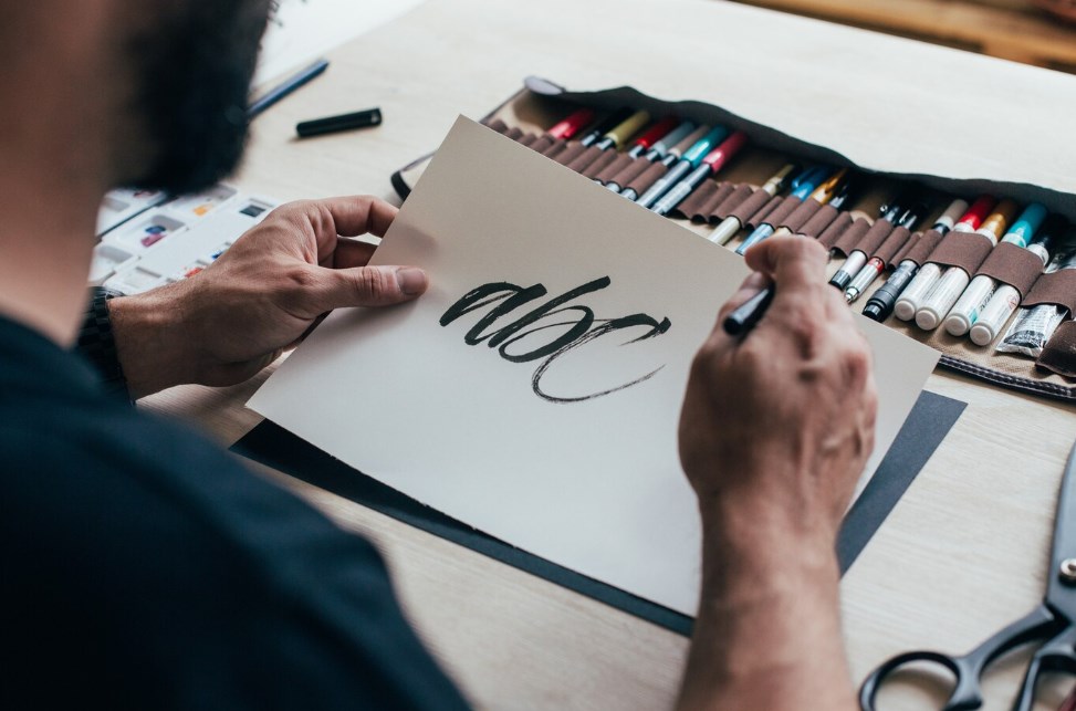
The Power of Method in Design
Vague and unstructured design processes might lead to several rounds of revisions, thus consuming a significant amount of time, exacerbating frustrations, and depleting client budgets. This is where having a solid and time-tested method for creating design elements, such as typography, becomes a vital tool in a designer’s arsenal. By establishing an effective method for building the typography structure on a page, designers can save time, resources, and peace of mind.
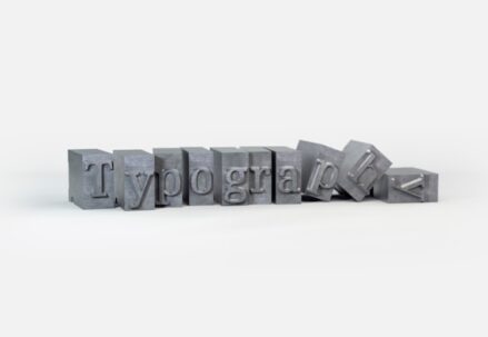
The Science of Typography
Typography extends beyond the mere selection of fonts; it also involves carefully considering their size and weight to create a visually appealing and reader-friendly page. Mastery of typography, therefore, involves understanding these elements and knowing how to use them to build effective page hierarchies.
Understanding Font Size
Page hierarchy can be deftly crafted by “working from the page up”, starting with the body copy, which typically contains the most content and is generally positioned towards the lower section of the page.
- For documents with flowing body copy, it is important to set the text size relative to the column measure, which refers to the width of continuous text columns. Wider measures demand larger type sizes. A generally accepted guideline is to aim for a character count of between 50 to 70 per line for a comfortable reading experience;
- Calculating type size involves halving the measured width in picas, providing a starting point. For example, a measure that’s 22 picas wide will start with an 11-point type. Adjustments to the type size can be made in the context of the typeface’s visual presence, the piece’s context, or simply personal preference.
Typographer Eric Gill asserted that an optimal line contains ten to twelve words, while Robert Bringhurst advises that 66 characters should be aimed for and warns against justifying text in columns less than 40 characters.
The Impact of Font Weight
Once the body text size is identified, the design process moves upwards into the header area. Contrast can be introduced through the use of font weights, which helps guide the reader down the page. The font weight is an indispensable factor in determining the header size, which should be proportionate to the body text size. It directly influences the best size range for optimal readability.
Bear in mind that the thinner or thicker typefaces are, the larger they need to be to maintain legibility. Medium-weight fonts strike a good balance with space-to-stroke proportions.
Extra thin fonts can appear virtually invisible against a background, while extremely thick fonts have counters that close in when small, reducing legibility. Therefore, if a designer opts for a typeface on the extreme ends of the weight spectrum, it’s best to ensure they feature higher up on the page at a larger size to enhance legibility.
Exploring Font Weight in Web Design
Web design is a different beast when compared to traditional print design, especially when considering typography. Factors such as screen resolution, device size, and backlighting play crucial roles in determining how legible a font would be to the end user. Thus, understanding the subtleties of font weight usage for the web can be a differentiator in creating engaging and user-friendly websites.
Font Weight in Print Design
Print design comes with its own set of challenges and considerations. Factors such as ink spread, paper quality, and printing technology can all influence the appearance and legibility of fonts. It becomes crucial to understand these factors when employing font weights in print design, ensuring that the final product meets both aesthetic and functional requirements.
| Key Point | Details |
|---|---|
| Recognizing Good Design | Design decisions should not be based solely on instinct but should use a systematic and strategic approach. |
| Effective Designing Method | Having a structured method for building typography structure on a page minimizes revisions and expedites the design process, leading to saved time and resources. |
| Importance of Typography | Typography involves more than selecting fonts; it involves considering their size and weight to make the page visually appealing and reader-friendly. |
| Significance of Font Size and Measure | The font size should be set in relation to the column measure. The wider the measure, the larger the type size should be for the ideal character count per line. |
| Impact of Font Weight | Introducing contrast through font weight helps guide the reader down the page and determines the header size. The thinner or thicker the typefaces, the larger they need to be to maintain legibility. |
| Font Weight in Web Design | Screen resolution, the size of the device, and backlighting play crucial roles in determining legibility. Understanding font weight usage in web design can enhance user experience. |
| Font weight in Print Design | Ink spread, paper quality, and printing technology can influence the appearance and legibility of fonts. Understanding these factors when using font weights in print design can ensure a high-quality final product. |
| The Magic of Design | When all elements of design, including page size, type size, and weight usage on the page, relate harmoniously, it results in an engaging reader experience. |
Closing Thoughts
Typography is a critical aspect of design, the correlation of page size to type size to weight usage on the page is an essential relationship that every designer should grasp. When these elements relate harmoniously, the result is a well-received and successful design that achieves the desired impact on its audience.
The magic of design happens when all elements coalesce to produce harmony on the page, leading to an engaging reader experience.