Starting to learn and excel in typography is like uncovering a hidden aspect of our daily communication. It’s the skill that transforms text on a page or screen into something that’s not only easy to read but also carries emotions and looks attractive. This guide is designed to help beginners grasp the basics of typography, from its definition to the finer points like type classifications and families. Whether you’re an aspiring graphic designer, a marketer looking to improve your branding, or simply someone interested in the visual aspects of text, this tutorial will provide a solid starting point for your typographic journey.
What Is Typography?
Typography is the meticulous craft of arranging type, the purpose of which is to ensure that written text is not only comprehensible and fluent in reading but also aesthetically pleasing to the viewer. This art form is multifaceted and detailed, involving several components that work together to create effective visual communication:
- Font Selection: Choosing the right font is critical as it sets the tone and voice of the written content. Each font carries its personality, from professional and authoritative to casual and playful;
- Size: The size of the text affects its readability and how it hierarchically fits within the overall design. Larger fonts are often used for headlines or important statements to draw attention;
- Line Length: The length of a text line influences how the eye moves across a page. Optimal line length improves readability and the reader’s comfort;
- Spacing: This includes both the spacing between lines (leading) and the spacing between characters (kerning and tracking). Proper spacing prevents text from appearing too dense or too sparse;
- Color: Color can emphasize or tone down text, invoke emotions, and convey meaning, often before a single word is read.
Essentially, typography dresses words to impress and impact. It shapes the user experience by guiding the reader’s eye and providing visual landmarks. Good typography can elevate the presentation of text, akin to how fashion can transform the appearance of an individual, playing a crucial role in the conveyance and reception of the message within any given content.
The Significance of Typography
The significance of typography extends well beyond the mere presentation of words on a page. It serves as an essential tool for communication, imparting not just the bare textual information but also imbuing the message with a specific tone, voice, and emotional context. Here are several reasons why typography holds such importance:
- Aids Comprehension: Well-executed typography facilitates the understanding of the text, enabling readers to navigate through the content with ease;
- Sets Tone: The choice of typeface and style can greatly affect how a message is perceived—whether it is to be taken seriously, with a sense of urgency, or with a more light-hearted approach;
- Guides Emotion: Typography can evoke and manipulate emotions, subtly influencing how the reader feels about the text’s message;
- Ensures Clarity: Clear typography helps to eliminate ambiguity, making sure that each word and sentence is unequivocal and understood in its intended context;
- Enhances Aesthetics: Good typography contributes to the visual appeal of content, making it more attractive and engaging for the reader;
- Facilitates Branding: Consistent use of typography becomes a part of a brand’s identity, helping consumers to recognize and remember the brand.
Conversely, poor typography can create a barrier between the text and its audience. If the typography is difficult to read, or if it fails to align with the intended message, it can deter readers, no matter how powerful the underlying content might be. It can lead to misunderstandings, disinterest, and a lack of engagement. Thus, typography is not just a backdrop for the text; it is an integral part of the message itself, shaping the way the content is consumed and interpreted by the reader.
Typography Lexicon: Definitions and Terminology

Typefaces and Fonts
Many people assume the terms “typeface” and “font” are synonymous, but they’re mistaken as both words have distinct meanings.
Nick Sherman, a typographer, introduced an excellent metaphor to clarify the differences between “typeface” and “font.” He suggested an analogy with music, comparing these two typographic terms to “song” and “mp3.” For instance, when you express your fondness for a tune, you’d say, “I adore this song!” not “I adore this mp3!” The song represents the artistic piece itself, while an mp3 file merely acts as the format for transmission.
In the world of typography, the same principle holds true. “Typeface” should be used when you’re referencing the artistic aspect (that is, the visual design). It represents the more conceptual aspect of design when discussing how a particular set of letters presents or the impression it imparts. Take Helvetica, for example, which is a typeface.
When referring to the tangible aspect of a collection of letters and characters, the correct term to use is “font.” It applies to the actual usage form, be it a digital file on your device or a physical set of metal type. This represents the concrete embodiment of the character set. For instance, both Helvetica Bold and Helvetica Light Oblique qualify as fonts.
Below are examples of how to appropriately apply these terms in sentences:
- “Impressive. The typeface you selected really enhances the cohesiveness of this design.”;
- “I’ll adjust the font size to 12 points to ensure it fits within the specified area.”
Typeface Structure
Effortless dialogue with designers is achievable by mastering their vernacular, underscoring the significance of grasping the structure of a typeface.
Like the human body, where each bone has a designated term, every fragment of a letter is named distinctly. Presented below are three schematic representations that delineate the composition of individual letters, the interplay of these segments, and their alignment on a baseline.
Here’s how each of the terms here are defined:
- Baseline: The line where the letters sit;
- Cap height: The distance from the baseline to the top of the capital letter;
- X-height: Located in between the baseline and the cap height, it’s the height of the body of the lowercase letter. (In this case, it’s the letters ‘a’, ‘u’, and ‘y’.);
- Bowl: The curved part of the character that encloses the circular or curved parts of some letters, like ‘d’, ‘b’, ‘o’, ‘D’, and ‘B’. (In this case, it’s that round shape sticking off the letter ‘a’.);
- Serif: The slight projection finishing off a stroke of a letter in certain typefaces. (In this case, it’s that little foot sticking off the letter ‘l’.);
- Descender: The longest point on a letter that falls beyond the baseline.
Here’s how these terms are defined:
- Ligature: The stroke that joins adjacent letters. (In this case, you’ll notice the ‘f’ and the ‘i’ smush together to form one character.);
- Stem: The base of a letter, similar to the stem of a flower;
- Spine: The curvy body of the letter ‘s’ — and only the letter ‘s.’ It gets its own term because the spine can be almost vertical or mostly horizontal, depending on the typeface;
- Ascender: The portion of a letter that extends above the mean line of a font — i.e., is taller than the font’s x-height. (In this case, you’ll also notice the letter ‘h’ is actually taller than the x-height.)
Here’s how these terms are defined:
- Cross bar: The bar that goes across the inside of the letter and connects one side to another. (In this case, it’s the bar inside the capital letter ‘B’.);
- Counter: The empty space in the middle of letters such as ‘B’, ‘O’, or ‘A’;
- Finial: The tapered end of letters such as ‘e’ or ‘c’;
- Terminal: A type of curve that you see at the top of the letter ‘f’ or the end of the letter ‘j’.
Kerning

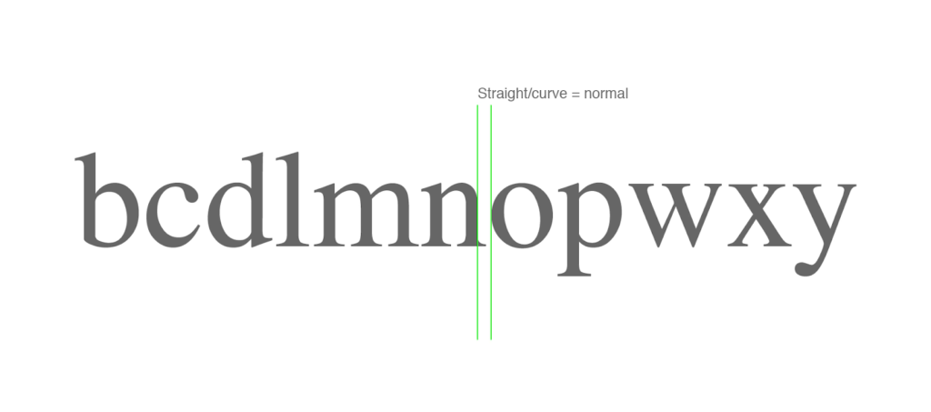
Kerning refers to the process of adjusting the spacing between characters in a typeface, aiming to create a more visually pleasing and readable arrangement. This typographic technique is essential, especially in design and print, where the uniformity of letter spacing can significantly impact the overall appearance and legibility of the text.
Effective kerning ensures that the space between each letter pair is visually even, regardless of the letters’ shapes and sizes. This detail-oriented adjustment can be the difference between an amateur and a professional look in typography. It is particularly important in logos, headings, and other display text where the details are more pronounced and can either attract or distract the reader.
While modern digital fonts often have built-in kerning pairs, designers sometimes need to manually adjust these to achieve the desired effect. For instance, certain combinations of letters, like ‘AV’ or ‘TA’, can have awkward spaces that appear too wide or too narrow, potentially disrupting the flow of reading. Kerning adjusts these spaces, so they appear more uniform to the eye, contributing to the aesthetic harmony and readability of the text.
Tracking
Tracking, often confused with kerning, is another fundamental aspect of typography that involves adjusting the overall spacing across a block of text. Unlike kerning, which is the process of adjusting the space between two individual characters, tracking applies a consistent change in spacing between all characters in a word or passage. This uniform adjustment is crucial for affecting the text’s density and texture, enhancing both aesthetics and readability.
In practice, tracking is usually altered with care, often in small increments. This subtle fine-tuning can significantly improve the overall look of a paragraph or document and is especially vital in large blocks of text, headings, or any textual elements where the character density can affect visual comfort and readability. The decision to adjust tracking should be informed by the specific requirements of the text and its design context, aiming to strike a balance that allows for easy reading and a visually pleasing typographic presentation.
Leading
Leading is a typographic term that refers to the vertical space between lines of text, originating from the days of hand-typesetting where strips of lead were used to separate lines. This spacing is crucial for readability and aesthetic appeal; it helps to determine how text is presented and received by the reader. Adequate leading allows the eye to move easily from one line to the next, enhancing the reader’s ability to absorb the content without strain. It varies depending on the font size, typeface, and the purpose of the text, whether for extended reading in a novel or quick scanning in signage.
Digital design has retained this concept, adjusting leading through software, which can be measured in points or pixels. In desktop publishing, leading is often calculated and adjusted automatically, but fine-tuning by a skilled designer can greatly improve the legibility and elegance of the text, demonstrating how traditional practices continue to influence modern typography.
Hierarchy
Typically, it is desired for the title to capture the initial attention of readers. This is the reason titles are generally presented in a larger and more prominent font style compared to the main text. To make certain phrases or sentences more noticeable within the text, techniques like bolding and italicization are employed.
A well-established hierarchy allows the reader to easily skim from one section to another, identifying the key points swiftly.

Type Classifications
| Typeface Category | Description | Common Examples |
|---|---|---|
| Serif Typefaces | Classic appeal with small serifs aiding reading flow, ideal for print materials. | Times New Roman, Georgia, Garamond |
| Sans Serif Typefaces | Modern appearance, clean lines, preferred for digital screens and web design. | Arial, Verdana, Futura |
| Blackletter Typefaces | Intricate and calligraphic style, evoking tradition and formality, suited for headers and logos. | Cloister Black, Deutsche Zierschrift, Germanica |
| Script Typefaces | Emulate handwritten text, offering fluidity and expressiveness, often used for branding. | Formal Scripts, Casual Scripts |
Type classifications provide a framework to understand and categorize the vast array of typefaces available in the design world. Each classification comes with its unique characteristics and historical background, influencing where and how a typeface might be used.
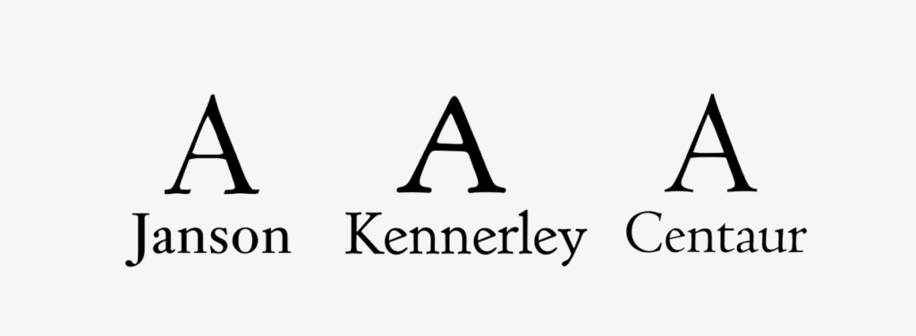
- Serif Typefaces are known for their classic appeal, with small lines or extensions called serifs at the end of their strokes. These serifs are believed to aid the flow of reading, especially in print, by creating an invisible line that helps guide the eye from one word to the next. Common serif typefaces include Times New Roman, Georgia, and Garamond, often found in the body text of novels and lengthy printed materials due to their readability and traditional aesthetic;
- Sans Serif Typefaces have a more modern appearance, characterized by clean, simple lines without serifs. The term “sans serif” is derived from French, meaning “without serif.” These typefaces are favored for their clarity and simplicity, making them highly readable on digital screens and at lower resolutions. They are commonly used in web design and digital interfaces, with popular sans serif typefaces including Arial, Verdana, and Futura;
- Blackletter Typefaces, also known as Gothic or Old English, are recognized for their intricate and calligraphic style, featuring thick and thin strokes and ornate serifs. This style was predominant in manuscripts and the earliest printed books, like the Gutenberg Bible. While blackletter fonts, such as Cloister Black, Deutsche Zierschrift, and Germanica, are not typically used for body text due to their complexity, they are still chosen for their dramatic flair in headers, logos, and signage to evoke a sense of tradition and formality;
- Script Typefaces emulate the fluidity and expressiveness of handwritten text. With advancements in digital typography, script fonts can be intricately designed to seamlessly flow together, mimicking the natural variations in handwriting. This category is divided into formal scripts, which reflect the elegance of seventeenth and eighteenth-century handwriting, and casual scripts, which have a more relaxed and contemporary feel. Script typefaces are often used for invitations, branding, and any design work where a touch of personalization or elegance is desired. However, due to their decorative nature, they are not typically suitable for body text in long documents.
Type Families
Type families are akin to extended kin in the world of typography, where the primary design is considered the progenitor from which various other styles and weights are derived. These families encompass a versatile palette of typefaces that share a cohesive visual structure while presenting an array of styles to provide a broad spectrum of expression within a single design language.
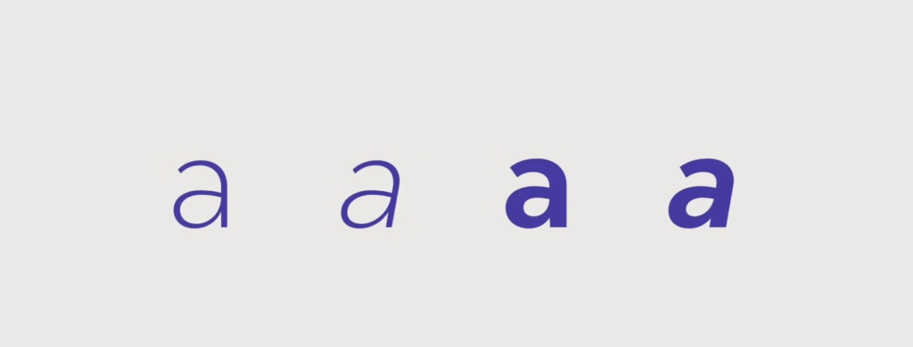
A comprehensive type family may include several weights (thin, light, regular, medium, bold, extra bold, etc.), styles (italic, oblique), and widths (condensed, extended, normal). Each variation serves a specific purpose and enables typographers and designers to maintain visual harmony across different design contexts. The weights can communicate different levels of emphasis within a text, while styles such as italics typically indicate a shift in tone, like a quieter voice or a side comment. Widths are particularly useful in space-sensitive environments, allowing for more flexibility in layout design without sacrificing the family resemblance.
Beyond the basics, some type families also offer small caps, old-style figures, and ligatures, which further enhance the type’s utility and aesthetic value. For example, small caps can be used for acronyms or initials to blend more seamlessly with lowercase text, and old-style figures can provide a more classical, integrated look in body text.
Typography Fonts: Resources & Examples
The realm of typography is rich with resources and illustrative examples that can both inspire and educate aspiring designers, typographers, and anyone with an interest in the visual aspect of written language. Online resources, such as Google Fonts and Adobe Fonts, act as extensive repositories, offering an array of typefaces ranging from time-honored classics to cutting-edge modern designs, all available for use and exploration. These libraries not only facilitate access to high-quality fonts but also provide tools for comparing and testing typefaces in various contexts, allowing users to select the perfect typography for their projects.
For a more hands-on understanding of typography, examining real-world examples serves as an exceptional learning strategy. By scrutinizing the typographic choices made in successful website designs, award-winning book layouts, and compelling marketing campaigns, one can discern the subtleties of font selection and application. Observing how a sans serif font contributes to a clean and minimalistic web interface or how a serif font in a novel enhances legibility and comfort over extended reading sessions, provides practical insights.
Conclusion
This introductory typography tutorial has aimed to demystify the basic elements and principles of the craft. Typography, when done well, can significantly enhance the communication and aesthetic appeal of your work. As you continue to practice and study, remember that typography is an art form that plays with the senses. It’s a balance of form and function, where the right type choice can tell a story just as compellingly as the words themselves. Let this guide be the first step on your path to becoming a proficient typographer, and may your designs speak volumes in their silent language of type. You might be interested in Steven Bonner’s Inspiring Artistic Journey.


