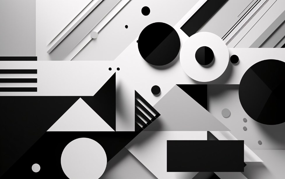
Geometry serves as the backbone of design, shaping every aspect from conception to completion.
When architects draft plans, they employ geometry to delineate space and create schematic sketches. Artists might utilize recurring structures like cubes or fractals, weaving intricate designs or generating abstract imagery. Professional designers use forms, icons, and balanced arrangements to craft visually captivating and harmonious spreads.
Our natural, instinctual response to proportionate images is generally positive. By strategically arranging lines and symmetry within your designs, you can enhance the relationship between the various components of your work or the visual signals they emit. Do you aim to increase the appeal of your piece? Geometry comes into play here as well, enabling you to determine the placement of your artwork through diagonal tracing and the rule of thirds.
Understanding the Importance of Diagonal Placement
One of the most straightforward geometric design instruments involves locating the diagonals within your composition.
Stretching from corner to corner in any rectangle or square, diagonals intersect at the center of any image, invariably drawing our gaze to this juncture. Diagonal divisions provide a framework that aids in the generation of layouts. Placing vital aspects of your design near this intersection is an effective means of attracting attention, and the remaining components should ideally balance around this visual core.
Items positioned along the diagonal axis will appear more visually stable and intentional, suggesting direction or movement as they guide the viewer’s gaze along that line. Key constituents placed outside these axis lines can create a brief visual interruption for the viewer, instigating a sense of imbalance or tension.
Utilizing the Rule of Thirds in Design
The rule of thirds states that when a rectangle or square is divided into thirds both vertically and horizontally, the four points of intersection within the piece are ideal focal points.
Employ these intersection points to highlight crucial elements in your design.
For instance, our eyes naturally gravitate toward the eyes of others. When introducing a face within your grid, aim to position your subject’s eyes near the intersection point, thus providing your image with a distinct focal draw. Also, keep in mind that off-centered arrangements are visually more pleasing. For maximum impact, position key elements in the outer thirds of your layout rather than directly in the center.
Believed geometry was exclusive to mathematics? Think once more. The principles of proportionality and symmetry can guide you in creating designs that are balanced, fluid, and impressive.
How to Harness the Power of Geometric Shapes in Design:
- Squares and Rectangles: Symmetrical and straightforward, these shapes suggest stability and reliability. Use them to create structure within your design;
- Circles: As the only shape without corners, circles often represent unity, wholesomeness, and completeness. Use them as solid bases or to highlight key elements;
- Triangles: Dynamic and directional, triangles can indicate movement, progression, or change. Use them to create a sense of action or to draw attention;
- Lines: Horizontal lines suggest tranquillity and stability, while vertical lines indicate strength and luxury. Diagonal lines, on the other hand, create a sense of movement or direction.
Applications of Geometry in Modern Design
Geometry has established its relevance in various subfields of modern design. Website design, for instance, relies on geometric principles to build user-friendly interfaces and visually appealing layouts. Even in logo design, the use of basic shapes can create memorable and iconic logos. Similarly, in print design, the role of geometry is undeniable – from determining the layout to deciding the typeface.
In the field of animation, geometry is indispensable. Animators leverage geometric principles to create dynamic, engaging characters and scenes.
Geometry in Modern Graphic Design
Geometry is a fundamental feature of modern design. The simple, clean lines and shapes are often found in websites, advertisements, and even logos. Geometric designs can give a sense of simplicity and sophistication. It’s a versatile design approach that can be applied in various creative projects.
Geometry in Logo Creation
In the era of flat design, geometric shapes have a significant role in logo creation. Simple geometric shapes can make logos easily recognizable and memorable. For example, a square or rectangle can represent strength and stability, a circle for unity and commitment, and a triangle for dynamics and innovation.
Final Thoughts
In essence, the sophisticated interplay between geometry and design has a profound impact, shaping our sensory and emotional interaction with visual creations. Geometry shines the light on the intricate dynamics of lines, shapes, and spaces, empowering designers and artists to construct compositions that resonate with viewers.
Designers gain an edge by understanding geometric structures and harnessing their power strategically to create layouts. Subtle applications like the diagonal placement and the rule of thirds draw the viewer’s attention to vital focal points in a design. Geometric shapes, with their symbolic connotations, can be tactfully used to reinforce the desired message or evoke specific emotions.
With the advent of modern design aesthetics, geometric principles are extensively leveraged in diverse fields, be it website design, logo creation, or print media. The simplification and sophistication brought forth by the clean lines and basic shapes of geometry lend an unequivocal charm to any design, rendering it memorable.
In conclusion, the principles of geometry are not limited to mathematical equations but permeate the creative realms, influencing design concepts and paradigms. By mastering these principles, designers can harness structure, balance, and symmetry to create visually stunning and impactful designs, turning the canvas into a chorus of lines, shapes, and space. Embracing geometry thus allows us to step into a world where art and science intersect, giving life to designs that beautifully echo the harmony of our universe.


