The Eternal Discussion: Metrics Versus Optical
The design world has been witnessing an ongoing lively discussion concerning the two automatic kerning settings – Metrics and Optical – as featured in Adobe’s popular design software, InDesign. Professionals tend to agree that the optimal approach to kerning, especially for headlines, is a blend of Optical and manual kerning. However, in certain cases, the default Metrics setting proves quite effective.
Adobe’s Automatic Kerning Settings Unvealed
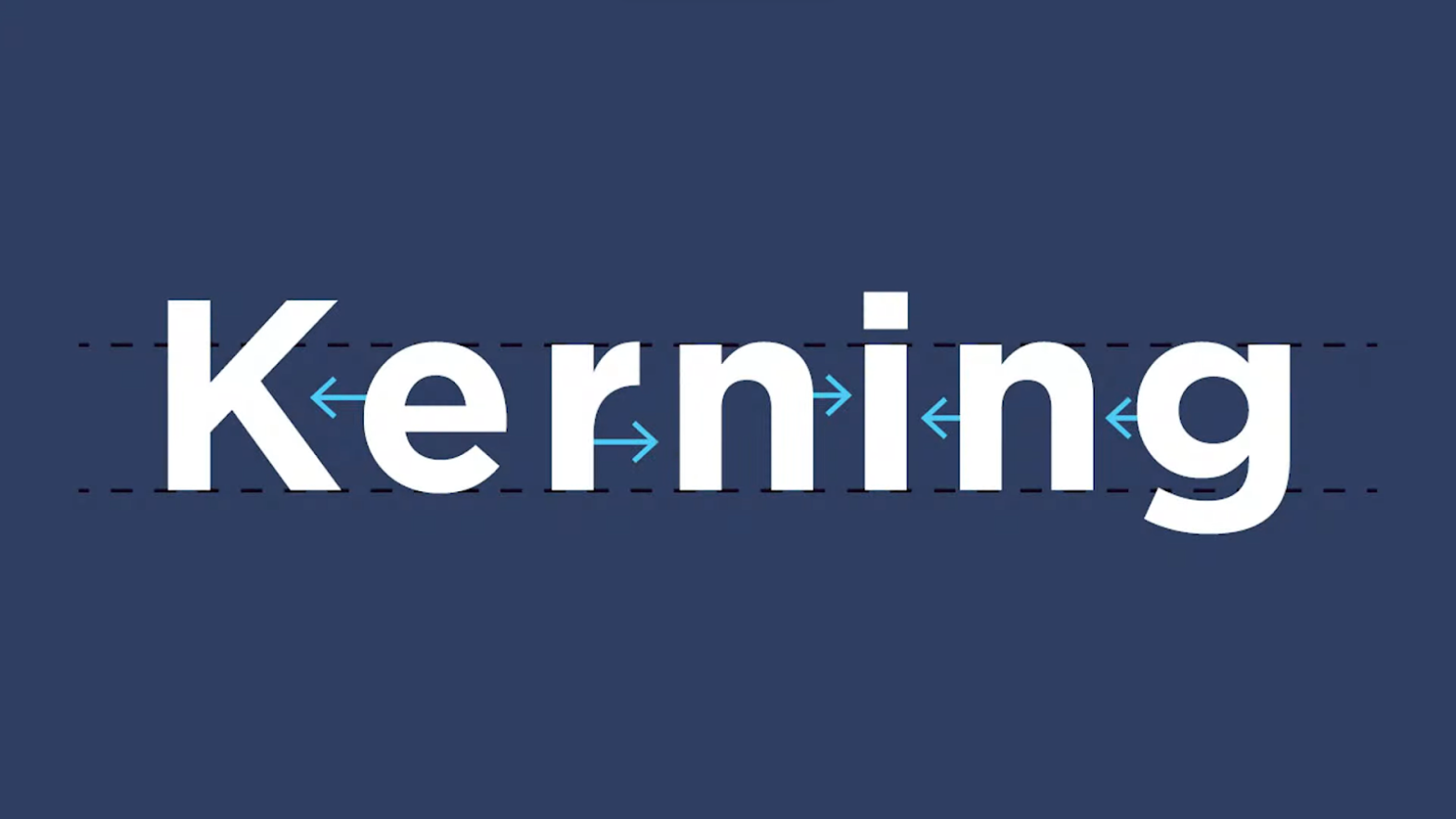
To provide a clear understanding of Adobe’s automatic kerning settings, it’s crucial to distinguish between Metrics and Optical. Metrics kerning utilizes predefined kerning pairs provided by the typeface designers. These pairs contain detailed information about the spacing between specific letter sets. On the other hand, Optical kerning adjusts the space between adjacent letters based on their respective shapes, enhancing readability and visual appeal.
Expert Opinions on Optical and Metrics Kerning
Various design experts have voiced their perspectives on Optical and Metrics kerning:
- Thomas Phinney, via the Extensis blog, clarified that Optical kerning evaluates standard spacing in the font, then calculates ideal spaces for every glyph pairing in the text.
- Matthew Butterick advises sticking to the “Metrics” option for optimal results.
- The League of Movable Type aligns with Butterick, emphasizing that choosing Metrics ensures adherence to the designer’s recommended kerning.
- Paper Leaf highlighted that top-notch type designers fine-tune kerning based on every letter pairing to ensure exceptional readability and aesthetics.
- Ellen Lupton, in her book “Thinking With Type,” observed: “The optical kerning in InDesign results in tighter spacing for larger text and looser spacing for smaller text.”
- Ilene Stritzver, writing for CreativePro.com, suggested that the choice between Optical and Metrics should be dictated by the typefaces themselves.
- Nikola Mileta, on the Magazine Designing blog, noted the importance of paying extra attention to kerning when working with low-cost, non-premium fonts.
- Jacob Cass, writing for JustCreative, believes that Optical settings often provide superior results for display type.
Understanding Typeface Design: Optical or Metrics?
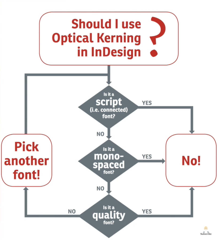
The selection between Metrics or Optical largely hinges on the design quality of a typeface. Free fonts may require meticulous manual kerning or the use of Optical settings for optimal display. Headlines generally require tighter kerning, so Optical settings or manual kerning are advisable. Metrics, being a bit laxer, could fit well for body text. However, there are no rigid rules here. It’s essential for designers to develop a keen eye for good typography and trust their instincts.
A Comparative Examination of Different Typeface Designs
We have conducted an in-depth study of different typefaces to demonstrate the impact of kerning. The space variations in some fonts are quite similar, while others differ significantly. The key is to identify which option caters best to the specific visual requirements of the project.
Understanding the Tools: Adobe InDesign for Optical Kerning
As a leading tool in the design industry, Adobe InDesign offers a sophisticated suite of features for kerning. Whether you use Optical or Metrics, understanding how to effectively leverage this robust tool can significantly enhance your kerning process.
The Relationship between Optical Kerning and Typography
Typography is an indispensable part of design, where Optical kerning plays a critical role. Diving deeper into how optical kerning interacts with typography can further refine your design skills and broaden your creative horizons.
Conclusion
The Metrics versus Optical kerning debate is indicative of the dynamic nature of design. Understanding these two options and recognizing when to apply each is a crucial skill for modern designers. Coupled with the powerful Adobe InDesign tool, designers can seamlessly navigate through the sometimes challenging world of kerning, ultimately creating designs that are visually captivating and easy to read. You might be interested in the article about Letterpress Los Angeles.