When we read, we don’t just see letters and words; we experience them. Typography hierarchy is the tour guide of that experience, setting the pace and pointing out the sights. It tells us where to go, what to notice, and what to remember. Imagine walking into a library with all the books jumbled up. Finding your favorite novel would be like searching for a needle in a haystack. That’s what reading would be like without typography hierarchy—just a jumble of words. Instead, a good design lays out a welcome mat and ushers you in, showing you around so you feel right at home.
To get typography hierarchy right, you’ve got to understand the importance of visual weight. Visual weight is how designers talk about how much a piece of text stands out. The heavier it is, the more attention it gets. It’s a combination of different factors like size, color, font style, and spacing. They all work together to create a visual pecking order: the most important bits get the most weight.
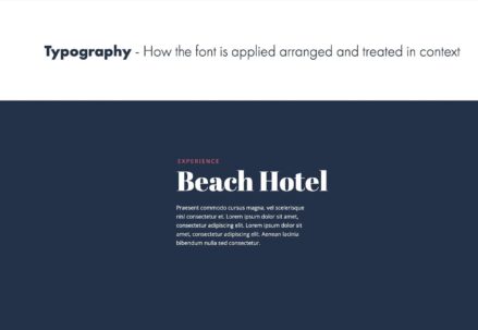
Starting with the Big Guns: Headlines
A headline should be the north star of any page—visible from afar and guiding the way. They’re the boldest, the bravest, and the loudest members of the text family. But they’re also the welcoming committee, giving readers a hint about what’s in store. A headline that’s done its job well will be both a beacon and an invitation.
Great headlines have a dash of personality. They’re not just big for the sake of it—they reflect the tone of the content. A headline for a serious article might stand tall and stoic in a robust serif font, while a headline for a more casual piece might be decked out in a relaxed sans-serif. The choice of font here isn’t just about looking pretty; it’s about setting the tone and expectations.
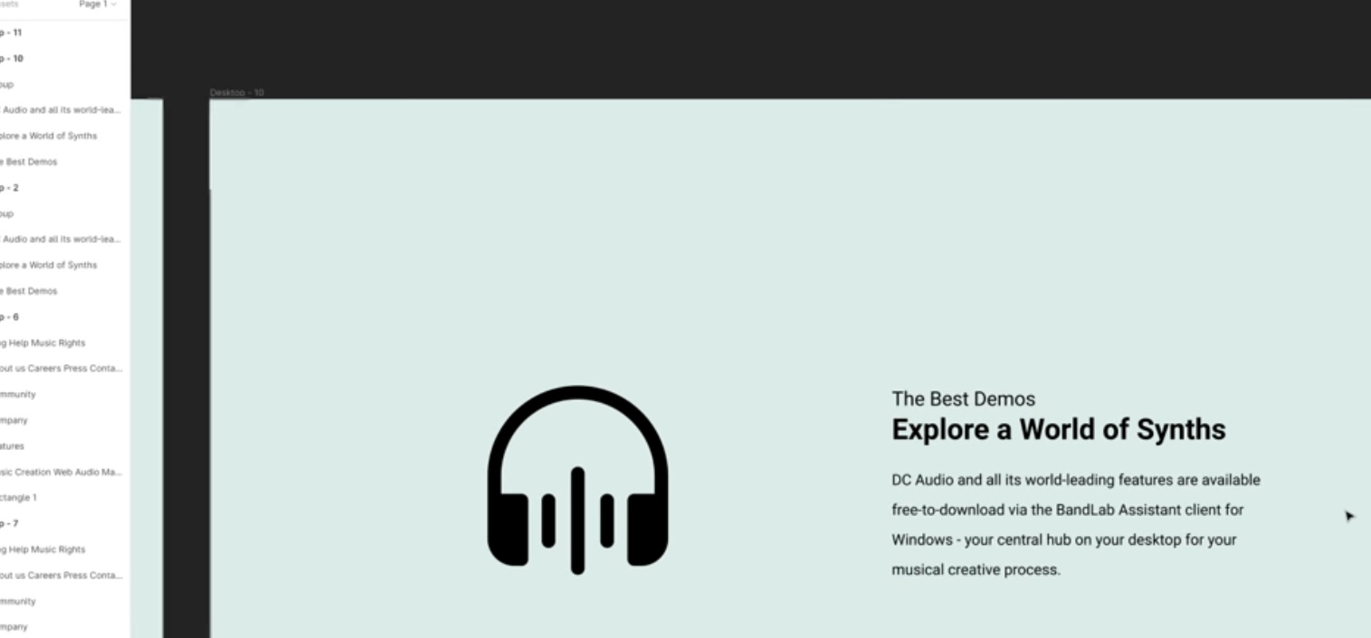
The Supporting Acts: Subheadings and Captions
Subheadings are the road signs on the journey through your text. They break the trip into smaller, more manageable segments. They’re like chapter titles in a book or scene changes in a play, each one setting the stage for what comes next. They often carry a bit of the personality of the headline but in a more subdued fashion.
Captions, on the other hand, are like the commentary from the guide on a tour bus. They might be small, but they’re packed with context. They whisper the backstories of images, making them speak and filling in the blanks. Without captions, images can be like mysterious strangers—interesting but unknown.
The Unsung Heroes: Body Text
Good body text is like a good conversation—it flows smoothly, doesn’t tire you out, and leaves you feeling informed. The font size, spacing, and paragraph structure all need to be tuned like a well-oiled machine. If it’s too dense, readers might bog down; too sparse, and they may drift away.
In the realm of body text, legibility is king. Choosing a font that’s easy to read isn’t just about avoiding a squint—it’s about making sure the journey through sentences and paragraphs is as comfortable as a stroll through a well-kept garden. This is where the magic of line-height and letter-spacing comes into play. Get it right, and the text becomes invisible in the best way—it carries its message with such ease that the reader forgets they’re reading at all.
The Finishing Touch: Color and Contrast
When it comes to color and contrast, think of them as the seasoning in a dish. Just as the right amount of salt can bring out the flavors, the right contrast can make the text palatable. It ensures that the text doesn’t strain the eyes and that important bits don’t get lost in the visual shuffle.
Color, too, is a powerful tool. It can highlight, signify importance, or evoke emotion. When used wisely, color can lead the reader’s eye to where you want it to go and help organize information. It’s not just about making things look pretty—it’s about enhancing the reader’s understanding and retention of the information.
The ABCs of Typography Hierarchy
Diving deeper into the ABCs of typography, let’s consider the journey of understanding as not just reading but experiencing the text. Typography hierarchy, in its essence, organizes this experience in a way that makes the act of reading feel natural and effortless. It’s like attending a concert where every musician knows their cue, and the harmony they create guides your emotions and reactions. In typography, the ‘musicians’ are the fonts, sizes, and styles, each playing a role to ensure the message isn’t just delivered, but felt and remembered.
The use of different typefaces is a subtle but powerful tool. Serif fonts, with their little ‘feet’, speak of tradition and reliability—think of the steady friend who’s always there for you. Sans-serif fonts, with their clean lines, carry a modern and clean vibe—the new kid on the block who’s cool without even trying. Typography hierarchy involves choosing the right font personality to match the voice of the text.
Starting with the Big Guns: Headlines
Expanding on headlines, they are the make-or-break first impression. A well-crafted headline is like the opening scene of a movie. It sets the stage, provides context, and, if done right, hooks the viewer instantly. Headlines are the gatekeepers of interest; they beckon the reader to delve deeper into the story.
A headline can often be a work of art in itself. It’s not merely about using the boldest or the largest font available; it’s about choosing the right character that embodies the spirit of the following text. It’s like choosing the lead actor for a play—star power matters, but so does the ability to capture the essence of the character.
The Supporting Acts: Subheadings and Captions
On subheadings and captions: Think of them as the supporting actors. They may not have the main role, but their performance is crucial to the storytelling. Effective subheadings and captions add layers to the narrative, providing depth and meaning.
Subheadings serve as waypoints on the reader’s journey through the text, ensuring the path is clear and the landmarks are notable. They’re the rhythm section of the band, providing the beat that keeps the song moving forward. Captions, often sidelined, actually carry the delicate task of marrying words to images. They’re like the background score in a film scene, subtly but significantly enhancing the mood and comprehension.
The Unsung Heroes: Body Text
For body text, let’s think of it as the script of the play. It contains the bulk of the content, the dialogue, the story. While it may lack the drama of headlines or the strategic positioning of subheadings, it’s the backbone of the text. It’s where the reader spends most of their time, so comfort is key. The typeface, point size, leading (space between lines), and tracking (space between characters) must all be carefully calibrated to guide the reader through the narrative with ease.
Moreover, the length of the lines of text, known as measure, plays a crucial role. Too long, and the reader’s eyes will tire; too short, and the text becomes choppy. The perfect measure strikes a balance, creating a rhythm that makes reading a pleasure rather than a chore.
The Finishing Touch: Color and Contrast
Color and contrast are the special effects of the typography world. They add drama, emphasize emotion, and can change the tone of the text almost instantaneously. Using color strategically can guide the reader’s eye to the most important elements, much like a spotlight in a dark theater. Contrast ensures that the text not only stands out but also remains legible under varying conditions. It’s the difference between a scene shot in the soft light of dawn and one under the harsh noon sun—each creates a different mood and serves a different purpose.
In a Nutshell
To sum up, typography hierarchy isn’t just a set of rules about what should be big or bold. It’s about creating a map for the reader’s journey—a map that’s both functional and beautiful. It’s about using the visual weight of different typographic elements to tell a story that’s pleasing to the eye and easy to follow.
When you next encounter a well-designed piece of text, take a moment to appreciate the thought that went into it. Each headline, subheading, and paragraph was crafted to make your reading experience not just informative, but enjoyable. The mastery of typography hierarchy is akin to the conductor of an orchestra—silent, yet essential, making sure every element comes together in perfect harmony to deliver a symphony for the eyes.