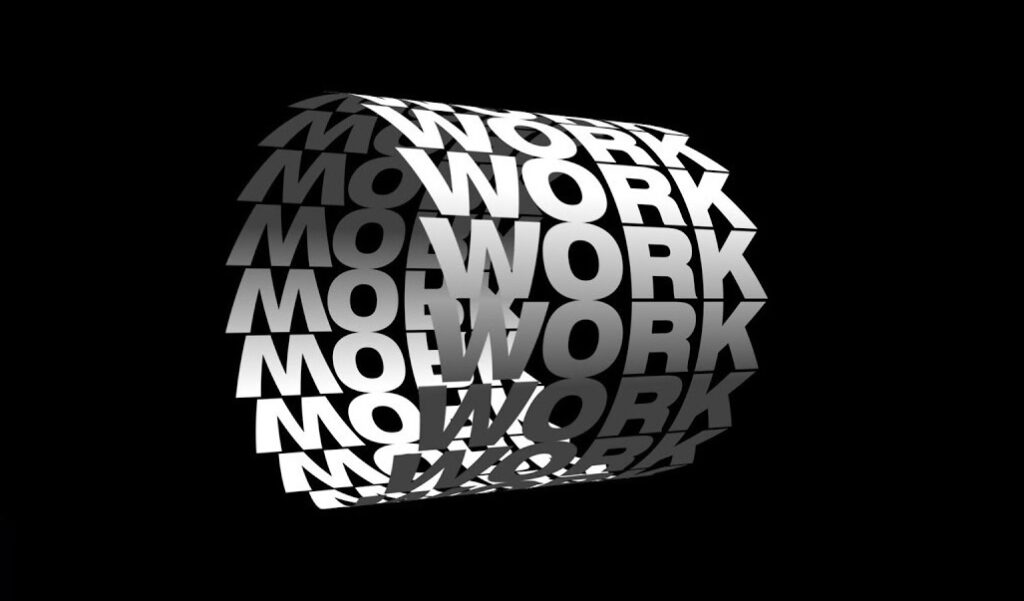
When we speak of typography in motion graphics, we’re not merely discussing the selection of fonts — we’re delving into a choreographed performance where letterforms twist, turn, and unfold over time. It’s a potent blend of animation and text design that, when done correctly, transcends the static nature of traditional typography.
This art form does more than just present information; it invites the audience into a narrative, often without the need for additional imagery. Through clever animation techniques, even a simple sentence can become a story. The key lies in understanding the nuanced relationship between typefaces — with their weights, styles, and sizes — and the motion that carries them.
Key Considerations in Typography Motion Graphics:
- Typeface Selection: The choice of font sets the groundwork for the animation’s character and tone;
- Animation Techniques: How the text moves, changes, and interacts with other elements can make a significant impact;
- Narrative Alignment: The movement of the type should be in harmony with the story or message.
The Evolution of Animated Text: A Journey Through Time
The Origins: From Static to Kinetic
In the nascent stages of graphic design, the text was confined to the immobility of paper. The advent of digital media, however, liberated typography, allowing it to move with elegance and purpose. This transition marked the beginning of a new era where type didn’t just sit; it acted, reacted, and interacted.
Modern Marvels: Typography Takes Flight
Fast forward to the present, and we find motion typography as a celebrated craft in diverse domains like cinema, advertising, and web design. It’s no longer an afterthought but a primary design element that can carry a piece from the mundane to the mesmerizing.
The Tools of the Trade: Software That Brings Text to Life
The Giants: After Effects and Cinema 4D
Professionals in the field often turn to Adobe After Effects and Cinema 4D — two pillars in the motion design toolkit. Each offers robust features for animating text, whether it’s simple rolling credits or complex three-dimensional movements.
After Effects vs. Cinema 4D:
| Feature | After Effects | Cinema 4D |
|---|---|---|
| 3D Text | Plugin Required | Native Support |
| Animation Presets | Extensive Library | Limited Selection |
| Integration | Seamless with Adobe Suite | Bridged via Plugins |
Emerging Technologies: Innovations in Typography Animation
The landscape is continuously evolving with new software and plugins that push the boundaries of what can be achieved. These innovations offer motion designers new ways to animate text, from physics-based simulations to AI-assisted design flows.
The Principles of Motion Design in Typography
Harmony and Contrast: Visual Composition Essentials
Typography in motion is not just about making text move; it’s about composing a visual symphony. The principles of design — balance, contrast, emphasis, rhythm — are all critical in guiding the viewer’s eye and ensuring that the text becomes an integral part of the overall design narrative.
Timing and Easing: The Subtleties of Movement
Understanding the subtleties of timing and easing is what separates good animation from great animation. This is where text comes to life, moving not just from point A to point B but doing so with a rhythm and pace that feels natural and intentional.
Crafting Emotion Through Kinetic Type
Font Selection: The Emotional Conduit
The selection of fonts in motion graphics is as much a science as it is an art. The right typeface can convey a mood, emphasize a message, and leave a lasting impression. It’s about finding that perfect voice for your text that resonates with the emotional core of your message.
Color and Movement: Stirring Feelings with Animation
Color theory and animation principles combine to stir emotions within the viewer. The way text moves — its speed, trajectory, and interaction with color — can set the entire tone for a piece.
The Psychological Impact of Kinetic Typography
The movement of text isn’t merely a visual gimmick—it taps into the human psyche, influencing how viewers process and remember information. Kinetic typography can dramatically affect a user’s cognitive experience, enhancing recall and emotional connection. This impact is a result of several psychological principles at play.
Cognitive Processing in Motion Typography:
- Attention Grab: Animated text captures attention more effectively than static text;
- Memory Retention: Motion can aid in the retention of information by creating memorable sequences;
- Emotional Resonance: The way text moves can convey feelings and mood, connecting on an emotional level with the audience.
Psychological Effects of Text Animation Techniques:
| Animation Technique | Psychological Effect | Applications |
|---|---|---|
| Smooth Entry/Exit | Eases cognitive load | Introductions/Transitions |
| Sudden Appearances | Grabs attention | Call-to-actions |
| Vibration | Conveys urgency | Warnings/Alerts |
Understanding these psychological underpinnings allows designers to craft typography that does more than just look good—it feels good, too, and serves a functional purpose in guiding the viewer through the content.
Integrating Typography with Visual Elements
In motion graphics, typography doesn’t exist in a vacuum. It’s often integrated with other visual elements—imagery, video, 3D models, and interactive elements—to create a cohesive and immersive experience. This integration is crucial, as it ensures that the typography doesn’t just move, but belongs.
Steps for Effective Integration of Typography in Motion Graphics:
- Assess the Visual Landscape: Before animating text, understand the visual context it will inhabit;
- Match Movement with Imagery: Ensure the motion of the text complements the visual elements it accompanies;
- Consider Spacing and Sizing: Text must be legible and harmoniously scaled with surrounding content;
- Maintain Style Consistency: The typography’s style should echo the overall design aesthetic for a unified look.
Tips for Harmonious Typography and Visual Integration:
- Match typography motion curves with the movement of visual elements;
- Use color schemes that unify text and imagery;
- Apply textures or patterns to text that reflect those found in the overall design;
- Consider the hierarchy of the screen space—what needs to stand out, the text or the visuals?
Example Integration Strategies:
- Complementary Animation: If the background visuals include flowing water, the text might mimic this with a gentle, wave-like animation;
- Contrast through Motion: For a static image, introducing a subtly animated text can bring balance and focus.
In the dance between text and image, one must lead, and the other must follow. By applying these integration strategies, designers can ensure that typography not only shares the stage with visual elements but also enhances the overall narrative and user experience.
Conclusion
In conclusion, typography in motion graphics is an art form that combines the timeless beauty of type with the fluidity of animation. By understanding the tools, principles, and storytelling potential of kinetic typography, designers can create immersive experiences that engage, inform, and delight their audiences.
FAQs
Typography in motion graphics refers to the technique of animating text to create a dynamic and engaging visual experience.
Animated typography can help convey a message, evoke emotions, and add a layer of storytelling to any visual piece.
Adobe After Effects and Cinema 4D are among the top choices for professionals in the industry.
Yes, well-crafted motion typography can significantly enhance brand identity and recall.
The choice of font should align with the tone, message, and emotional impact you aim to achieve in your project.