Congratulations, you’ve stumbled upon the ideal content creation specialist, a true gem in her field. Her capabilities are nothing short of remarkable. Irrespective of the nature of the task at hand, she consistently crafts top-notch content. What sets her apart, even more, is her unwavering commitment to open communication and ensuring that your specific requirements are not just met, but exceeded. However, there’s always a caveat, isn’t there? In this case, there are certain aspects of the content creation process that she may not be entirely familiar with: widows, orphans, runts, and rivers.
In a moment, you will gain a comprehensive understanding of these aforementioned elements within the realm of composition, elements that you’d be wise to steer clear of in your marketing and informational materials, whether in print or digital, destined for your clientele, business partners, distributors, suppliers, and the wider consumer audience. Maintaining a professional appearance is paramount in all forms of marketing. After all, it is your company’s brand and reputation that hang in the balance. The more polished and professional your marketing materials appear, the higher the level of respect you’ll command in the eyes of your consumers.
Typography Challenges and Solutions in Document Layout
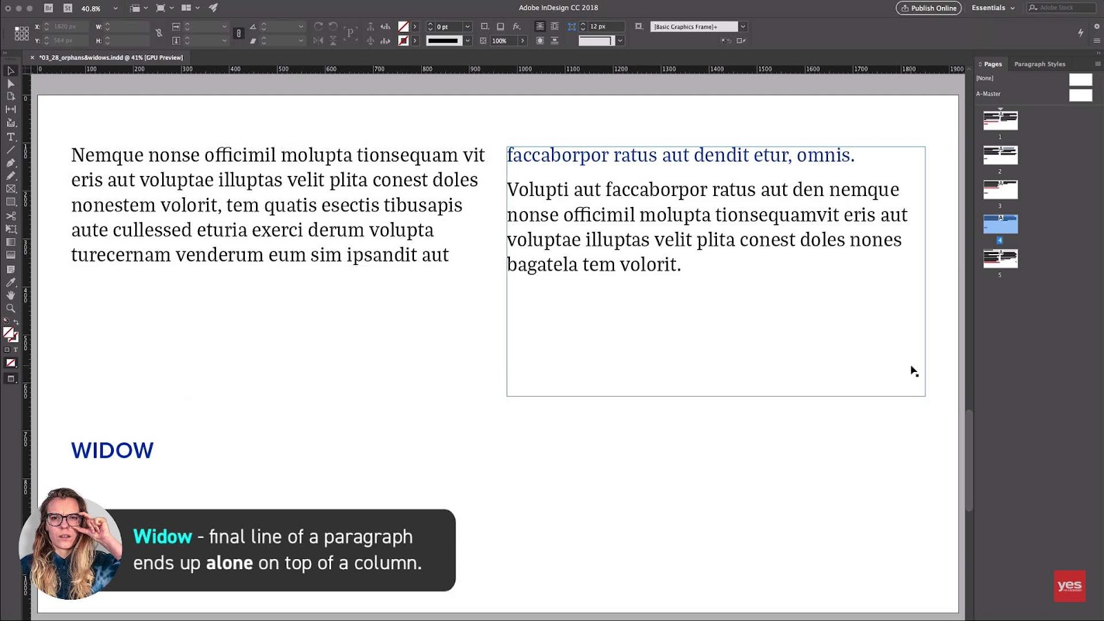
Understanding Widow Lines
- Definition: A widow line emerges when the final sentence of a paragraph does not make it onto the current page or column but instead gets isolated at the start of the next one. This solitary line may disrupt the reader’s flow and aesthetic uniformity of the text;
- Impact on Reading Experience: The presence of a widow can distract the reader and detract from the visual appeal of the document.
Strategies for Correction:
- Adjust paragraph spacing to pull the widow back to its original page;
- Slightly alter the font size or spacing of previous paragraphs to accommodate the widow;
- Rewrite the paragraph to either shorten or lengthen the text appropriately.
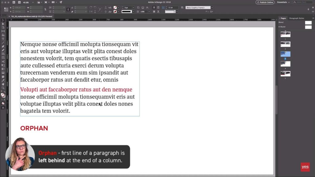
Orphan Lines: A Companion Challenge
- Definition: The counterpart to the widow, an orphan line, occurs when the introductory sentence of a paragraph is left all by itself at the bottom of a page or column, creating a visual imbalance;
- Reader’s Journey Disruption: Orphans can cause a jarring break in the continuity of the text, leading to potential confusion or a suboptimal reading experience.
Resolution Tactics:
- Tweak the text flow by adjusting the space before the paragraph to bring the orphan in line with its bulk on the following page;
- Play with the paragraph length or word choice to eliminate the orphan situation;
- Consider content edits that can naturally extend or contract the preceding content to resolve the layout imbalance.
Runts in Typography
- Definition: A runt is found when a paragraph concludes with a lone word or a very short line, often resulting from hyphenation;
- Aesthetic Impact: Runts can mar the elegance of a paragraph by creating an uneven edge and can be especially conspicuous if they occur frequently throughout a document.
Mitigation Techniques:
- Hyphenation settings can be adjusted to prevent single words from being left on a line;
- Manual text reflow can be executed by revising sentence structure or using synonyms to alter line breaks;
- Column and margin adjustments may allow for more text per line, reducing the occurrence of runts.
Rivers Through Text
- Definition: Rivers refer to the uneven white space that flows through a block of text, often the result of inconsistent spacing between words or characters, which can be pronounced after altering the tracking or justifying text;
- Visual Harmony Disruption: Rivers can break the ‘gray’ appearance of a body of text, drawing the eye inappropriately and making a page look fragmented.
Countermeasures:
- Reviewing and adjusting the tracking and kerning settings to ensure consistent spacing;
- Opt for left-aligned or ragged text alignment in severe cases, as justification can exacerbate the creation of rivers;
- Proofread the layout in different formats to identify and address any river patterns that emerge.
Best Practices for Managing Layout Discrepancies
Each document layout possesses unique challenges, including the aforementioned typographical issues, which can vary based on the format it’s viewed in (e.g., print, web, mobile). Here are some general guidelines to ensure these issues are adeptly handled:
- Regular Review: Periodically check the layout during the design process, as text reflows can introduce these issues at any stage;
- Professional Insight: Enlist a graphic design professional or utilize advanced typesetting software, which can help detect and correct these formatting faux pas;
- Flexible Design: Adopt a flexible mindset with content. Sometimes rephrasing or restructuring a sentence or paragraph can be the most straightforward solution to a typographic dilemma;
- Format-Specific Adjustments: Be prepared to make unique adjustments for different formats. What works on a printed page may not translate well to a digital screen;
- Continuity Checks: Consistency is key. A uniform look not only contributes to the document’s professionalism but also enhances readability;
- User-Centric Approach: Always keep the end reader in mind. The document should be easy to navigate and pleasing to the eye to hold the reader’s attention and convey the intended message effectively.
Understanding Typography: The Role of Tracking
The Essence of Tracking in Typography
Tracking, in the realm of typography, refers to the meticulous process of adjusting the uniform space between characters across a body of text. This typographic technique is pivotal for addressing typographical anomalies known as widows, orphans, and runts. These issues, if left unresolved, can cause visual disruptions in a block of text.
Widows are singular lines at the end of a paragraph that appear alone at the top of a page.
Orphans are the first lines of a paragraph stranded at the bottom of a page.
Runts are short lines or single words that occupy an entire line at the end of a paragraph.
Employing tracking involves selecting chunks of text—from sentences to entire paragraphs—and methodically modifying the letter-spacing. To efficiently remediate these layout issues, it is crucial to initiate the process from the initial line of text and advance methodically. Correcting one issue can influence the overall text block, potentially rectifying or, conversely, instigating additional spacing problems. It is recommended to avoid erratic alternation between different sections of the text during this adjustment phase to maintain consistency and flow.
Strategies to Prevent ‘Rivers’ in Text
‘Rivers’—unwanted patterns in the white space within text blocks that distract the eye—can be prevented with careful typography settings. Here are some strategies:
- Implement appropriate hyphenation settings to break words at conventional points, enhancing the readability of text;
- Adjust hyphenation parameters to reduce the occurrence of awkward breaks and to avoid disrupting the reader’s flow;
- In cases where rivers persist, subtle tracking adjustments can be applied to even out the spacing and eradicate these visual disturbances.
Cultivating Impactful Marketing Through Polished Content
Elevating the impact of marketing material transcends beyond the mere crafting of compelling content; it involves the fine-tuning of textual presentation to ensure a smooth reading experience. The goal of refining content is to deliver an impressionable and coherent message to the audience.
Consider the following benefits of well-edited content:
- Professional Appearance: Cleanly formatted text without typographical errors reflects a high level of professionalism;
- Enhanced Readability: Eliminating distractions such as widows, orphans, and runts facilitates effortless reading, which is paramount for engagement;
- Effective Communication: The absence of layout errors ensures the reader’s attention remains on the message, not on the medium, amplifying the intended impact of the marketing efforts.
While the terms like widows and orphans may not be part of the average customer’s vocabulary, their presence can subconsciously affect the reader’s perception and engagement with the content. It’s the unobstructed flow of text that contributes to a lasting and positive impression, fortifying the success of marketing initiatives. Also, explore the dynamic world of design as we unveil the essence of ‘leading graphic design definition.’
Conclusion
Understanding and addressing widows, orphans, runts, and rivers is just one facet of typography, but it exemplifies the meticulous attention to detail required in this discipline. Typography is both an art and a science, where the right balance of form and function can transform a piece of text into a visually pleasing and easily digestible work of communication. So, the next time you encounter these typographic challenges, remember the importance of their resolution in the pursuit of effective and beautiful design.