In the detailed arena of typography, accuracy in terminology is crucial. For graphic designers and typesetters, a single misapplication of a specific term could lead to confusion, misunderstandings, and even arguments. Take, for example, the perplexing pair known as “orphans” and “widows,” where definitions often blur, sparking heated debates among professionals.
Aiming to unravel this typographic puzzle, we’ll dissect these terms and their influence on design.
The Quartet of Confusions
Turning to various references quickly reveals that there are four main interpretations of these typographic terms:
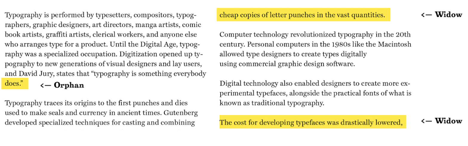
- Orphan: A line left at the bottom of a paragraph;
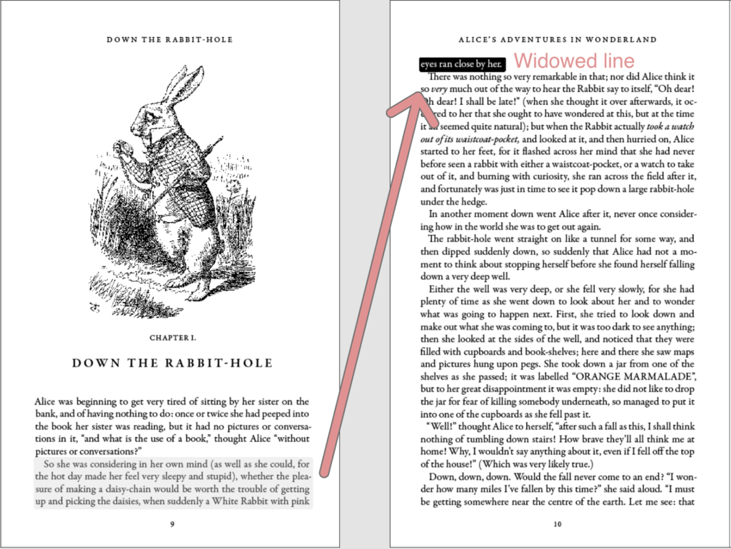
- Widow: A solitary line at both the top and bottom of a column;
- Orphan: A single word remaining at the bottom of a paragraph;
- Widow: A solitary line at the top part of a column;
- Orphan: A solitary line at the top part of a column;
- Widow: A solitary line at the bottom part of a column and a single word at the bottom of a paragraph;
- Orphan: A short line at the bottom of a page or a word at the end of a paragraph;
- Widow: A short line ending a paragraph at the top of a page.
It’s clear that varying interpretations of these terms in the typographic community have only added to the bewilderment. Thus, the issue extends beyond semantics into the practical plane of design.
The Influence on Design
Why should precision in these definitions concern us? In a visual domain like design, do words really hold such weight?
- The unequivocal answer is “yes.” They disrupt the visual harmony of a layout, affecting the aesthetics and readability of the text;
- Widows, standing alone at the start of a paragraph or atop a column, leave distracting white spaces that interrupt the reader’s visual flow. Such breaks can hinder comprehension and engagement with the content. Orphans, as single lines at the bottom part of a paragraph, also disrupt text alignment, creating awkward gaps between paragraphs and columns;
- In the digital environment, “widows” and “orphans” can be even more detrimental. In an era of scrolling and variable screen sizes, they exacerbate the challenge of creating an engaging and visually cohesive reading experience online.
In both contexts, the goal is to maintain the design’s cleanliness and visual allure, ensuring a smooth and easy reading experience. Graphic designers, typesetters, and editors pay close attention to these typographic details to enhance the overall aesthetic and readability of printed materials, such as books, magazines, and newspapers.
Addressing Orphan Lines in Document Layout
Typos and layout errors can disrupt the visual flow of a document, throwing off its balance. Layout artists and typographers employ a variety of strategies to eliminate these stray lines to craft a visually appealing document design. Here are some common techniques used:
- Rephrasing or Editing the Text: One of the most straightforward methods to address stray lines is to reword or modify the text so that the final line of a paragraph is longer, avoiding ending with a single word or short line;
- Adjusting Line Spacing: Expanding the line spacing, also known as leading, can help evenly distribute the lines of text. Occasionally, this allows for addressing stray lines by moving more text down to the next line, ensuring a smoother transition;
- Modifying Font Size or Character Spacing: A minor adjustment in the font size or the spacing between characters, known as kerning, can aid in fitting the text within the available space and may solve the stray line issue;
- Hyphenation: Enabling hyphenation in your typesetting program allows words to be automatically broken and some carried over to the next line, which helps prevent the issue of stray lines. However, be cautious with hyphenation, as an excess can impact readability negatively;
- Adjusting Margins or Column Width: Tweaking the margins or column width can be effective, especially in multi-column layouts. Expanding or narrowing the text block allows for controlling where lines break, reducing the likelihood of stray lines appearing;
- Manually Adding Line Breaks: In certain instances, to adjust line length and avoid gaps, it may be necessary to manually insert a line break into a paragraph. This should be done with care to maintain the overall structure of the text;
- Considering Reformatting: If other methods are insufficient, it may be necessary to reformat the text or alter its layout. This could involve changing the number of columns, resizing the text field, or making other structural adjustments;
- Utilizing Widow and Orphan Control Settings: Numerous text formatting and typesetting applications offer controls to manage widow and orphan lines. These features automatically adjust line and page breaks to minimize the occurrence of isolated lines at the beginning or end of columns and pages;
- Rewrite or Manually Add Content: Sometimes, when other methods fall short, it may be necessary to manually rewrite or supplement the content in a paragraph to ensure it doesn’t conclude with an isolated line.
It’s critical to note that the chosen strategy to correct widows may vary based on the document’s nature, styling guidelines, and the capabilities of the typesetting software used. Often, a blend of these techniques is required to achieve the desired outcome. The primary goal is to ensure that the text is visually pleasing and easily readable, with no single lines or words stranded at the ends of paragraphs or columns.
Conclusion
The baffling dynamics between orphans and widows in typography remain perplexing. The debates surrounding their definitions are not merely semantic; they bear significant implications for design and readability. The lack of consensus in the typographic community further muddles understanding.
Designers must navigate this typographic quandary carefully, ensuring these disruptive elements are absent from their work. Regardless of the terms we assign – orphans, widows, or even novel nomenclature – recognizing and mitigating their visual impact is paramount in our creations. In the intricate craft of typography, precision in our language is a critical component of crafting visually engaging and readable content.
Ultimately, what matters is the end product: a cohesive and engaging design that allows readers to seamlessly transition from line to line without the disruption of these typographic complexities. Thus, as you approach your next design endeavor, remember that while the discourse on orphans and widows may persist, the pursuit of typographic excellence remains steadfast.