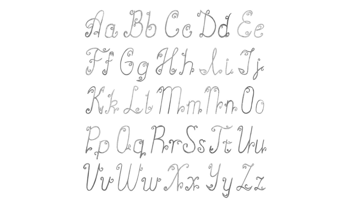
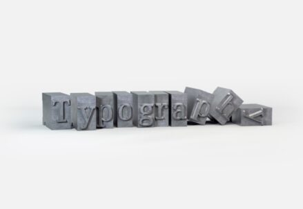
Do you ever ponder why certain designs stand out with a superior aesthetic? Often, the secret lies in the masterful use of typography. Properly executed typography can significantly elevate the quality and aesthetic charm of your creations. For those eager to refine their typographic prowess, here are 20 actionable tips that you can apply right away to make your typography shine.
- Understand Your Audience
- Opt for Expertly Crafted Typefaces
- Implement Information Hierarchy
- Leverage Grid Systems
- Embrace Grid Flexibility
- Minimize Font Varieties
- Harness the Power of Contrast
- Embrace Whitespace
- Opt for Soft Color Tones
- Align Text by Sight, Not by Numbers
- Implement a Typographic Scale
- Opt for Display Fonts in Headlines
- Fine-Tune Line Spacing (Leading)
- Incorporate Engaging Lead Paragraphs
- Select Fonts with Minimal Stroke Contrast for Body Text
- Choose Fonts with Generous X-Height for Body Text
- Utilize Italics Instead of Bold for Emphasis
- Focus on Letter-Spacing
- Explore OpenType Attributes and Glyph Options
- Mastering the Art of Punctuation in Typography
- Conclusion
Understand Your Audience
Choosing the perfect typography transcends beyond just picking an appealing font or the appropriate text size; it involves crafting a message and evoking the right emotions tailored to your audience.
The typefaces you select have the power to influence how people emotionally perceive your design. Take for instance, sans-serif fonts, which are synonymous with a contemporary and streamlined look, whereas serif fonts are indicative of a more classic and sophisticated style.
Consider the impact of font size as well. A bold, oversized headline can convey a sense of innovation and boldness, fitting for a cutting-edge architectural firm. However, when designing for a healthcare provider, more subdued font sizes may be more suitable to convey reliability and professionalism.
Opt for Expertly Crafted Typefaces
Fonts crafted by professional typographers come with an expansive variety of styles and weights, meticulously designed for coherence and legibility across diverse platforms and devices, thanks to rigorous quality assurance processes.
Take advantage of the free trial versions provided by many reputable type foundries. This is a great chance to test and explore a range of fonts in your designs.
Implement Information Hierarchy
Prevent information overload in your designs by establishing a clear hierarchy. Utilize varying font sizes, styles, and colors to guide the viewer’s focus and underscore key information.
Determine the sequence in which you want the viewer to process the information—what should grab their attention first, second, third, and so forth—before you begin crafting your design.
Leverage Grid Systems
Grids segment a layout into systematic columns and rows, offering a structural reference for where to place content. This structure is crucial for achieving a harmonious alignment of text and visuals.
Various grid systems include:
- The manuscript grid, ideal for long-form text like books;
- The column grid, favored for organizing content on web pages;
- The modular grid, versatile for complex layouts;
- The baseline grid, essential for aligning text lines across columns;
- The hierarchical grid, which is flexible for varied content types;
- Each grid type has its niche, such as manuscript grids for books or column grids for web pages.
Experiment with diverse grid systems to discern which aligns best with the needs of your specific project.
Embrace Grid Flexibility
While grids serve as an excellent blueprint for creating organized layouts, adhering too strictly can result in designs that feel overly formulaic. Intentionally disrupting the grid can inject an element of surprise, giving your design a more vibrant and compelling quality.
Balance is key. Introducing just a single element or two that strays from the grid can be sufficient to introduce visual intrigue without causing chaos.
Minimize Font Varieties
In the realm of typography within your design, embracing minimalism can be advantageous. An excess of varied fonts can lead to a chaotic and less refined look. Aiming to limit yourself to a maximum of three different fonts is a sound practice to maintain a clean and professional appearance.
Avoid pairing fonts that are nearly identical in style. Instead, aim for contrast, such as pairing a serif font with a sans-serif counterpart to achieve a visually engaging balance.
Harness the Power of Contrast
It extends to the interplay of font sizes, colors, and weights (like bold versus light). Contrast is essential for delineating a clear hierarchy of information and guiding the viewer’s attention.
Take, for example, the approach used by the German chocolate brand Jokolade. They masterfully overlay text on vividly colored shapes to ensure the typography pops.
Remember, contrast isn’t solely tied to text. You can create visual interest and emphasis by incorporating varied design elements such as shapes, images, and a spectrum of colors.
Embrace Whitespace
It’s a common beginner’s oversight to underestimate the power of whitespace. Resist the urge to saturate every part of your layout with text or graphics. Sometimes, embracing minimalism can be far more impactful.
Whitespace, or negative space, refers to the unmarked areas surrounding design components. When leveraged intentionally, it can instill a sense of equilibrium in your design and strategically draw attention to key elements.
Consider Aesop as an illustrative case; they employ minimalistic design to powerful effect. Begin with the bare essentials necessary to convey your message. Only then, incrementally reintroduce additional elements as needed to enhance your design without cluttering the visual space.
Opt for Soft Color Tones
In the natural world, the extremes of pure black and white are virtually non-existent, as surfaces absorb and reflect surrounding hues.
While contrast is a key design principle, the starkness of absolute black text on a stark white background can be harsh on the eyes, particularly in digital contexts like websites.
Experiment with various tints and shades to achieve a visually comfortable balance. Your audience’s eyes will appreciate the gentler approach.
Align Text by Sight, Not by Numbers
Optical alignment, rather than mathematical precision, should guide the placement of your text. Just as type designers employ visual techniques to ensure letters look balanced and aesthetically pleasing, font positioning should follow suit. Perfect measurements do not always equate to a visually harmonious result.
Examine these examples to develop an intuition for what I’m suggesting. Rely on your visual judgement to align text in a way that seems naturally balanced to the eye.
Implement a Typographic Scale
Employing a typographic scale is an effective way to establish a consistent and visually appealing hierarchy in your text elements, from headings to subheadings and body text. It ensures readability and an organized flow of content.
Begin with a base font size for the body text. Then, apply a predetermined scale, like the golden ratio or a modular scale, to define the sizes of other text elements.
Visit typescale.com for a convenient resource that helps calculate font sizes for you. Remember, it’s perfectly fine to make manual adjustments to these sizes for optimal visual harmony.
Opt for Display Fonts in Headlines
Display fonts are crafted with sophistication and flair, making them ideal for headlines where you want to capture attention.
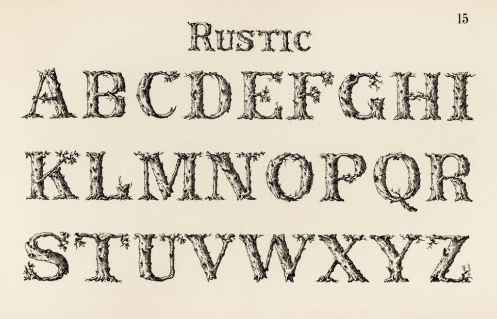
Their pronounced strokes and elaborate details lend a distinguished air to your work. However, be cautious to reserve display fonts for larger text, as their complexity can compromise readability at smaller scales.
When it comes to web design, also consider the font’s impact on loading times. Each font added to a website can slow its performance, which may detract from the user experience.
Thus, while aesthetics are important, they should be balanced against functional web design principles. Sometimes, the need for speed may trump the use of certain elaborate fonts.
For instance, take a look at Freight Display Pro by Cindy Hernandez. Can you see how its nuanced details stand out?
While most display fonts include ‘Display’ in their name, keep an eye out for alternatives labeled as ‘Headline’, ‘Banner’, ‘Poster’, and similar variants.
Fine-Tune Line Spacing (Leading)
Leading, the space between lines of text, is a pivotal factor in text legibility. Optimal leading neither cramps the text too closely nor spaces it out excessively.
Line spacing should be adjusted according to font style, size, and the length of the text lines. For example, text with longer lines may benefit from increased leading to enhance readability, while headings often require tighter leading compared to body text.
As a rule of thumb, setting your leading at 1.2 to 1.5 times the font size can serve as an effective baseline. Adjust from there based on the needs of your specific text.
Incorporate Engaging Lead Paragraphs
Lead paragraphs act as a succinct, captivating preview at the outset of your article, crafted to seize the reader’s interest and provide a snapshot of the narrative that unfolds.
They are exceptionally beneficial online, where skimming is the norm. A well-crafted lead paragraph can draw readers into engaging more thoroughly with the article, even when they’re browsing in haste.
Additionally, lead paragraphs can facilitate content sharing, offering a digestible glimpse of the article for those who may not read it in its entirety.
To differentiate lead paragraphs, consider increasing the font size, employing all caps, or beginning with a drop cap to command attention.
Select Fonts with Minimal Stroke Contrast for Body Text
In designing for readability and accessibility, choosing the right font for body text is essential.
Fonts with low stroke contrast, where the variation between thick and thin lines is subtle, tend to be more readable. High-stroke contrast fonts, like Bodoni, can pose challenges at smaller sizes as their fine details may disappear, straining the eye.
Opt for typefaces that maintain clarity and legibility at smaller scales, with uniform stroke widths, to ensure your text is effortlessly readable for all audiences.
Choose Fonts with Generous X-Height for Body Text
When selecting a font for body text, consider the x-height—the height of the lowercase letters compared to the uppercase ones. A generous x-height can enhance legibility because it increases the openness of the letterforms, such as the ‘e’ and ‘o’, which can make text more readable at small sizes.
However, it’s important not to go to extremes. Excessively large x-heights may impair readability by disrupting the distinct shapes of words, which are essential for quick recognition.
A practical approach is to opt for fonts that include “text” in their name, suggesting they’re optimized for body text legibility.
Utilize Italics Instead of Bold for Emphasis
It’s common practice to draw attention to specific words on websites by bolding them. However, this approach can disrupt the reading flow, as the prominent weight of bolded words can cause the reader’s gaze to bounce erratically across the page.
To maintain a smoother reading experience, italics are recommended for emphasis. Italics offer a more understated form of stress, allowing readers to navigate the text with ease while still acknowledging the highlighted information.
Focus on Letter-Spacing
Letter-spacing, or kerning, involves fine-tuning the space between characters to enhance text appearance and legibility, especially in logos and headings.
Well-executed kerning leads to a cohesive and pleasing typographic display; conversely, improper kerning can create distracting gaps that disrupt the reading flow.
Design Insight: To sharpen your kerning acumen, consider engaging with online kerning challenges and games.
Explore OpenType Attributes and Glyph Options
Delve into the extensive range of OpenType attributes and glyph variations to elevate your typography. OpenType fonts come packed with rich features like stylistic alternates, ligatures, and small caps, which can significantly enhance your design’s aesthetic.
Ligatures are unique combinations where two or more letters are fused into a single, fluid shape, offering an elegant solution to potentially awkward letter pairings.
Design Insight: In Adobe Illustrator, you can tap into OpenType features and explore glyphs by navigating to “Window” and choosing “Type > OpenType” or “Type > Glyphs.”
Mastering the Art of Punctuation in Typography
Punctuation marks are the subtle yet powerful elements of typography that ensure clarity and enhance readability in any text.
Employing punctuation accurately—be it commas for pause, hyphens for compound words, dashes for range or interruption, or apostrophes for possession—is crucial.
To refine your typography, here’s a quick guide to some often-confused punctuation:
- Hyphens (-) combine words or split them at a line’s end;
- En Dashes (–) connect numbers in ranges or link-related terms;
- Em Dashes (—) create emphasis or denote a change in thought within a sentence;
- Bullets (·) can be replaced with midpoints for a clean list separation;
- Quotation Marks (“ ”) encapsulate direct speech or a term needing definition;
- Apostrophes (’) show possession or replace omitted letter(s) in contractions;
- Ellipses (…) indicate missing text or a conversational pause;
- Fraction Symbols (½) are preferable to their slash-separated counterparts (1/2).
Conclusion
Typography is key to impactful design, and these tips are your toolkit:
- Understand your audience for targeted design;
- Establish a clear hierarchy and utilize white space;
- Use grids for alignment but don’t shy away from breaking free for dynamic effects;
- Ensure readability with suitable leading, stroke contrast, and x-heights;
- Highlight with italics instead of bold for subtlety;
- Details like kerning, OpenType features, and color nuances matter;
- Opt for professional typefaces for more style options and better quality.
Master these, and watch your designs soar. For a deeper dive, resources like Typewolf’s checklist await. You might be interested in: Getting Started with Typography: A Beginner’s Tutorial.
